Downtown Northampton Association Holiday Campaign

It’s hard to believe it’s holiday time already - weren’t we all just dining al fresco on Strong Avenue? But here we are somehow, decking the halls.

Holiday joy came a little early for me this year, when the wonderful Downtown Northampton Association got in touch about creating a big, beautiful holiday campaign to celebrate shopping locally. I couldn’t have been more excited! Downtown Northampton has been my go-to for holiday shopping since I was a teenager - I can always count on finding something unique for everyone on my list, a festive winter stroll, and a hot tea from Familiars on one end of town, and a cookie from Hungry Ghost on the other. I wanted to illustrate that wholeeee cozy, jolly vibe.

Our campaign was focused on that magical feeling you can find in Northampton this time of year.

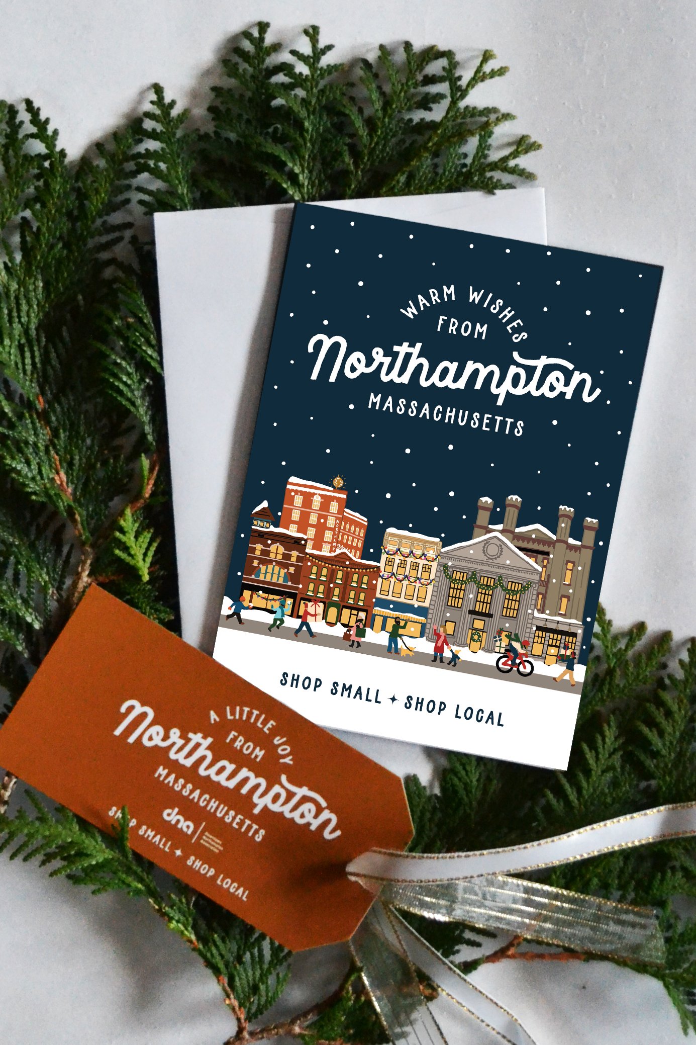
We created branded materials that shop owners and shoppers can all enjoy. There are posters…

…gift tags…

…greeting cards…

…window clings - how many can you spot downtown?

…and a full page ad in the Gazette!

Shopping locally is so important to me - and it’s what fuels our vibrant, magical community. I hope this inspires all you Western Mass folk to make your way downtown this holiday season, support our business owners, and share in that holiday magic.

A HUGE thank you to Amy at the DNA for being the heart and soul behind the shop local movement. The DNA is keeping Northampton vibrant in so many ways - check them out!

Branding: 25 Central

Surely every Western Mass Girl remembers her first visit to Thornes Marketplace, babysitting cash burning a hole in that knock-off Coach bag. I think I was in eighth grade or so, and a whole new level of cool christened me as I pushed open those swinging doors and shuffled down the creaky hallway - this was no Holyoke Mall. I remember following my gaggle of friends straight to the back corner of the first floor - there was a fall dance on Friday and we were going to 25 Central.

25 Central never lost its cool factor. Whether it was a flirty dress, a quirky scarf, or a little bling - there was always something to catch my eye when I visited the shop here and there over the next two decades of womanhood.

So, when Katie - the shop’s fabulous proprietor - called me up back in the spring with some big news, middle-school me did a happy dance.

25 Central was making a big move over the summer - straight out to Main Street. Katie had taken ownership of the Northampton shop about five years earlier, and had been working on growing the brand, expanding the inventory, and keeping things young, hip, and fresh. 25 Central has been around since the 80’s, and Katie’s hard work was feeling hidden way in the back of Thornes. She found the perfect storefront, signed on the dotted line, and her next big project was a rebrand. I couldn’t have been more excited!

When Katie and I chatted about the look and feel of 25 Central over the years, there was one iconic element to the scattered branding that customers knew and loved: the store’s leopard print shopping bags. This gave me an idea that I was thrilled Katie was willing to run with:

25 Central Logo - Full Color.jpg

This chic leopard. She was going to be the mascot for our brand, and help bring some well-deserved attention to the new 25 Central.

I let the rest of the branding be inspired by Katie’s bubbly personality. Her enthusiasm is what makes the store a truly fun place to be, and it’s what keeps customers coming back. She always has a great recommendation, knows how to brighten every shopper’s day, and was always telling me, “it needs more sparkle!!!!!” If that doesn’t sum up this brand, I don’t know what does.

25 Central - So Good - Full Color 2.jpg
25 Central - Round Logo - Full Color on Pink.jpg

We made some cute business cards, a gift card, and bunch of fun stickers…

Business Card Mockup.jpg
gift card mockup.jpg
Sticker Mockup2.jpg

…and the crown jewel: the storefront sign. We defied the downtown Northampton regulatory odds in making this giant, sparkling, party of a sign, and I am so glad we did. It’s bring the fun back to Main Street. Big thanks to Porcupine Signs for helping us bring this to life.

25 Central Sign.jpg

I love the way this brand came together because it exudes the personality of a business without reservation. It celebrates the shop’s beloved customers and the vibrant community it lives in, and gets everyone around it excited.

Thank you for an AMAZING project, Katie and 25 Central!!!!!

Branding: Woven Stars Farm

Farming regeneratively is a mission I am learning more and more about from many of my farm clients, and it’s very exciting to hear all the different approaches, methods, and philosophies they’re exploring in support of a better future. The why and how of farming are becoming more important than ever, as we start to better understand how it all affects the land and our environment. This is so critical for all of us.

Woven Stars Farm in Ghent, NY has focused on regenerative farming from the beginning. They specialize in pasture raised meats and eggs, and emphasize rotational grazing as a means of keeping their livestock and the land happy and healthy. I found our Discovery conversation to be particularly inspiring, as Lizzie and Emerson explained the interconnectivity of all living things on their farm and how they work to best support those relationships - from the soil, to the microorganisms, to the plants, to the animals, to the people who eat, all the way to the cosmos. Hence the name - Woven Stars. Talk about an authentic brand! I loved it.

Interconnectivity was a concept I really wanted to get across in the logo design and branding, and give some visual representation to the connections and interdependencies that this farm has been built around.

Woven Stars Farm Logo -01.jpg

The primary logo addressed that by bringing in a variety of animals from the farm - cow, sheep, pig, chicken, and faithful guard dog. Woven Stars Farm is known for their incredible working Great Pyrenees, who keep careful, constant watch over the livestock. They’re all intertwined beneath the shade of a big farm tree, twinkling stars above. It’s all connected.

We carried this theme across a few versatile secondary logos…

Woven Stars Farm Round Logo-01.jpg
Woven Stars Farm Stacked Wordmark - Multicolor.jpg

Created a tagline to fully communicate their approach to regenerative agriculture…

Woven Stars Farm - Humanely Raised Tagline 1 - Light Yellow on Gold.jpg

and a few other elements to help tell the fully tell the story of all this farm has to offer. I love this CSA badge in particular - Woven Stars is known for their amazing meat CSA.

Screen Shot 2021-06-30 at 11.25.29 AM.png

We also designed a label for their egg cartons. We really wanted this to stand out on the shelf, and fully embrace the new branding. We went for a label that covered the full length, and again celebrates that theme of interconnectivity.

Woven Stars Egg Carton Mockup round 2.jpg

Woven Stars has been busy applying their branding to all elements of their farm this season, and it’s been so fun to see it come to life. I just got a hat in the mail!!

Woven Stars Farm Hat.jpg

This one was a true pleasure to work on, and a story I was happy to help tell. Work like this is the future of farming, and it is so inspiring to see it in the hands of people like Lizzie and Emerson, who care so deeply for their land, their animals, and their community. Thanks Woven Stars Farm!

Branding: Summer on Strong

There’s nothing like the feeling of being right at the edge of summer, the whole glorious sunny season an expanse stretching out in front of us. This year I think it feels particularly exciting - pandemic restrictions are being lifted, we’re holding loved ones close again, going out for dinner and drinks, and it kinda just feels like everyone is ready for a big party.

Businesses on Strong Avenue in Northampton were picking up on that vibe, and wanted to give locals an opportunity to safely celebrate this summer. Together, they pitched a brilliant idea: close Strong Avenue to traffic and fill it with good food, live music, and happy people all summer long. It got the green light, and Familiars, The Eastside Grill, Local Burger, Progression Brewery, Homestead, and Mulino’s turned their block into a little slice of downtown summer paradise.

And I got to do the branding! We wanted to shout this celebration from the rooftops, and give it a real summer block party look and feel. I also really wanted to make this specific to Strong Avenue, and celebrate the local businesses that were coming together to make this all happen.

Summer on Strong Launch Graphic.jpg

The primary logo is a little composite landscape of many of the iconic buildings on Strong Avenue that these awesome businesses call home: Familiars’ cute dining car, the deck at Mulino’s, those stairs going up to Local Burger, the little peak and awnings of The Eastside Grill, the bike trail…it’s so Northampton.

Summer on Strong - Horizontal Logo - Full Color.jpg

This secondary logo really celebrated the outdoor dining atmosphere that’s at the center of this event: a little bistro table and chairs in the middle of the street, under shady trees and string lights. Wouldn’t you want to make a reservation?

Summer on Strong - Oval Logo - Full Color.jpg

From there we made banners, posters, postcards, and social graphics to get the word out - and it’s working! The street is bustling with diners, dancers, and locals just happy to see one another again. It’s a beautiful thing.

Summer on Strong Postcard.jpg
Summer on Strong Lamppost 2.jpg
Summer on Strong Poster Mockup.jpg
Summer on Strong Banner 1.jpg

THANK YOU to the wonderful businesses of Strong Avenue and their generous sponsors for bringing this vision to life for the whole community - my thanks especially to Danny and Isaac of Familiars and Deb of The Eastside Grill for entrusting me with this one.

Happy Summer!

Branding: Thomas Farm & Dairy

One of my favorite things about spring is the abundance of cute baby animals. Baby chickens, baby horses, baby cows, baby sheep – that is – chicks, foals, calves, lambs. I’m a bit partial to baby goats though – kids. There’s something about their playfulness and awkwardness that just melts my heart. I fell in love with a Nubian goat kid aptly named JoyJoy last spring at Thomas Farm & Dairy, and that love grew into one of my most favorite branding projects to date.

 Thomas Farm & Dairy is well established in Western Massachusetts for their delectable goat cheese. If you’ve ordered a salad with goat cheese on top from a local restaurant, I’ll bet it came from Thomas Farm & Dairy. Their chèvre is award-winning, and the secret to their success is actually pretty simple, albeit much hard work: they put a lot of love into it.

35884EC7-FCDC-4EEC-9823-D690589975DF.JPG

When I visited Thomas Farm & Dairy and met owners Laurie and Jim, I was welcomed so warmly, and was instantly struck by the level of care they put into all they do. Laurie walked into the goat barn, and hundreds of goats suddenly had eyes only for her, climbing over one another to get a cuddle in. She called each one by name and told me their unique stories and quirks. It was clear – she loved these goats and they loved her.

FullSizeRender.jpeg

And I loved JoyJoy! Client meetings are always fun, but I have to say this one was really fun.  

 In building a brand for this farm, I wanted to capture all the love, care, and joy that I witnessed in just that one visit. Goats are a big deal at Thomas Farm & Dairy, but it’s also a very diverse farm – they’re raising and milking Jersey and Swiss Brown Cows, growing vegetables and cut flowers, running a roadside farm stand, and more. This was a big story to tell, and we started with the logo:

Thomas Farm & Dairy Logo - Cream on Navy.jpg

We kept the goats the focus for the primary logo – two ladies grooming one another. We thought it really conveyed that feeling of love that goes into everything on this farm and captured the sweet personalities of Nubians in particular.

 That was expanded into a set of secondary logos and custom brand illustrations that work together to tell the full story of this farm. I like how we brought in a little retro dairy farm flair that still feels modern and exciting.

Thomas+Farm+Script+Logo+-+Cream+on+Light+Blue.jpg
Thomas+Farm+Tractor+-+Blue+on+Cream-01.jpg
Thomas Farm & Dairy Pattern - cream on navy.jpg
Thomas+Farm+Small+Logo+-+Cream+on+Red.jpg

Taglines were fun to develop for this farm too, using typography to once again describe those values of love, joy, and care.

Tagline Gif.gif

Thomas Farm’s farm stand was also a huge focus of this project, as it has become an important and reliable resource for local food during the pandemic. Laurie and Jim keep all of their cheeses, seasonal vegetables, and cut flower bouquets in stock throughout the year, as well as a terrific spread of other favorite local goods. We gave The Farm Stand its own logo and really made it shine.

Thomas Farm Stand Logo with Illustration - Red-01.jpg

All of this branding was incorporated into a new website, that makes it easy to find Thomas Farm & Dairy cheeses, learn about the farm, and get a behind the scenes look at everything going on there.

The final piece was a label update, which really brought the branding together in a practical and beautiful way that ought to really stand out on the shelf. We developed labels for all varieties of goat cheese, and for the farm’s famous squeaky cheese curds.

Thomas Farm & Dairy Goat Cheese - The Homegrown Studio.jpg

I love how the little colored ribbons differentiate the cheeses. So many delicious flavors!

Thomas Farm & Dairy Cheese Curds - The Homegrown Studio.jpg

To come full circle, this project was truly a labor of love. Laurie and Jim were so enthusiastic throughout the process, and deeply care about the ways they share their farm with the community. Most recently, they are really inspiring me with these barn quilts they’ve been painting and hanging around the farm. So genuinely on-brand. Wow!

Thank you Thomas Farm & Dairy for all your collaboration on this project, and thank you to CISA for helping make it possible! We accomplished this project in partnership with CISA, who does such a fabulous job of connecting local farmers with resources to help them succeed. Local farms - reach out to CISA to see how we can work together to help you tell your story with some new branding! (and don’t forget I offer a 15% discount to Local Heroes!)

Branding: Rooted Flowers

There are some farms in Western Massachusetts that are just establishments, and I am always humbled when those establishments trust me with their brand. It’s an overwhelming honor - really. When Becky of Rooted Flowers got in touch about refreshing her brand, I got that feeling.

Photo courtesy of Rooted Flowers

Photo courtesy of Rooted Flowers

Becky has been farming all her life, coming from a long line of hard working farmers here in the Pioneer Valley. Cut flowers are her focus, growing all her beautiful blooms from seed and designing stunning arrangements. Becky and her family recently moved from Hadley to Agawam, onto a plot of land all their own, and Becky has totally transformed the acreage from dormant farmland to rows upon rows of flowers in just a little over a year’s time. I’ve had a first-hand glimpse of just some of the work going on over at Rooted - and let me tell you - it’s nothing short of amazing. Check out her daily Instagram stories to see what I mean.

With the new land and a new chapter beginning for Rooted Flowers, it was time for a brand update as well. Becky really wanted to offer the heart of her farm’s story: passing agriculture down through the generations. Becky learned farming from her grandparents, and shares all she does on the farm with her two young daughters, Mary and Julia (Becky was pregnant with Julia for the duration of our project, and ran a successful farm and business during a pandemic - really, it’s AMAZING).

Rooted Flowers Logo - The Homegrown Studio.jpg

The primary logo is centered around that concept. We have a big “mama” flower and two smaller flowers looking up at her, representing Becky’s two daughters. The logo carries all the elegance and professionalism we needed to appeal to bridal clients, but carries some really significant meaning at the same time.

We rounded out the branding with lots of marks and details that told the story of all that goes on at Rooted, which focuses on three main themes: Grow, Build, and Create. Each theme got its own illustration, and really shows all that goes into every plot, harvest, and bouquet on this farm.

grow+build+create.jpg
Rooted Flowers Monogram - The Homegrown Studio.jpg
Rooted Flowers Pattern - The Homegrown Studio.jpg

We applied the branding to floral tissue paper, kraft tags, and boxes that were all sourced sustainably and are recyclable and compostable, putting Becky’s mission into clear practice.

Rooted Flowers - The Homegrown Studiol.jpg

Of course designing for a beautiful flower farm is as much fun as it sounds like it might be, but furthermore, I learned so much from Becky in the process. Witnessing her energy, enthusiasm, grit, perseverance, work ethic, and genuine love for the land and her family totally inspired me, and made for some work I’m really excited about and proud of. Rooted is truly an establishment in our Western Mass farming community. Thanks Becky!

We accomplished this project in partnership with CISA, who does such a fabulous job of connecting local farmers with resources to help them succeed. Local farms - reach out to CISA to see how we can work together to help you tell your story with some new branding! (and don’t forget I offer a 15% discount to Local Heroes!)

Packaging: Apis Apotheca

One of my favorite things about this job is that oftentimes clients are friends and friends are clients. I’ve made lots of new friends thanks to happy client relations and sometimes clients and I go way back! 

Way back in college I had easily the coolest freshman year roommate a girl could ever be randomly assigned. Actually, I had never met anyone that cool before and sometimes I needed a minute to catch up. Aviva was from New York City and she had a knack for finding chic vintage cardigans and leather bags in thrift stores. She’d been to France. She listened to music I’d never heard before, by Bon Iver and Dr. Dog and Beirut and Grizzly Bear. She had a Netflix subscription; DVDs you picked out on the computer then arrived in the mail!! She played the guitar and the banjo and the violin and could even sing opera but mostly just crooned ethereal melodies she had written in-between classes, and when she brought them to Thursday night Open Mic, boys cried. She made oatmeal each morning and we spent a year talking about everything. She wasn’t just cool, she was kind, and just the sort of friend I needed to navigate a new thing like college.

She transferred away to another school sophomore year, and we fell in and out of touch over the years. Our paths serendipitously crossed again two years ago as we both found our greater callings: she was farming and making skin care and I was farming and making logos.

Aviva founded Apis Apotheca, a farm-to-face brand run by farmers, herbalists, and educators who feel a duty to uphold traditions of equitable access to safe herbal medicine and knowledge. She brings together extensive knowledge in organic farming and herbal remedies to create products that are healing for the body, the community, and the environment. Aviva may be a friend, but I can genuinely say these are the best skin care products I’ve ever used. Golden Milk + Resin is my religion, and my skin is so much better for it. I really wouldn’t use anything else. 

I was psyched when she started talking about a rebrand; it was time to elevate things with shiny new packaging. We put together what could be my most favorite moodboard of all time, featuring an eclectic mix of Italian runway fashion, Russian grandmas, ‘70s flower children, and cute little vintage jam jars. It was all over the place and made perfect sense. 

One word kept coming up: juicy. When I went to design this brand, all I kept thinking was “it needs to be juicier.”

So I created a very folksy botanical pattern customized to each product. Lush green foliage is adorned with herbal symbols representing each formula: chamomile, calendula, gotu kola, wild rose, frankincense, and dragon’s blood. 

The Homegrown Studio - Apis Apotheca Pattern.gif

Applied to the boxes, we had definitely hit “juicy” level. And complemented with jewel tones and gold foil details, there was a whole new luxury and intrigue introduced to the brand. 

Apis Box gif.gif
IMG_4170.jpg

The screen-printed amber bottles and jars balance the maximalism of the boxes nicely with a single terra cotta color, softly carrying the botanical vignettes and general juice through the whole line

Apis bottle gif.gif

The result here is a brand that now embodies everything Aviva has been pouring into this brand: organic, sustainable ingredients, thoughtful, equitable herbal medicine, eco-conscious packaging, the sweat and love she’s put into her bursting gardens, a solar powered lab, and a certain - I don’t know - coolness that is just her.

I am so excited for this launch. What an opportunity when you get to design for a good friend, and a brand you truly believe in. Thanks Aviva! 

Branding: Diemand Farm

Turkey isn’t just for Thanksgiving - turns out it’s most definitely for pandemic times, too. Diemand Farm in Wendell is well know locally for their farm raised turkeys - and more. Their farm store is filled with delicious homestyle comfort food: pot pies, mac and cheese, turkey soup, meatloaf, and just-baked cookies. Now, maybe more than ever, people want comfort food, and Diemand Farm has delivered - to the point where they were clean out of turkeys!

diemand-farm-turkeys.jpg
Photos courtesty of Diemand Farm

Photos courtesty of Diemand Farm

Diemand Farm has been family owned and operated since 1936, and four generations have proudly carried forth the family’s tradition of farm fresh food from their bucolic acres gently tucked into the Wendell hills. Alongside the swell in traffic flocking to the farm store for good, local food, the family began thinking it was time to update their branding, in hopes of connecting with new audiences and refreshing the look of the farm store.

Fully embracing the farm store’s trademark warm, comforting, at-home feel, we developed a logo and brand elements that spoke to Diemand Farm’s heritage and future all at once.

Diemand-Farm-Logo---Animation.gif

The primary logo is retro and rustic, speaking to the breathtaking view as the sun rises over the hills at Diemand Farm. And, there’s a little symbolism - the illustration forms a diamond shape, in homage to the farm’s namesake.

Secondary Logos provided some nice flexibility within the branding:

Diemand Farm Secondary - The Homegrown Studio.jpg

Developing out the rest of the brand was the really fun part, as we began to really tell the story of this incredible farm.

Diemand-Farm---Come-See-Whats-Cookin!---Animation.gif

Diemand Farm had already been using this tagline for years - we just spiffed it up a little.

Diemand Farm To Go - The Homegrown Studio-36.jpg

Grab and go meals and frozen foods have been a particularly big sell during the pandemic, so we highlighted that convenient “to go” feature of the farm store with this cute little doggie bag illustration.

Diemand Food Wrap Mockup.jpg

Actually, we did lots of custom illustrations for this one! The brand was begging for this retro butcher-paper style pattern, and the result really told a nice story of all that’s happening at Diemand Farm: pot pies, happy birds, and good eatin’.

When it came time to apply this brand IRL, we developed some freezer signs for the farm store, and a chicken label for the farm’s signature roasters. The look and feel really started to come together nicely.

Signs 1&2 Mock up.jpg
Chicken.jpg

So, as we continue to navigate the ups and downs of our socially distanced times, be sure to venture out to Diemand Farm’s little market for some truly local, always homestyle food to help you get through. A little turkey pot pie goes a long way.

This was such a fun brand to work on. Thank you to Diemand Farm for your awesome collaboration, and to CISA, who partnered with us in support of this project! They do such a fabulous job of connecting local farmers with resources to help them succeed. Local farms - reach out to CISA and see how they can help you up your marketing game! (and don’t forget I offer a 15% discount to Local Heroes!)

Branding: Chase Hill Farm

Warwick, Massachusetts sits wayyyyyyyy up on our Northern border, New Hampshire’s Mount Monadnock no more than an arm’s length away. It’s a bit of a journey up, but it’s become something of a destination for raw milk enthusiasts looking for the very best that local bovine have to offer - and that’s at Chase Hill Farm. Folks drive from hours away and miles around to get their hands on this 100% grass-fed organic raw milk.

Why is Chase Hill raw milk so good? Ben and Laura, the owners, chalk it up to two main things: grass and love. Their exclusively grass-fed cows are considered part of the family, and are always treated as such. When it came time to develop a new logo for the farm, grass and love were two things Laura identified as absolute;y key to the brand.

I couldn’t have been happier to hear it. Working in a block print style that has been inspiring a lot my work lately, I created a design that embraced the lush grass so central to all that happens at Chase Hill Farm, and illustrated a well-loved cow, blissfully munching away.

The Homegrown Studio - Chase Hill Farm Logo.jpg
The Homegrown Studio - Chase Hill Farm.jpg

Ben and Laura were totally on board with this, but an alternate concept I had presented to them caught their eyes too. We ended up reworking it to serve as a secondary logo; in total alignment with the chosen primary logo, but a bit of a different layout that offers a wider glimpse of all Chase Hill Farm has to offer.

A cow, pig, and chicken enjoy a little chase over a grassy hill - a quite literal interpretation of the farm’s name.

The Homegrown Studio - Chase Hill Farm Logo 2.jpg

The little butterfly offers a nice consistency between the two logos too, and has an awesome story behind it. Chase Hill Farm has lots of native milkweed growing around their pastures, which encourages breeding of Monarch butterflies. Every summer, the farm is a sanctuary for Monarchs; a beautiful testament to the healthy ecosystem that the Chase Hill family works so hard to maintain.

These logos were such a pleasure to work on, and I was so happy we were able to bring two concepts together to create a solid foundation for the farm’s branding. Looking forward to seeing the new look on raw milk bottles soon!

Branding: Belden Farmstand

When you’ve been farming for thirteen generations, SINCE THE 17TH CENTURY, it’s sort of a big deal when you consider updating your brand! But that’s just what Belden Farmstand in Hatfield, Massachusetts decided it was time for, and I’m so glad they got in touch as a result.

With a business that well-established, change can feel a little daunting, but I was reassured completely after talking with Jillian out on the porch of Luther Belden Farm’s big old farmhouse. Jillian’s husband’s family has been farming the land in Hatfield since 1661, and over the centuries they have offered all sorts of farm products to the community. The prevailing product has been dairy, however, and the farm sends its milk to Agri-Mart to be used for local milk and Cabot cheese. Over 300 happy cows call Belden home.

Photo courtesy of Belden Farmstand.

Photo courtesy of Belden Farmstand.

Jillian and her husband understand the importance of diversification though, and have been exploring new ways to get farm products directly into the hands of consumers. It was in this way that the brand Belden Farmstand was established, under which they would be offering artisanal products beyond just milk, including goat’s milk products, soaps, farm fresh eggs, beef, and more.

Photo courtesy of Belden Farmstand.

Photo courtesy of Belden Farmstand.

With this new endeavor came a need for fresh branding, as the farm had been primarily focusing marketing efforts on the trade side of things. Now wanting to connect directly with local consumers, they needed a brand that really told the story of Belden Farmstand: their rich heritage, farm fresh products, and new focus on farm-to-table.

So we got to work on the logo and branding.

Belden Farmstand Logo - The Homegrown Studio.jpg

The primary logo achieves the balance of traditional and modern style, speaking to the history of the farm while presenting a fresh, clean look. Inspired by vintage farm illustrations, a cow, chicken, and goat come together in a playful way, complemented by a traditional serif font and just a touch of curvy handwriting. It tells a little story, one that is very personal to the farm, but relevant to the customer.

Expanding this story into larger branding was the fun part, as each animal got a chance to take center stage in their own sublogo! These will make perfect labels down the road.

Belden Farmstand Secondary Logo Goat - The Homegrown Studio.jpg
Belden Farmstand Secondary Logo Chicken - The Homegrown Studio.jpg
Belden Farmstand Secondary Logo Cow - The Homegrown Studio.jpg

My favorite brand element is the pattern we created. All of the animals come together with little brand details sprinkled in. It calls to mind a farmy toile print, and really shows off the illustrations nicely.

Belden Farmstand Pattern - The Homegrown Studio.jpg
Belden Farmstand Brand Mark - Blue on Grey-01.jpg

We also created a business card, which came with its own little challenge. We wanted this piece to showcase the new branding to consumers, but also stay relevant on the trade side, where most of the milk business still takes place. We did this by bringing in the larger company name “Luther Belden, Inc.” in an attractive way on the flip side, uniting both brands in a way that made sense to all audiences.

Belden Business Card Mock up square.jpg

The result of all this is an enduring story of an old New England Farm, getting new life from the next generation. That really comes through in the branding, and in all the excellent products Belden Farmstand puts forth.

Speaking of new life – you MUST check out Belden Farmstand’s Instagram for regular baby goat updates. So much cuteness - they’ve had a busy spring!

It was such a pleasure getting to know Jillian and the whole Belden Farmstand family throughout this process, and I had so much fun helping bring their story to life. We accomplished all this in partnership with CISA, who does such a fabulous job of connecting local farmers with resources to help them succeed. Local farms - reach out to CISA and see how they can help you up your marketing game! (and don’t forget I offer a 15% discount to Local Heroes!)

Thank you CISA, and thank you Belden Farmstand!