Branding: Finch Flower Co.

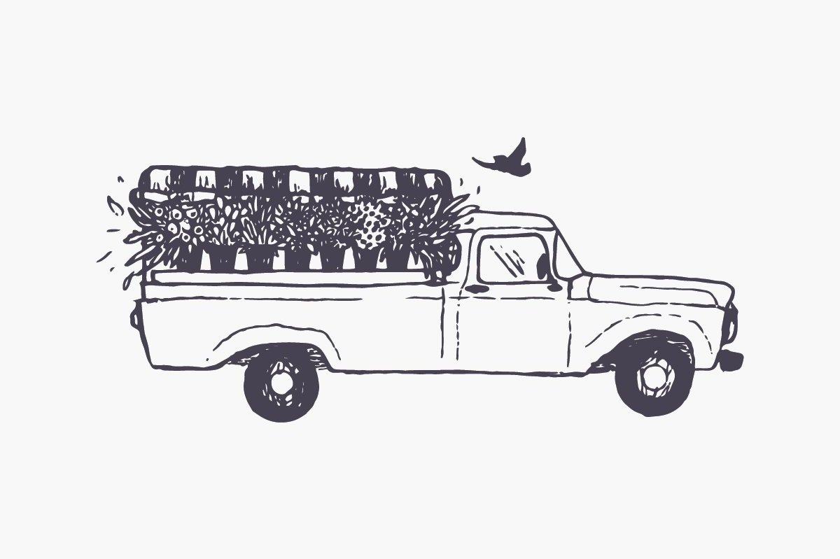
Flowers have certainly been a big theme for many of our branding endeavors this year – but there was one floral-themed project in particular that we couldn’t wait to get started on. Nina got in touch back in the spring with an idea that made us just giddy: an antique flower truck! She had just secured the keys for a 1957 Ford F100, and was ready to launch her dream business, Finch Flower Co, here in Western Massachusetts.

The image of locally-grown bouquets adorning the bed of this cream-colored vintage pick-up was nothing short of inspiring, and we wanted to complement that iconic look with branding that told the full story of a unique business.

Starting with the logo, it was all romance and floral wildness centered around a signature finch.

We built off that ethereal look and feel to both tell the story of the truck – affectionately called “Birdie”! – and create a memorable aesthetic. Secondary logos, custom illustrations, brand marks, monograms, call-outs, and a fun pattern all came together to do the job.

All of these elements were designed with application top-of-mind, as customer experience was at the center of the business. We wanted every interaction with the flower truck to be special and memorable, and looked to achieve that in the details of the bouquet packaging and truck adornments.

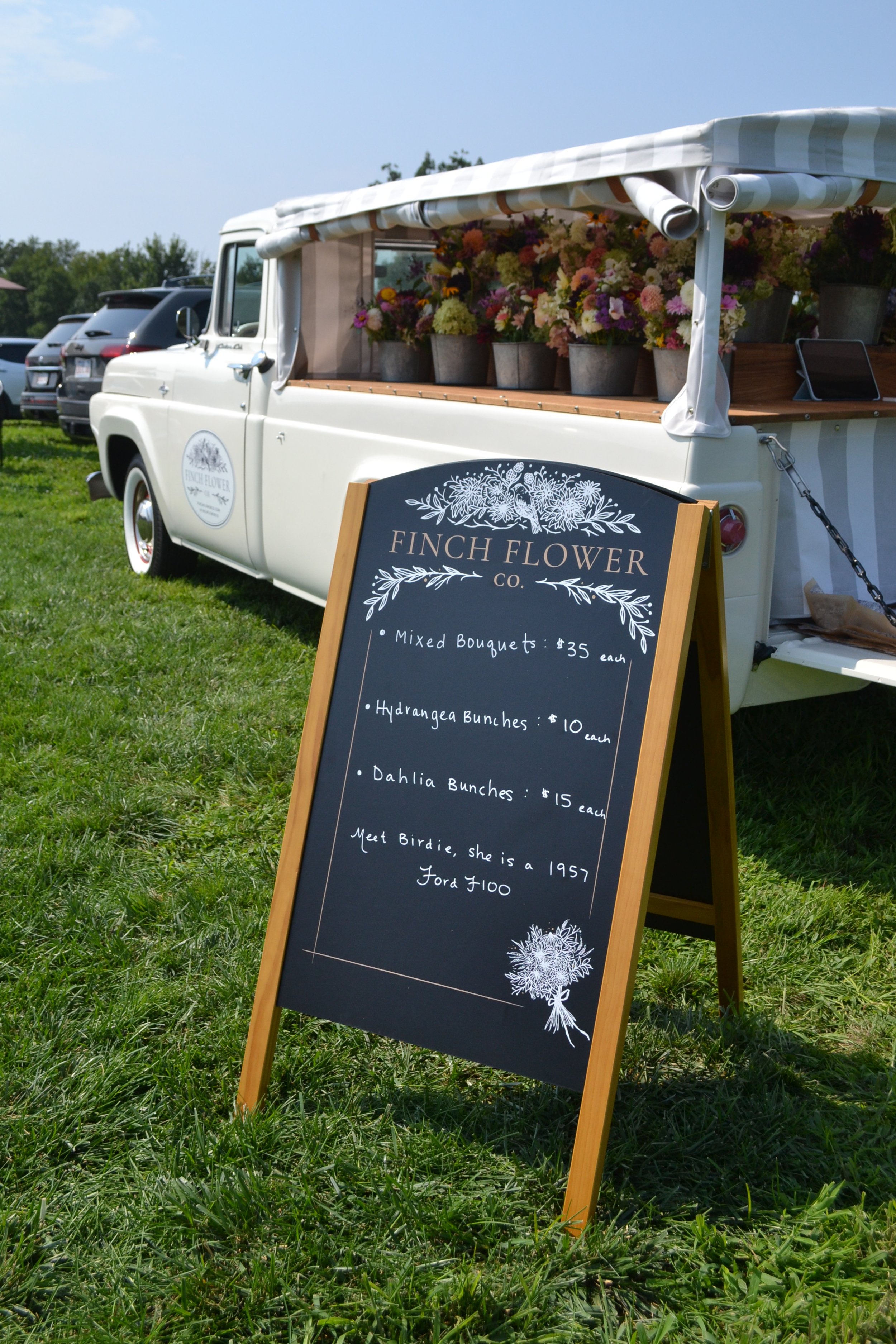
A custom A-frame chalk board and subtle, elegant truck signage made for a versatile and flawless presentation at events.

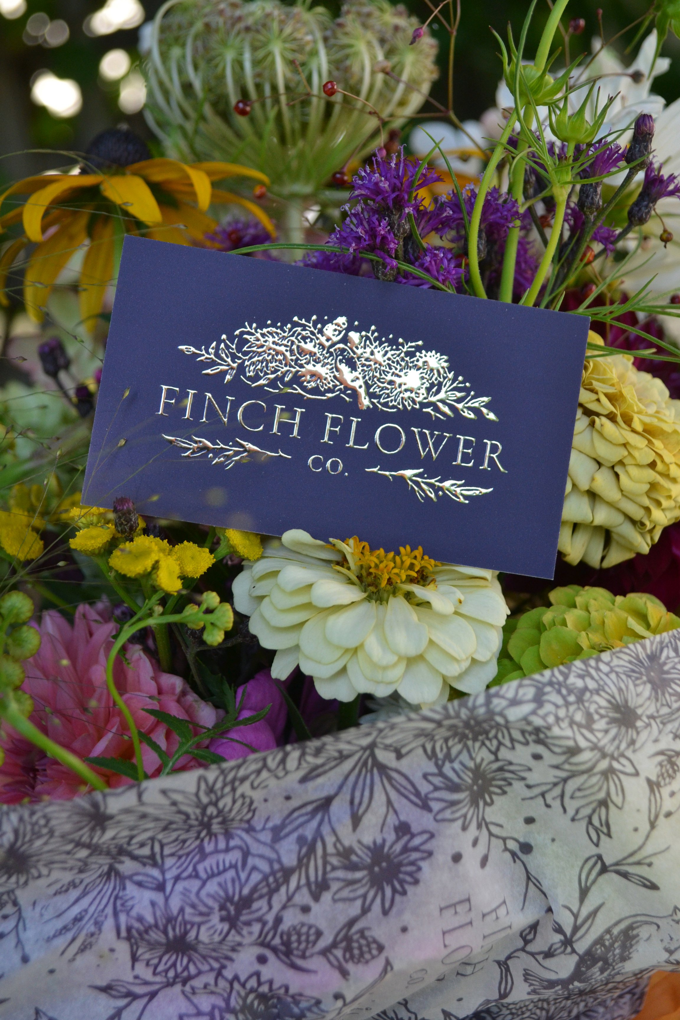
Gilded business cards really elevated the whole look and feel - there’s nothing like seeing your logo set in gold foil!!!

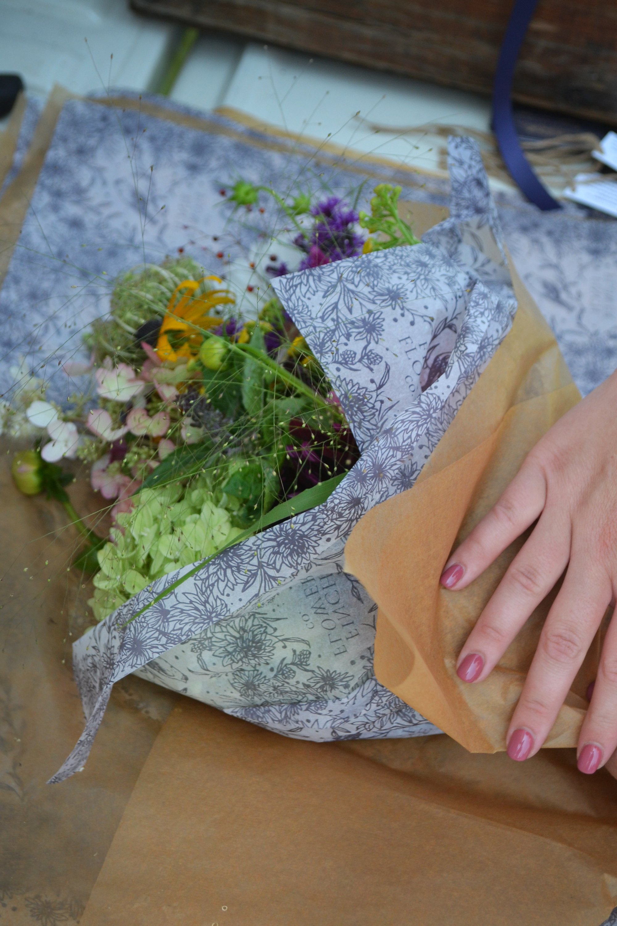
Custom floral tissue was a place where we really maximized the floral illustrations into a repeat brand pattern - and then subdued it just a bit by pairing it with a more neutral brown kraft paper.

It was fun to sprinkle our little finch throughout this brand!

The silk floral ribbon may be our most favorite element of this project - elegantly tying it all together, quite literally. Paired with a tag (which doubles as a mini business card!) each bouquet really delivers the full brand experience in a tasteful way.

We couldn’t have been more pleased with the way this brand came together. It has been so much fun to see Nina and Birdie out on the road this summer, at events and gatherings all over the Pioneer Valley. Follow her travels over on instagram and learn more about booking the truck for events on the Finch Flower Co. website - designed and developed by our trusted partner, Emily King at Wheel Horse Digital!

Thank you Nina for this incredible vision - it was a thrill to help bring it to life and we are so glad to have this gem of a small business in our community!
Branding: The Tulip Workshop

It’s always pleasant to work on flower farm brands, but it is particularly satisfying to be drawing nothing but flowers right on the cusp of spring. We’ve had a slew of flower-themed projects coming our way lately, and it just really fits the mood as my tulips are popping up from the ground.

Tulips have been top of mind especially these past few months. I couldn’t help but notice a trend over the winter, as many of my beloved flower farm clients were harvesting armfuls of homegrown tulips on the coldest, darkest days of the year. Turns out they had all taken the same course with The Tulip Workshop - a collaboration between Linda D’Arco of Little Farmhouse Flowers, and Emily von Trapp of von Trapp Flowers.

When Linda and Emily got in touch about branding their workshop series, along with their respective flower farms, I have to say was a little starstruck, dabbling in cut flowers myself. These two are complete powerhouse growers and I really admire the businesses they’ve built.

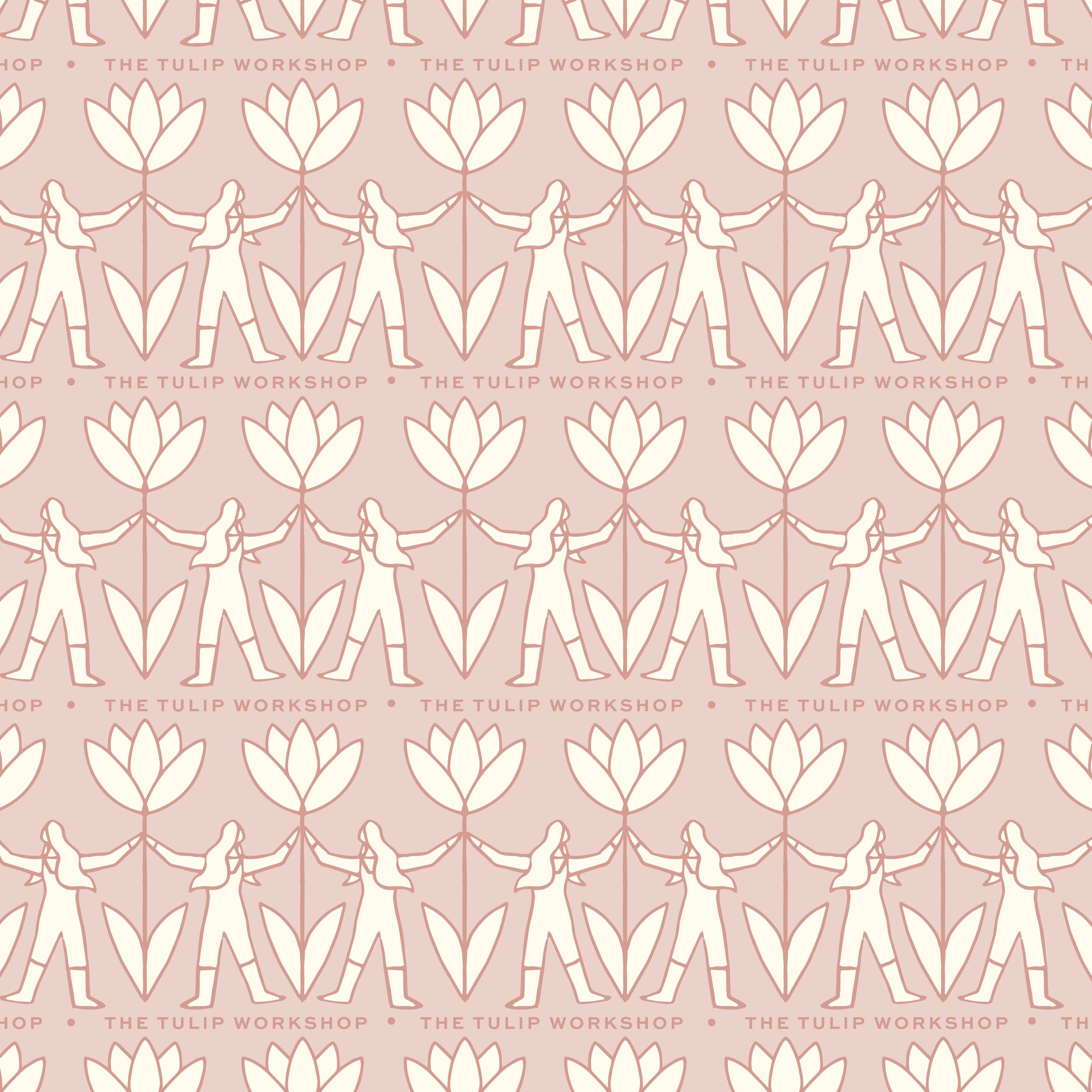
I’m thrilled we’re now wrapping up all three projects just in time for spring! First, I want to share our work on The Tulip Project, which was all about the partnership of these two awesome women sharing knowledge, building a community, and learning from one another.

This was so lovely to work on, and it’s been exciting to start seeing the new brand reaching the vast network of students benefiting from The Tulip Workshop courses. We’ll be sharing branding for Linda and Emily’s own farms in the coming weeks - happy spring!

Branding: Brynhill Flower Farm

It’s never not fun to brand a flower farm. Being passionate about growing flowers myself, I always find it interesting to talk with flower farmers about how they are growing, selling, and setting themselves apart. And I love to draw flowers about as much as I love to plant them.

Working with Haley and Missy of Brynhill Flower Farm in Prospect, Pennsylvania was a particularly fun time. This mother-daughter team had extensive expertise in growing, specifically in the nursery setting for landscaping - but were passionate about cut flowers and ready to start a wholesale floral business. They had vision, enthusiasm, and a great sense of humor about it all. We hit it off right away.

We wanted to create a strong sense of place with the logo and branding, showing where all these beautiful local flowers come from. The primary logo centers around their red barn, set deep amongst maples and gardens:

We developed a full brand from this scene, bringing together fun floral illustrations, hand lettering, and a jewel toned color palette to tell their full story.

Haley and Missy also produce maple syrup from the many maple trees on the farm. This little maple leaf sub logo is one of my favorite parts of the branding suite:

But my most favorite element is the repeat pattern - perhaps my favorite I’ve made! I just love these colors all together.

We got touched by our first frost over the weekend and I can’t believe this growing season is coming to a close - I’m not ready. Follow Brynhill for flower inspiration all year long - and if you’re in the Pittsburgh area, check out their gorgeous florals available wholesale through the Greater Pittsburgh Flower Collective! Thanks Haley and Missy for such a fun project!

Branding: Rooted Flowers

There are some farms in Western Massachusetts that are just establishments, and I am always humbled when those establishments trust me with their brand. It’s an overwhelming honor - really. When Becky of Rooted Flowers got in touch about refreshing her brand, I got that feeling.

Photo courtesy of Rooted Flowers

Photo courtesy of Rooted Flowers

Becky has been farming all her life, coming from a long line of hard working farmers here in the Pioneer Valley. Cut flowers are her focus, growing all her beautiful blooms from seed and designing stunning arrangements. Becky and her family recently moved from Hadley to Agawam, onto a plot of land all their own, and Becky has totally transformed the acreage from dormant farmland to rows upon rows of flowers in just a little over a year’s time. I’ve had a first-hand glimpse of just some of the work going on over at Rooted - and let me tell you - it’s nothing short of amazing. Check out her daily Instagram stories to see what I mean.

With the new land and a new chapter beginning for Rooted Flowers, it was time for a brand update as well. Becky really wanted to offer the heart of her farm’s story: passing agriculture down through the generations. Becky learned farming from her grandparents, and shares all she does on the farm with her two young daughters, Mary and Julia (Becky was pregnant with Julia for the duration of our project, and ran a successful farm and business during a pandemic - really, it’s AMAZING).

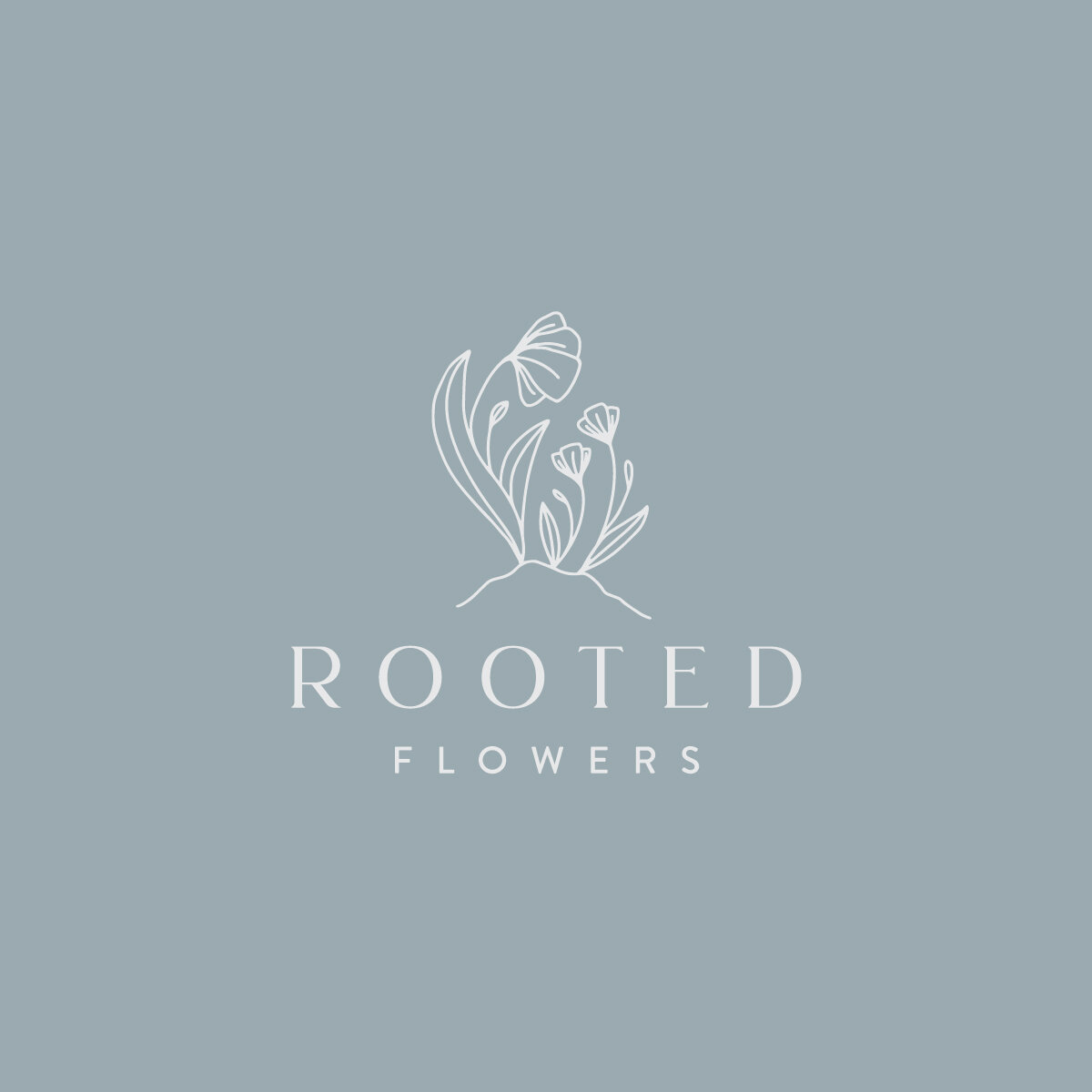
Rooted Flowers Logo - The Homegrown Studio.jpg

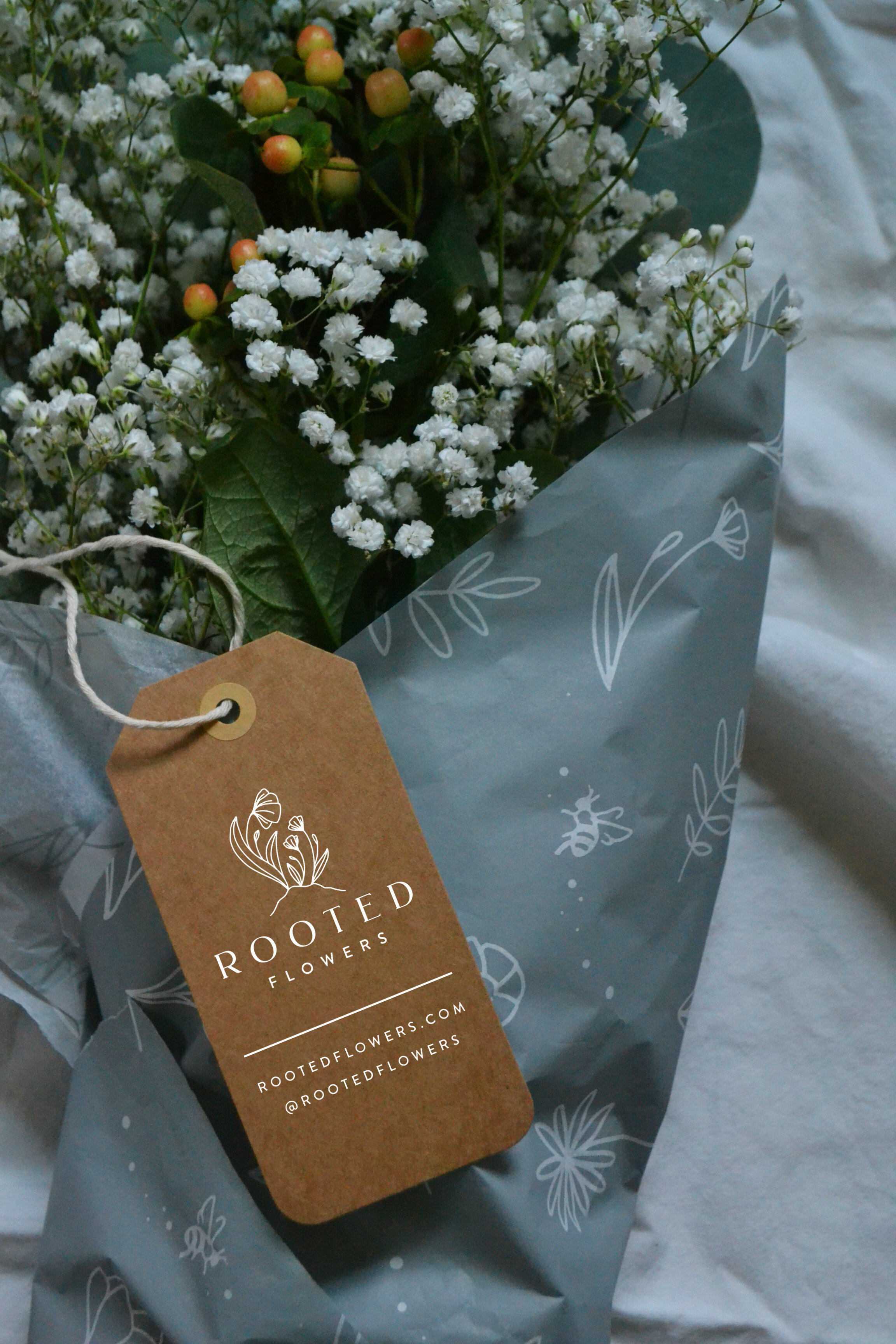
The primary logo is centered around that concept. We have a big “mama” flower and two smaller flowers looking up at her, representing Becky’s two daughters. The logo carries all the elegance and professionalism we needed to appeal to bridal clients, but carries some really significant meaning at the same time.

We rounded out the branding with lots of marks and details that told the story of all that goes on at Rooted, which focuses on three main themes: Grow, Build, and Create. Each theme got its own illustration, and really shows all that goes into every plot, harvest, and bouquet on this farm.

grow+build+create.jpg
Rooted Flowers Monogram - The Homegrown Studio.jpg
Rooted Flowers Pattern - The Homegrown Studio.jpg

We applied the branding to floral tissue paper, kraft tags, and boxes that were all sourced sustainably and are recyclable and compostable, putting Becky’s mission into clear practice.

Rooted Flowers - The Homegrown Studiol.jpg

Of course designing for a beautiful flower farm is as much fun as it sounds like it might be, but furthermore, I learned so much from Becky in the process. Witnessing her energy, enthusiasm, grit, perseverance, work ethic, and genuine love for the land and her family totally inspired me, and made for some work I’m really excited about and proud of. Rooted is truly an establishment in our Western Mass farming community. Thanks Becky!

We accomplished this project in partnership with CISA, who does such a fabulous job of connecting local farmers with resources to help them succeed. Local farms - reach out to CISA to see how we can work together to help you tell your story with some new branding! (and don’t forget I offer a 15% discount to Local Heroes!)
Wildflowers

I've had a lot of daydreams around planting a cut-flower garden on the farm, drawing inspiration from some incredible flower farms like this one and this one. While a busy spring went by too quickly and left any potential flower beds untilled, summer has not been without blossoms. 

There's an uncut grove on the outskirts of the farm bursting with wildflowers right now, and I've been cutting bouquets and satisfying my flower garden dreams that way. Plus you can't beat their natural, uncultivated beauty. 

They're brightening up several corners of my home, reminding me that those flower bed dreams must be realized next spring.