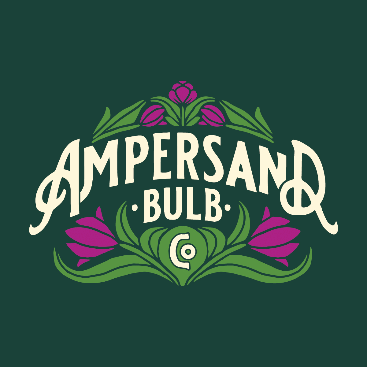
Branding: Ampersand Bulb Co.
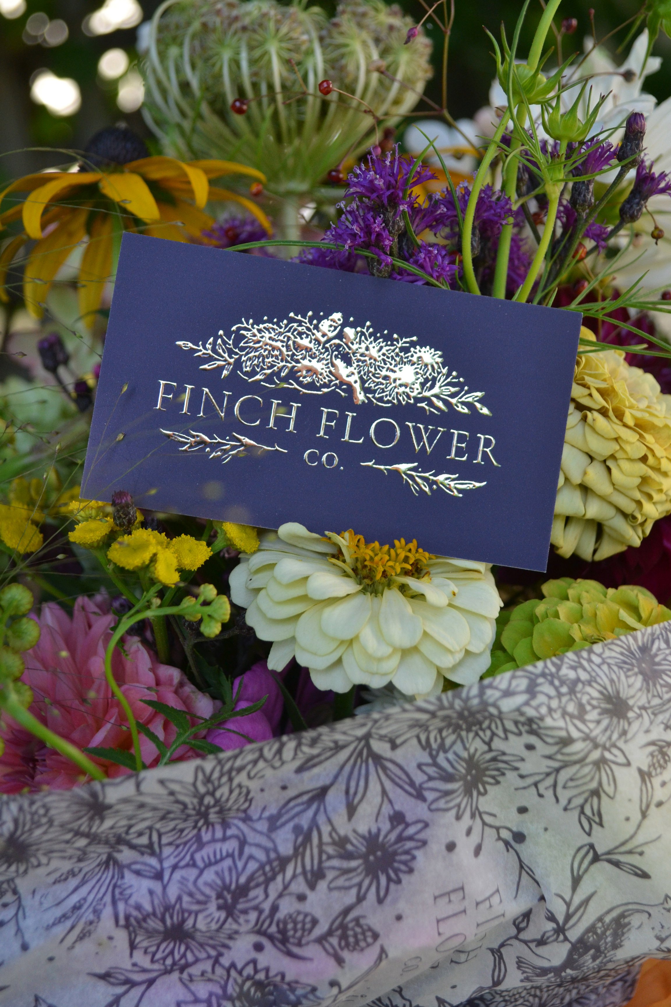
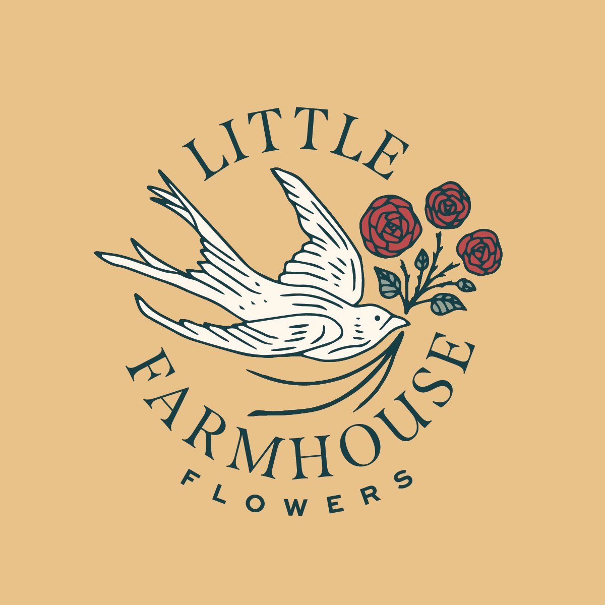
/We’ve been really fortunate to partner with the FORCE that is Linda D’Arco of Little Farmhouse Flowers on quite a few branding projects now. We’re big fans of Linda because she knows how to get things done and done right: she’ll throw an idea out into the world, make a plan, work really hard, manifest, and bam - whatever she dreamed up is reality, and it is always really good.
So when Linda told us she wanted to create a separate wholesale bulb business, we were all ears. Through her work with The Tulip Workshop and Little Farmhouse Flowers Pro, she knew the pain points and desires of flower farmers across the globe, and she had her own frustrations with corporate, clunky catalog businesses. Linda wanted to build something accessible, high quality, customer-centric, and of course - beautiful. It was going to be called Ampersand Bulb Co.
Bulb catalogs have a long, rich history, and Linda wanted to draw inspiration for the branding from Victorian-era catalogs: decorative lettering, colorful illustrations, swashes and serifs. This heritage seems to have been completely lost on today’s very sterile looking bulb catalogs, and Linda saw the perfect opportunity to bring personality back into the wholesale landscape.
So for the primary logo, we focused heavily on custom lettering and integrating illustrations and color in a meaningful way, marrying Victorian design ideals with a modern look and feel.
From there, we could build a brand that carried the aesthetic effectively, and told the story of a bulb company approaching the business in a new and improved way.


Typography was so much fun to play around with here, and we developed several taglines and call-outs with the catalog setting in mind.


Linda gets just as excited about merch as we do - and she wanted to get cheeky with it this time. We created a bunch of punny merchandise for the bulb lovers out there.


And my personal favorite - the packing tape! Linda ships thousands of bulbs around the world and they are going to arrive looking spiffy.

We are so happy to see Ampersand Bulb Co. out in the world now, and we’re so grateful for yet another collaboration with Linda. Happy fall planting!