Branding: Little Farmhouse Flowers

Continuing right along with our flower farm themed spring - next up we have Little Farmhouse Flowers, tucked away in the Adirondacks of New York. Linda D’Arco is one-half of The Tulip Workshop, and saw an opportunity to further develop the brand of her own farm, too, considering how it had evolved and grown over the past few years.

Before she became a flower farmer and floral designer, Linda was a teacher, and she has found her passion for education and sharing skills resurfacing in exciting ways. Through Little Farmhouse Flowers, she offers the chance for other farmer-florists to discover ways to grow both their floral crops and their businesses, through initiatives such as workshop opportunities, the @littlefarmhouseflowerspro subscription, and one-on-one consultations.

As Linda shifts focus to these educational aspects of her business, we wanted to make sure her branding was communicating those values, and connecting with the appropriate audiences.

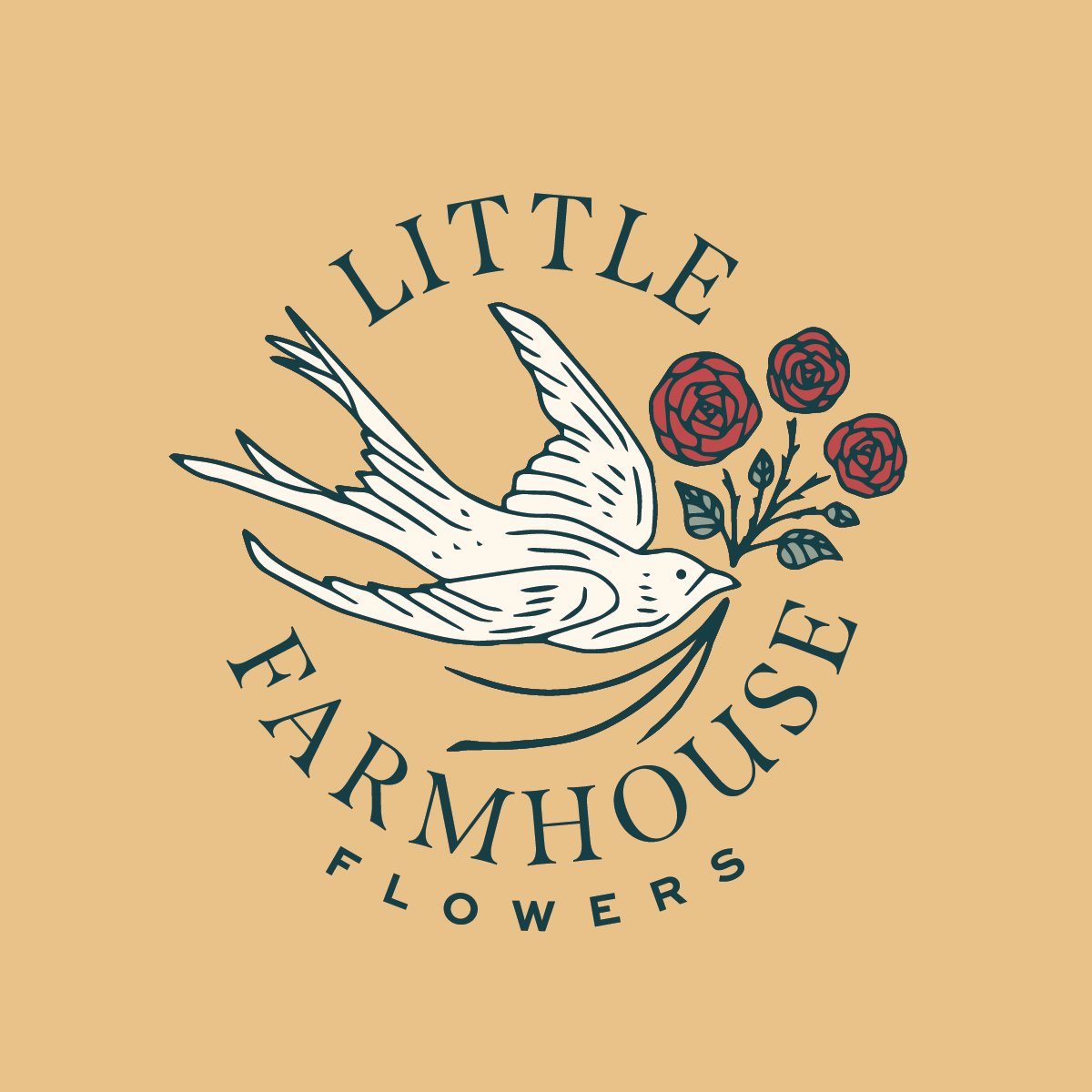
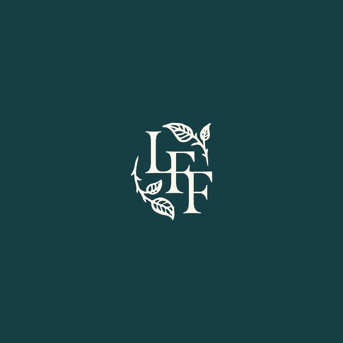
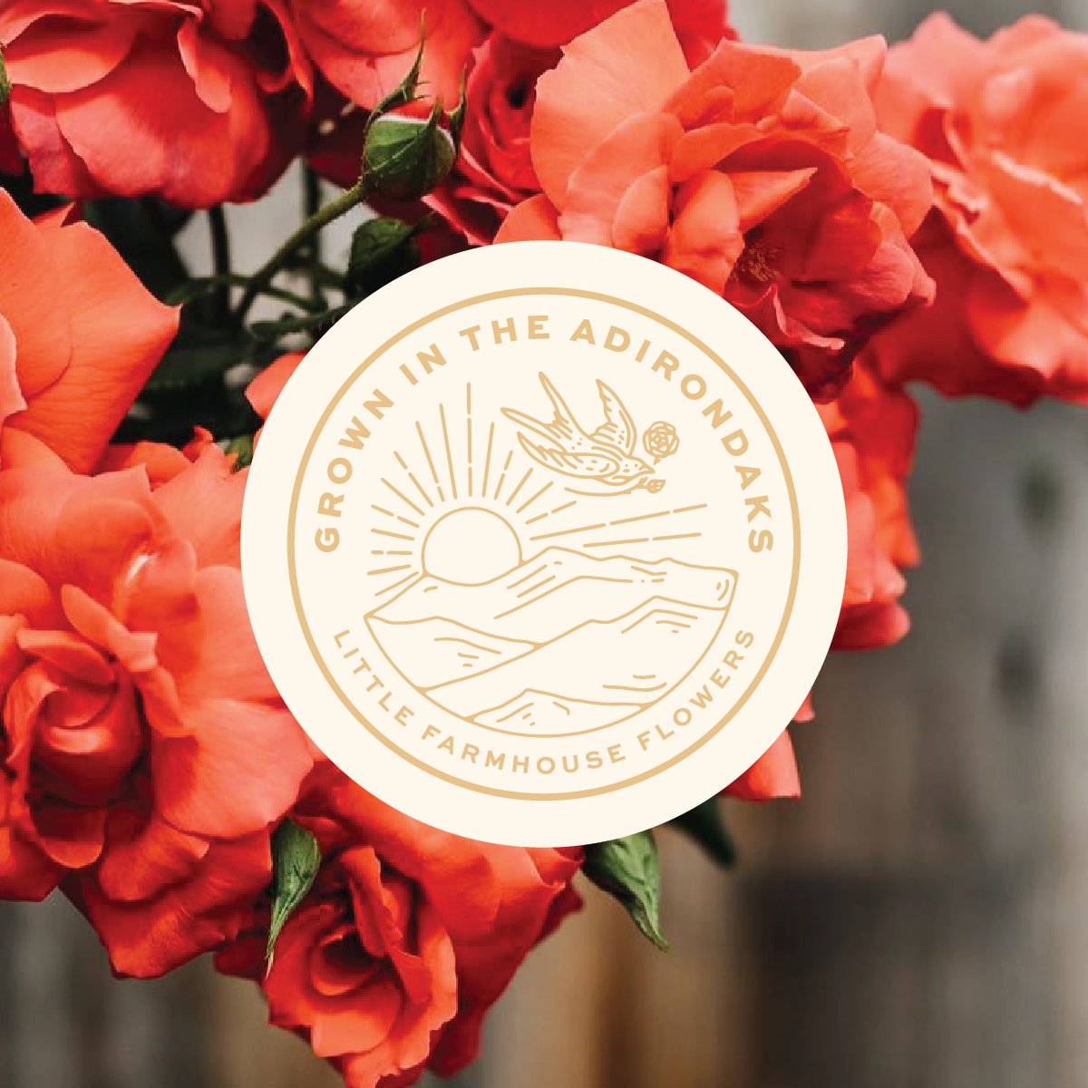
We started with a barn swallow, a long-standing symbol for Little Farmhouse Flowers, and evolved it into an eye-catching, versatile logo that expanded nicely into a larger brand that really tells the full story of the farm.

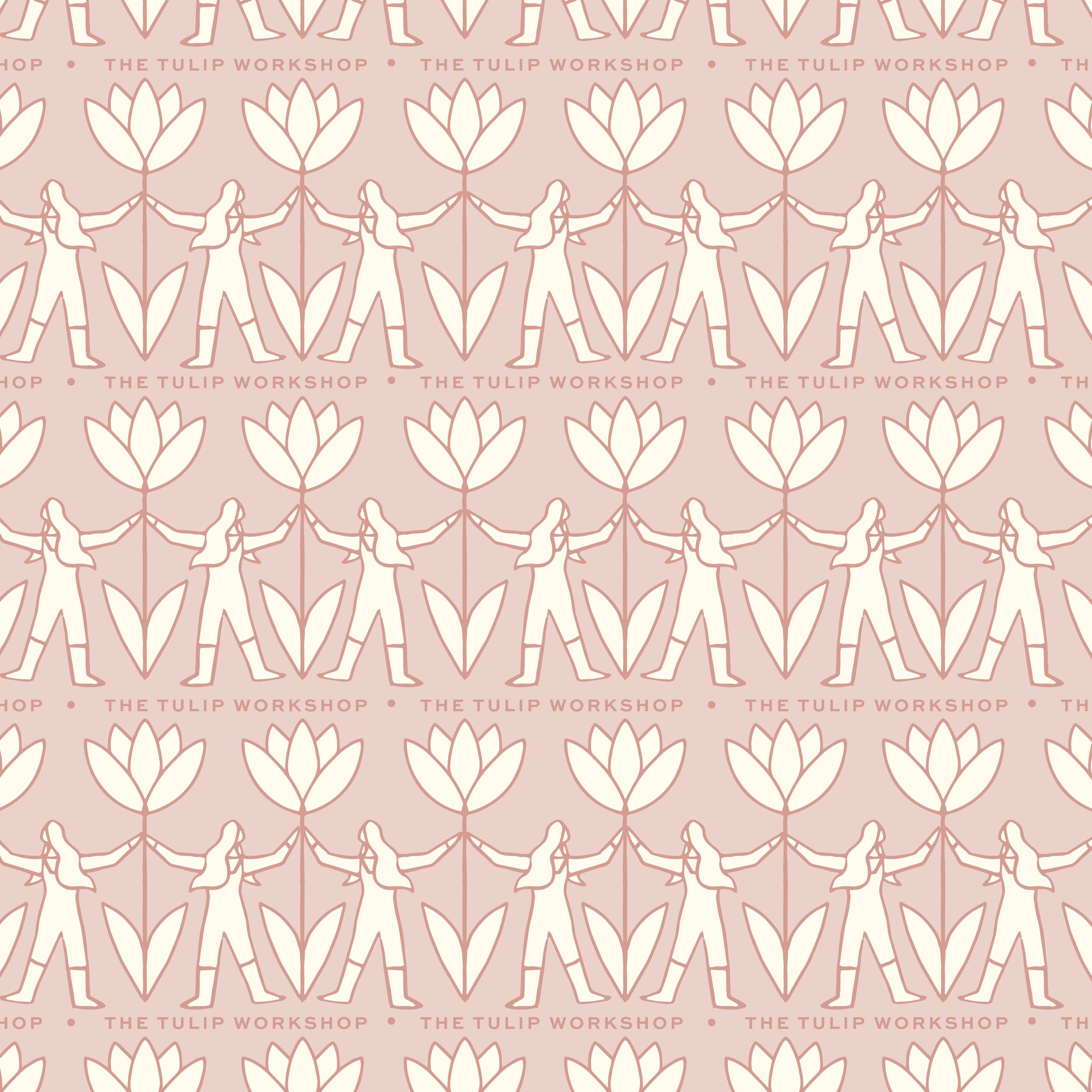
The pattern is one of my favorite elements from this project - and works so well on kraft floral wrap.

We also created elements specifically for Linda’s signature workshop, The Cold Climate Rose Grower’s Program - including a ‘Rosarian’ badge that became fun stickers for flower farmers who completed the workshop!

Thank you Linda for such a fun and inspiring project! We love to see farms thinking about how their skills are shared and passed down - and Linda is doing that in a really inspiring way. Check out Little Farmhouse Flowers and follow all of the floral beauty over on Instagram to learn more.

Branding: The Tulip Workshop

It’s always pleasant to work on flower farm brands, but it is particularly satisfying to be drawing nothing but flowers right on the cusp of spring. We’ve had a slew of flower-themed projects coming our way lately, and it just really fits the mood as my tulips are popping up from the ground.

Tulips have been top of mind especially these past few months. I couldn’t help but notice a trend over the winter, as many of my beloved flower farm clients were harvesting armfuls of homegrown tulips on the coldest, darkest days of the year. Turns out they had all taken the same course with The Tulip Workshop - a collaboration between Linda D’Arco of Little Farmhouse Flowers, and Emily von Trapp of von Trapp Flowers.

When Linda and Emily got in touch about branding their workshop series, along with their respective flower farms, I have to say was a little starstruck, dabbling in cut flowers myself. These two are complete powerhouse growers and I really admire the businesses they’ve built.

I’m thrilled we’re now wrapping up all three projects just in time for spring! First, I want to share our work on The Tulip Project, which was all about the partnership of these two awesome women sharing knowledge, building a community, and learning from one another.

This was so lovely to work on, and it’s been exciting to start seeing the new brand reaching the vast network of students benefiting from The Tulip Workshop courses. We’ll be sharing branding for Linda and Emily’s own farms in the coming weeks - happy spring!

Branding: Bell Brook Farm

I can’t even remember when I first started following Emily Day’s work over at Bell Brook Farm in West Brookfield - but over the years I’ve admired both the beauty of her floral creations, and the thoughtful, intentional, and honest way she and her husband have been growing their farm. It’s incredible.

Emily took a big step this spring, leaving her full time job to fully devote herself to farming and floral design. This was such exciting news - at first, I was shocked because I had no idea Emily was working a full time gig alongside all that she does at Bell Brook (many of my clients surprise me with this kind of news! You people are amazing!!!!) and at second, I was thrilled to hear she felt it was the right time to do a rebrand - her business was in a whole new place from where it first began.

There was a lot from the original branding that we wanted to preserve, but it was important to communicate all that Bell Brook Farm offers customers these days: floral design for events and occasions, Christmas trees and evergreens in the wintertime, a farm stand chock full of bouquets, tuber sales, a flower CSA, workshops, and so much more. Emily also really wanted to emphasize her focus on the design side of what she does, and how that creativity is intricately woven into farming and growing her own florals. She has developed an ethereal, romantic, natural and wild style that is instantly recognizable.

So, we brought all those qualities together into a logo, and then expanded into a more fully realized brand.

The primary logo feels “all grown up” - an elegant representation of the way the farm and design studio have matured. Luxurious and earthy all at once.

We incorporated some simpler secondary logos, to keep the brand versatile:

And then a few illustrations and descriptions of the core offerings at Bell Brook - the Farm Stand, the Design Studio, the Holiday Shop, and the Flower CSA:

A brand pattern, can’t you just picture it on tissue paper wrapping a bouquet?!

Some holiday-specific elements, as the farm’s focus shifts to Christmas trees, wreaths, and evergreens in December:

And of course, Doug, the farm’s beloved rooster.

This was such a pleasure to create in collaboration with Emily. I so appreciate that sweet spot between design, farming, and nature that she brings forth in her work, and found that perspective really inspirational to my own design process. Check out Bell Brook Farm for so much more inspiration and beautiful local flowers - and I’ll be planting my Bell Brook Farm dahlia tubers in my own garden tonight!

Branding: Woven Stars Farm

Farming regeneratively is a mission I am learning more and more about from many of my farm clients, and it’s very exciting to hear all the different approaches, methods, and philosophies they’re exploring in support of a better future. The why and how of farming are becoming more important than ever, as we start to better understand how it all affects the land and our environment. This is so critical for all of us.

Woven Stars Farm in Ghent, NY has focused on regenerative farming from the beginning. They specialize in pasture raised meats and eggs, and emphasize rotational grazing as a means of keeping their livestock and the land happy and healthy. I found our Discovery conversation to be particularly inspiring, as Lizzie and Emerson explained the interconnectivity of all living things on their farm and how they work to best support those relationships - from the soil, to the microorganisms, to the plants, to the animals, to the people who eat, all the way to the cosmos. Hence the name - Woven Stars. Talk about an authentic brand! I loved it.

Interconnectivity was a concept I really wanted to get across in the logo design and branding, and give some visual representation to the connections and interdependencies that this farm has been built around.

Woven Stars Farm Logo -01.jpg

The primary logo addressed that by bringing in a variety of animals from the farm - cow, sheep, pig, chicken, and faithful guard dog. Woven Stars Farm is known for their incredible working Great Pyrenees, who keep careful, constant watch over the livestock. They’re all intertwined beneath the shade of a big farm tree, twinkling stars above. It’s all connected.

We carried this theme across a few versatile secondary logos…

Woven Stars Farm Round Logo-01.jpg
Woven Stars Farm Stacked Wordmark - Multicolor.jpg

Created a tagline to fully communicate their approach to regenerative agriculture…

Woven Stars Farm - Humanely Raised Tagline 1 - Light Yellow on Gold.jpg

and a few other elements to help tell the fully tell the story of all this farm has to offer. I love this CSA badge in particular - Woven Stars is known for their amazing meat CSA.

Screen Shot 2021-06-30 at 11.25.29 AM.png

We also designed a label for their egg cartons. We really wanted this to stand out on the shelf, and fully embrace the new branding. We went for a label that covered the full length, and again celebrates that theme of interconnectivity.

Woven Stars Egg Carton Mockup round 2.jpg

Woven Stars has been busy applying their branding to all elements of their farm this season, and it’s been so fun to see it come to life. I just got a hat in the mail!!

Woven Stars Farm Hat.jpg

This one was a true pleasure to work on, and a story I was happy to help tell. Work like this is the future of farming, and it is so inspiring to see it in the hands of people like Lizzie and Emerson, who care so deeply for their land, their animals, and their community. Thanks Woven Stars Farm!

Branding: Thomas Farm & Dairy

One of my favorite things about spring is the abundance of cute baby animals. Baby chickens, baby horses, baby cows, baby sheep – that is – chicks, foals, calves, lambs. I’m a bit partial to baby goats though – kids. There’s something about their playfulness and awkwardness that just melts my heart. I fell in love with a Nubian goat kid aptly named JoyJoy last spring at Thomas Farm & Dairy, and that love grew into one of my most favorite branding projects to date.

 Thomas Farm & Dairy is well established in Western Massachusetts for their delectable goat cheese. If you’ve ordered a salad with goat cheese on top from a local restaurant, I’ll bet it came from Thomas Farm & Dairy. Their chèvre is award-winning, and the secret to their success is actually pretty simple, albeit much hard work: they put a lot of love into it.

35884EC7-FCDC-4EEC-9823-D690589975DF.JPG

When I visited Thomas Farm & Dairy and met owners Laurie and Jim, I was welcomed so warmly, and was instantly struck by the level of care they put into all they do. Laurie walked into the goat barn, and hundreds of goats suddenly had eyes only for her, climbing over one another to get a cuddle in. She called each one by name and told me their unique stories and quirks. It was clear – she loved these goats and they loved her.

FullSizeRender.jpeg

And I loved JoyJoy! Client meetings are always fun, but I have to say this one was really fun.  

 In building a brand for this farm, I wanted to capture all the love, care, and joy that I witnessed in just that one visit. Goats are a big deal at Thomas Farm & Dairy, but it’s also a very diverse farm – they’re raising and milking Jersey and Swiss Brown Cows, growing vegetables and cut flowers, running a roadside farm stand, and more. This was a big story to tell, and we started with the logo:

Thomas Farm & Dairy Logo - Cream on Navy.jpg

We kept the goats the focus for the primary logo – two ladies grooming one another. We thought it really conveyed that feeling of love that goes into everything on this farm and captured the sweet personalities of Nubians in particular.

 That was expanded into a set of secondary logos and custom brand illustrations that work together to tell the full story of this farm. I like how we brought in a little retro dairy farm flair that still feels modern and exciting.

Thomas+Farm+Script+Logo+-+Cream+on+Light+Blue.jpg
Thomas+Farm+Tractor+-+Blue+on+Cream-01.jpg
Thomas Farm & Dairy Pattern - cream on navy.jpg
Thomas+Farm+Small+Logo+-+Cream+on+Red.jpg

Taglines were fun to develop for this farm too, using typography to once again describe those values of love, joy, and care.

Tagline Gif.gif

Thomas Farm’s farm stand was also a huge focus of this project, as it has become an important and reliable resource for local food during the pandemic. Laurie and Jim keep all of their cheeses, seasonal vegetables, and cut flower bouquets in stock throughout the year, as well as a terrific spread of other favorite local goods. We gave The Farm Stand its own logo and really made it shine.

Thomas Farm Stand Logo with Illustration - Red-01.jpg

All of this branding was incorporated into a new website, that makes it easy to find Thomas Farm & Dairy cheeses, learn about the farm, and get a behind the scenes look at everything going on there.

The final piece was a label update, which really brought the branding together in a practical and beautiful way that ought to really stand out on the shelf. We developed labels for all varieties of goat cheese, and for the farm’s famous squeaky cheese curds.

Thomas Farm & Dairy Goat Cheese - The Homegrown Studio.jpg

I love how the little colored ribbons differentiate the cheeses. So many delicious flavors!

Thomas Farm & Dairy Cheese Curds - The Homegrown Studio.jpg

To come full circle, this project was truly a labor of love. Laurie and Jim were so enthusiastic throughout the process, and deeply care about the ways they share their farm with the community. Most recently, they are really inspiring me with these barn quilts they’ve been painting and hanging around the farm. So genuinely on-brand. Wow!

Thank you Thomas Farm & Dairy for all your collaboration on this project, and thank you to CISA for helping make it possible! We accomplished this project in partnership with CISA, who does such a fabulous job of connecting local farmers with resources to help them succeed. Local farms - reach out to CISA to see how we can work together to help you tell your story with some new branding! (and don’t forget I offer a 15% discount to Local Heroes!)

Branding: Rooted Flowers

There are some farms in Western Massachusetts that are just establishments, and I am always humbled when those establishments trust me with their brand. It’s an overwhelming honor - really. When Becky of Rooted Flowers got in touch about refreshing her brand, I got that feeling.

Photo courtesy of Rooted Flowers

Photo courtesy of Rooted Flowers

Becky has been farming all her life, coming from a long line of hard working farmers here in the Pioneer Valley. Cut flowers are her focus, growing all her beautiful blooms from seed and designing stunning arrangements. Becky and her family recently moved from Hadley to Agawam, onto a plot of land all their own, and Becky has totally transformed the acreage from dormant farmland to rows upon rows of flowers in just a little over a year’s time. I’ve had a first-hand glimpse of just some of the work going on over at Rooted - and let me tell you - it’s nothing short of amazing. Check out her daily Instagram stories to see what I mean.

With the new land and a new chapter beginning for Rooted Flowers, it was time for a brand update as well. Becky really wanted to offer the heart of her farm’s story: passing agriculture down through the generations. Becky learned farming from her grandparents, and shares all she does on the farm with her two young daughters, Mary and Julia (Becky was pregnant with Julia for the duration of our project, and ran a successful farm and business during a pandemic - really, it’s AMAZING).

Rooted Flowers Logo - The Homegrown Studio.jpg

The primary logo is centered around that concept. We have a big “mama” flower and two smaller flowers looking up at her, representing Becky’s two daughters. The logo carries all the elegance and professionalism we needed to appeal to bridal clients, but carries some really significant meaning at the same time.

We rounded out the branding with lots of marks and details that told the story of all that goes on at Rooted, which focuses on three main themes: Grow, Build, and Create. Each theme got its own illustration, and really shows all that goes into every plot, harvest, and bouquet on this farm.

grow+build+create.jpg
Rooted Flowers Monogram - The Homegrown Studio.jpg
Rooted Flowers Pattern - The Homegrown Studio.jpg

We applied the branding to floral tissue paper, kraft tags, and boxes that were all sourced sustainably and are recyclable and compostable, putting Becky’s mission into clear practice.

Rooted Flowers - The Homegrown Studiol.jpg

Of course designing for a beautiful flower farm is as much fun as it sounds like it might be, but furthermore, I learned so much from Becky in the process. Witnessing her energy, enthusiasm, grit, perseverance, work ethic, and genuine love for the land and her family totally inspired me, and made for some work I’m really excited about and proud of. Rooted is truly an establishment in our Western Mass farming community. Thanks Becky!

We accomplished this project in partnership with CISA, who does such a fabulous job of connecting local farmers with resources to help them succeed. Local farms - reach out to CISA to see how we can work together to help you tell your story with some new branding! (and don’t forget I offer a 15% discount to Local Heroes!)

Branding: Diemand Farm

Turkey isn’t just for Thanksgiving - turns out it’s most definitely for pandemic times, too. Diemand Farm in Wendell is well know locally for their farm raised turkeys - and more. Their farm store is filled with delicious homestyle comfort food: pot pies, mac and cheese, turkey soup, meatloaf, and just-baked cookies. Now, maybe more than ever, people want comfort food, and Diemand Farm has delivered - to the point where they were clean out of turkeys!

diemand-farm-turkeys.jpg
Photos courtesty of Diemand Farm

Photos courtesty of Diemand Farm

Diemand Farm has been family owned and operated since 1936, and four generations have proudly carried forth the family’s tradition of farm fresh food from their bucolic acres gently tucked into the Wendell hills. Alongside the swell in traffic flocking to the farm store for good, local food, the family began thinking it was time to update their branding, in hopes of connecting with new audiences and refreshing the look of the farm store.

Fully embracing the farm store’s trademark warm, comforting, at-home feel, we developed a logo and brand elements that spoke to Diemand Farm’s heritage and future all at once.

Diemand-Farm-Logo---Animation.gif

The primary logo is retro and rustic, speaking to the breathtaking view as the sun rises over the hills at Diemand Farm. And, there’s a little symbolism - the illustration forms a diamond shape, in homage to the farm’s namesake.

Secondary Logos provided some nice flexibility within the branding:

Diemand Farm Secondary - The Homegrown Studio.jpg

Developing out the rest of the brand was the really fun part, as we began to really tell the story of this incredible farm.

Diemand-Farm---Come-See-Whats-Cookin!---Animation.gif

Diemand Farm had already been using this tagline for years - we just spiffed it up a little.

Diemand Farm To Go - The Homegrown Studio-36.jpg

Grab and go meals and frozen foods have been a particularly big sell during the pandemic, so we highlighted that convenient “to go” feature of the farm store with this cute little doggie bag illustration.

Diemand Food Wrap Mockup.jpg

Actually, we did lots of custom illustrations for this one! The brand was begging for this retro butcher-paper style pattern, and the result really told a nice story of all that’s happening at Diemand Farm: pot pies, happy birds, and good eatin’.

When it came time to apply this brand IRL, we developed some freezer signs for the farm store, and a chicken label for the farm’s signature roasters. The look and feel really started to come together nicely.

Signs 1&2 Mock up.jpg
Chicken.jpg

So, as we continue to navigate the ups and downs of our socially distanced times, be sure to venture out to Diemand Farm’s little market for some truly local, always homestyle food to help you get through. A little turkey pot pie goes a long way.

This was such a fun brand to work on. Thank you to Diemand Farm for your awesome collaboration, and to CISA, who partnered with us in support of this project! They do such a fabulous job of connecting local farmers with resources to help them succeed. Local farms - reach out to CISA and see how they can help you up your marketing game! (and don’t forget I offer a 15% discount to Local Heroes!)

Branding: Chase Hill Farm

Warwick, Massachusetts sits wayyyyyyyy up on our Northern border, New Hampshire’s Mount Monadnock no more than an arm’s length away. It’s a bit of a journey up, but it’s become something of a destination for raw milk enthusiasts looking for the very best that local bovine have to offer - and that’s at Chase Hill Farm. Folks drive from hours away and miles around to get their hands on this 100% grass-fed organic raw milk.

Why is Chase Hill raw milk so good? Ben and Laura, the owners, chalk it up to two main things: grass and love. Their exclusively grass-fed cows are considered part of the family, and are always treated as such. When it came time to develop a new logo for the farm, grass and love were two things Laura identified as absolute;y key to the brand.

I couldn’t have been happier to hear it. Working in a block print style that has been inspiring a lot my work lately, I created a design that embraced the lush grass so central to all that happens at Chase Hill Farm, and illustrated a well-loved cow, blissfully munching away.

The Homegrown Studio - Chase Hill Farm Logo.jpg
The Homegrown Studio - Chase Hill Farm.jpg

Ben and Laura were totally on board with this, but an alternate concept I had presented to them caught their eyes too. We ended up reworking it to serve as a secondary logo; in total alignment with the chosen primary logo, but a bit of a different layout that offers a wider glimpse of all Chase Hill Farm has to offer.

A cow, pig, and chicken enjoy a little chase over a grassy hill - a quite literal interpretation of the farm’s name.

The Homegrown Studio - Chase Hill Farm Logo 2.jpg

The little butterfly offers a nice consistency between the two logos too, and has an awesome story behind it. Chase Hill Farm has lots of native milkweed growing around their pastures, which encourages breeding of Monarch butterflies. Every summer, the farm is a sanctuary for Monarchs; a beautiful testament to the healthy ecosystem that the Chase Hill family works so hard to maintain.

These logos were such a pleasure to work on, and I was so happy we were able to bring two concepts together to create a solid foundation for the farm’s branding. Looking forward to seeing the new look on raw milk bottles soon!

Branding: Belden Farmstand

When you’ve been farming for thirteen generations, SINCE THE 17TH CENTURY, it’s sort of a big deal when you consider updating your brand! But that’s just what Belden Farmstand in Hatfield, Massachusetts decided it was time for, and I’m so glad they got in touch as a result.

With a business that well-established, change can feel a little daunting, but I was reassured completely after talking with Jillian out on the porch of Luther Belden Farm’s big old farmhouse. Jillian’s husband’s family has been farming the land in Hatfield since 1661, and over the centuries they have offered all sorts of farm products to the community. The prevailing product has been dairy, however, and the farm sends its milk to Agri-Mart to be used for local milk and Cabot cheese. Over 300 happy cows call Belden home.

Photo courtesy of Belden Farmstand.

Photo courtesy of Belden Farmstand.

Jillian and her husband understand the importance of diversification though, and have been exploring new ways to get farm products directly into the hands of consumers. It was in this way that the brand Belden Farmstand was established, under which they would be offering artisanal products beyond just milk, including goat’s milk products, soaps, farm fresh eggs, beef, and more.

Photo courtesy of Belden Farmstand.

Photo courtesy of Belden Farmstand.

With this new endeavor came a need for fresh branding, as the farm had been primarily focusing marketing efforts on the trade side of things. Now wanting to connect directly with local consumers, they needed a brand that really told the story of Belden Farmstand: their rich heritage, farm fresh products, and new focus on farm-to-table.

So we got to work on the logo and branding.

Belden Farmstand Logo - The Homegrown Studio.jpg

The primary logo achieves the balance of traditional and modern style, speaking to the history of the farm while presenting a fresh, clean look. Inspired by vintage farm illustrations, a cow, chicken, and goat come together in a playful way, complemented by a traditional serif font and just a touch of curvy handwriting. It tells a little story, one that is very personal to the farm, but relevant to the customer.

Expanding this story into larger branding was the fun part, as each animal got a chance to take center stage in their own sublogo! These will make perfect labels down the road.

Belden Farmstand Secondary Logo Goat - The Homegrown Studio.jpg
Belden Farmstand Secondary Logo Chicken - The Homegrown Studio.jpg
Belden Farmstand Secondary Logo Cow - The Homegrown Studio.jpg

My favorite brand element is the pattern we created. All of the animals come together with little brand details sprinkled in. It calls to mind a farmy toile print, and really shows off the illustrations nicely.

Belden Farmstand Pattern - The Homegrown Studio.jpg
Belden Farmstand Brand Mark - Blue on Grey-01.jpg

We also created a business card, which came with its own little challenge. We wanted this piece to showcase the new branding to consumers, but also stay relevant on the trade side, where most of the milk business still takes place. We did this by bringing in the larger company name “Luther Belden, Inc.” in an attractive way on the flip side, uniting both brands in a way that made sense to all audiences.

Belden Business Card Mock up square.jpg

The result of all this is an enduring story of an old New England Farm, getting new life from the next generation. That really comes through in the branding, and in all the excellent products Belden Farmstand puts forth.

Speaking of new life – you MUST check out Belden Farmstand’s Instagram for regular baby goat updates. So much cuteness - they’ve had a busy spring!

It was such a pleasure getting to know Jillian and the whole Belden Farmstand family throughout this process, and I had so much fun helping bring their story to life. We accomplished all this in partnership with CISA, who does such a fabulous job of connecting local farmers with resources to help them succeed. Local farms - reach out to CISA and see how they can help you up your marketing game! (and don’t forget I offer a 15% discount to Local Heroes!)

Thank you CISA, and thank you Belden Farmstand!

Branding: Wild Bramble Farm

The terms “pasture raised” and “free range” are thrown around a lot these days, but if you want to see what that should actually look like, take a drive up to Wild Bramble Farm in Northfield. You’ll come up a little driveway and find a farm that’s bursting with life and energy. Pigs snuffling their way through towering sunflowers, chickens strutting in and out of their coop, children chasing the chickens, and a puppy chasing the children.

Wild+Bramble+Farm+Goddard+Family.jpg

At the center of it all is Chris and Shannon Goddard, who have been hard at work building a farm that embodies their values. And they’ve done a really good job. Offering pasture-raised pork products, cut flowers, and farm fresh eggs from their farm stand, the Goddards don’t cut any corners in producing humane, sustainable, fresh, and local farm products.

Wild Bramble Farm pigs.jpg
Wild Bramble Farm eggs.jpg
All photos by Megan Haley Photography

They thought it was about time to manifest this in their branding, and I was so excited when they reached out. It was clear to me Wild Bramble Farm was truly living and breathing the concepts of pasture raised and free range; they weren’t just taking these terms on as marketing jargon. We needed some branding that would illustrate that authentic story, and truly show customers what goes into producing food this way.

And boy, was I excited to make a pig logo. Pasture raised pork products are at the heart Wild Bramble’s labors, and their mindful, humane process makes for an exceptionally delicious and healthy product that you can feel good about (I can attest; there may have been a bacon exchange involved in this project). Capturing that ideal in a brand was the challenge here, and I love the way we ran with it, especially in the primary logo.

Wild+Bramble+Farm+Logo.jpg

Integrating pigs and florals in a very folksy, rustic style, this logo was all about the energy, life, and joy that is present on the farm every day. It aims to be a true embodiment of the quality of life granted to every living thing on the farm, allowing each the freedom to be wild. This is a strong visual for what pasture raised ought to be, and tells the story of what it means at Wild Bramble Farm.

We developed lots of secondary logos, illustrations, marks, a palette, and patterns to help fully tell that story. I love the way it all integrated, coming together in not just an attractive way but in a very meaningful way, too.

Wild Bramble Farm Secondary Logo.jpg
Wild+Bramble+Farm+chickens.jpg
Wild Bramble Farm 5.jpg
Wild Bramble Farm Pig Monogram.jpg

We then applied this brand story to print materials and a fancy new website! We developed new labels for the pork products, a brochure for farm stand visitors explaining the farm’s practices, and shiny new business cards.

Wild Bramble Farm Business Cards.jpg
Wild Bramble Farm Brochure.jpg

The website is where the farm’s story really came together in a coherent, interactive way. Visitors can take a visual journey through Wild Bramble Farm’s daily operations, learning more about their values, practices, and products - and of course order up some pork chops!

Wild Bramble Farm Website.gif

It was such a pleasure getting to know Shannon, Chris, and their beautiful family and farm throughout this process, and I had so much fun helping bring their story to life. We accomplished all this in partnership with CISA, who does such a fabulous job of connecting local farmers with resources to help them succeed. Local farms - reach out to CISA and see how they can help you up your marketing game! (and don’t forget I offer a 15% discount to Local Heroes!)

Thank you CISA, and thank you Wild Bramble Farm!

All photography by the incredible Megan Haley Photography. Want a really nice website? You need really nice photos! Photography is an essential part of the integrated branding process, and Megan nailed it here. Get in touch with her to find out how she can help capture your story.