Branding: Diemand Farm

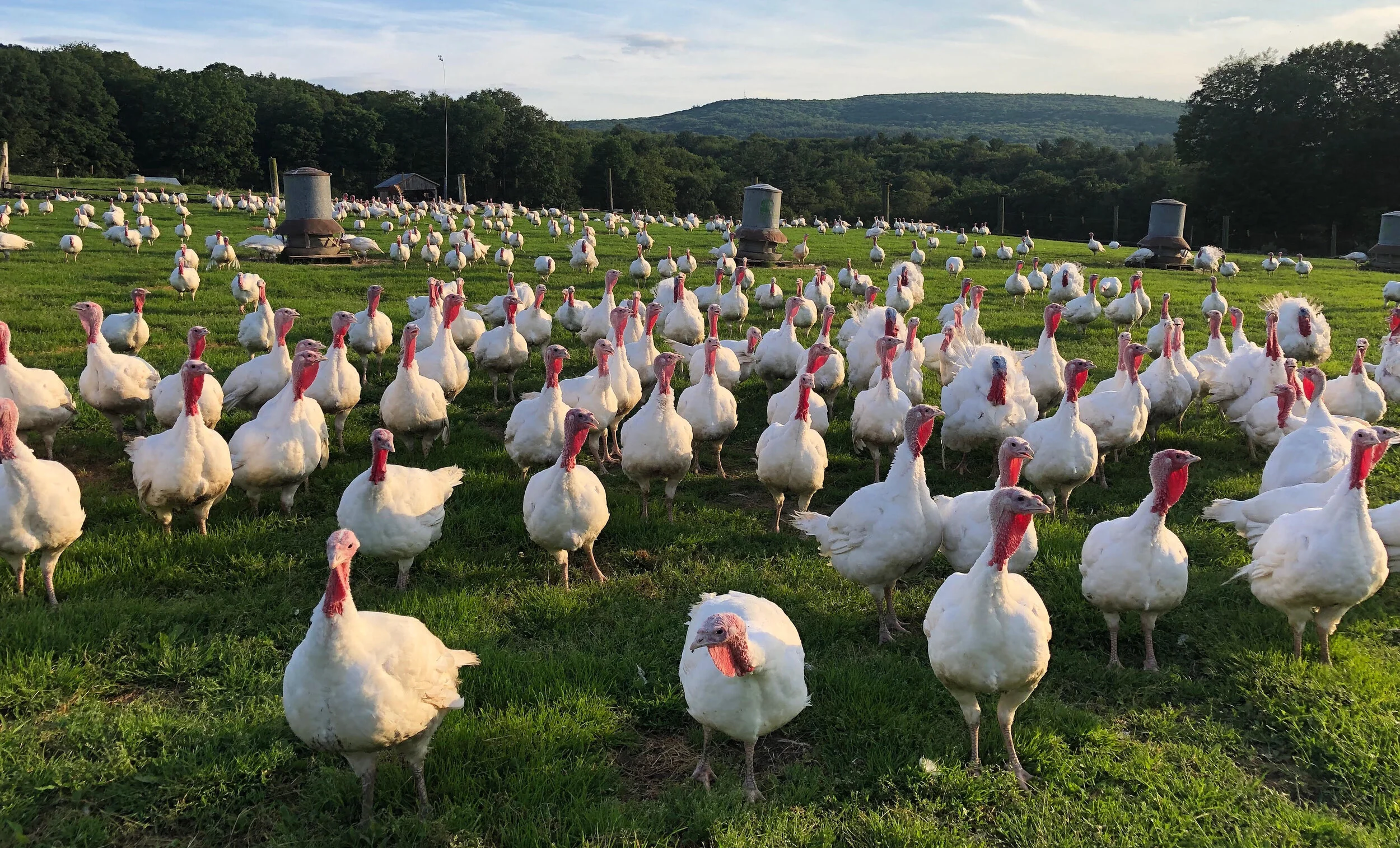
Turkey isn’t just for Thanksgiving - turns out it’s most definitely for pandemic times, too. Diemand Farm in Wendell is well know locally for their farm raised turkeys - and more. Their farm store is filled with delicious homestyle comfort food: pot pies, mac and cheese, turkey soup, meatloaf, and just-baked cookies. Now, maybe more than ever, people want comfort food, and Diemand Farm has delivered - to the point where they were clean out of turkeys!

diemand-farm-turkeys.jpg
Photos courtesty of Diemand Farm

Photos courtesty of Diemand Farm

Diemand Farm has been family owned and operated since 1936, and four generations have proudly carried forth the family’s tradition of farm fresh food from their bucolic acres gently tucked into the Wendell hills. Alongside the swell in traffic flocking to the farm store for good, local food, the family began thinking it was time to update their branding, in hopes of connecting with new audiences and refreshing the look of the farm store.

Fully embracing the farm store’s trademark warm, comforting, at-home feel, we developed a logo and brand elements that spoke to Diemand Farm’s heritage and future all at once.

Diemand-Farm-Logo---Animation.gif

The primary logo is retro and rustic, speaking to the breathtaking view as the sun rises over the hills at Diemand Farm. And, there’s a little symbolism - the illustration forms a diamond shape, in homage to the farm’s namesake.

Secondary Logos provided some nice flexibility within the branding:

Diemand Farm Secondary - The Homegrown Studio.jpg

Developing out the rest of the brand was the really fun part, as we began to really tell the story of this incredible farm.

Diemand-Farm---Come-See-Whats-Cookin!---Animation.gif

Diemand Farm had already been using this tagline for years - we just spiffed it up a little.

Diemand Farm To Go - The Homegrown Studio-36.jpg

Grab and go meals and frozen foods have been a particularly big sell during the pandemic, so we highlighted that convenient “to go” feature of the farm store with this cute little doggie bag illustration.

Diemand Food Wrap Mockup.jpg

Actually, we did lots of custom illustrations for this one! The brand was begging for this retro butcher-paper style pattern, and the result really told a nice story of all that’s happening at Diemand Farm: pot pies, happy birds, and good eatin’.

When it came time to apply this brand IRL, we developed some freezer signs for the farm store, and a chicken label for the farm’s signature roasters. The look and feel really started to come together nicely.

Signs 1&2 Mock up.jpg
Chicken.jpg

So, as we continue to navigate the ups and downs of our socially distanced times, be sure to venture out to Diemand Farm’s little market for some truly local, always homestyle food to help you get through. A little turkey pot pie goes a long way.

This was such a fun brand to work on. Thank you to Diemand Farm for your awesome collaboration, and to CISA, who partnered with us in support of this project! They do such a fabulous job of connecting local farmers with resources to help them succeed. Local farms - reach out to CISA and see how they can help you up your marketing game! (and don’t forget I offer a 15% discount to Local Heroes!)
Branding: The Belmont Inn

Maine is the New England state I’ve unfortunately spent the least amount of my time in. Who knows why; everyone is always raving about the beaches and the forests and the quaint towns with their lobster rolls. This is probably a side-effect of being a child of Cape Cod; summer vacations rarely strayed far off Route 6 growing up. We did go to Kennebunkport once! If I were to spend some time in Maine though, the town of Camden would be first on my list to visit; and I’m pleased to say I will be doing so in July!

efcac666fb4017820de34458ca4a007c.jpg

This came about by way of The Belmont Inn, a historic bed and breakfast which is under new ownership this year - a perfect time for a brand refresh! I was so excited when the proud new innkeeper, Kim, reached out wanting to give the Inn’s look a facelift. The elaborate Victorian script and lilac illustrations she had inherited were feeling a little dusty.

y6cnd0ywcoz7nrrqhv8h.jpeg

The Belmont Inn is a big, gorgeous Queen Anne Victorian home tucked away among bursting gardens on a quiet street just a stroll away from the ocean, and I wanted to make the logo all about that iconic structure. Kim agreed. Making the Inn the face of the brand seemed obvious; it was the image that welcomes vacationers first to their home-away-from-home, and what they anticipate returning to summer after summer. So, I made a little drawing of the Inn and it quickly became the logo.

Kim didn’t want to lose the nautical culture and tradition of the location as well, so we complemented the logo with seaworthy blues, whites, and greys, as well as a fun sailboat pattern that really brought the branding together.

This is best seen in the Inn’s print suite, where the logo, pattern, and pallet come together and really shine on business cards, letterhead, a postcard, and note cards. The envelope is actually my favorite part, with sailboats peeking through in the lining.

I can’t wait to see The Belmont Inn’s new branding be put to work this season, welcoming new travelers from around the world. Including Jake and I, when we venture out to coastal Maine at the end of July!

Some logo outtakes for your consideration: still love that fly fishing gal!

Branding: Keeler Concepts by Design

Branding for an interior design firm was a first for me, so I was thrilled when Brittany and Robyn of Keeler Concepts by Design in Chatham, New York got in touch. I genuinely loved the style and designs of their spaces, as well as the process behind each project: every room begins with hand drawn plans that reveal thoughtful, informed design and an artistic eye. The branding process is always easiest when I am excited about the client, and I was immediately tempted to ask the mother-daughter team to have a go at my outdated kitchen. I just loved their work.

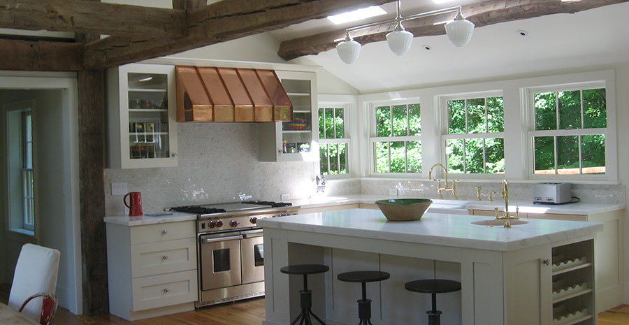
Photo courtesy of Keeler Concepts by Design

Photo courtesy of Keeler Concepts by Design

Robyn Keeler’s kitchen and bathroom designs have been featured in Better Homes, Women’s Day, and more, and she is well sought after in the Berkshires, Hudson Valley, and beyond. We wanted to create a logo and brand that spoke to that high quality, but also conveyed the warm, intimate feeling characteristic of her spaces, totally refreshing their look. I noticed that it was keen attention to details that really made these spaces deeply personal, and wanted to bring that into the branding.

Keeler Concepts Logo Agean on Marble.jpg

The logo was built from pattern details I pulled from a piece of antique wallpaper, cleaning them up and arranging them around a wordmark. I love the elegance of the arrangement balanced with a boldness - the brand has a definite presence while remaining very stylish.

Keeler Concepts Secondary Logo Nude on Agean.jpg
keeler pattern-01.jpg

Bringing in secondary marks, pallet, pattern, and texture, I wanted to keep things very bright and clean; I love the contrast of nude pink with a deep, rich turquoise for this. Complemented by an earthy green and white marble details, this branding speaks to many of the elements of interior design while remaining very versatile.

I love the way the business cards came out in particular: clean, stylish, and professional!

Keeler Business Card Final mockup.jpg

This brand was a pleasure to work on, and I am so excited to see Robyn and Brittany put it into action. I’m thrilled we could collaborate towards branding that well represents such beautiful and intelligent interior design work.

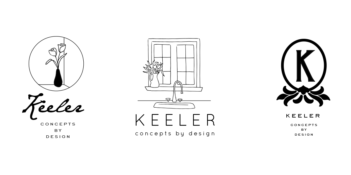
A few logo design outtakes too, always like to show a little of my own process behind the final results:

Keeler Outtakes.jpg

Branding: The Gilded Oyster

When Quinn’s Fine Jewelry closed its doors in my hometown of Wilbraham, everyone was sad. No more little green boxes under the Christmas tree! My father was perhaps the saddest, as Denise Quinn, the owner, had made anniversaries and birthdays very simple for him for years - he knew to always check my mom’s wish list for the perfect sparkly gift.

So Dad was awfully pleased when I told him Denise had gotten in touch with me about some branding - for her new shop on Cape Cod! After relocating to Falmouth, she and her husband Brian had the itch to have a storefront once again, this time embracing the heritage, culture, and aesthetic of the Cape that they love so much. They settled on the name The Gilded Oyster, in reference to an all-time favorite golden oyster piece her son had created. I rejoiced: gold foil EVERYTHING, please.

TGO+Logo+Aqua+%26+Gold+on+White.jpg

Denise wanted the logo focused on the oyster for which the shop was named. I played with that symbol in a few different ways, including adorning a little mermaid illustration with an oyster necklace (I had to try it), but the design Denise chose combined one of my all-time favorite script fonts with a simple line drawing. It reflects the elegant, natural designs characteristic of the shop’s jewelry collections, and nods to that timeless Cape Cod nautical aesthetic.

Developing the branding and website was just as fun, and allowed me to gild to my heart’s content. Denise was after a calm, beachy look and feel and loved the combination of sea glass aqua with gold, so we brought that in to most all elements of her shop.

TGO Print Suite Mock up.jpg

My favorite piece was the business card - gold foil oyster! The sign for the front of the shop is going to look just like these; it’s in production now and I cannot wait to see how it comes out.

IMG_7702.JPG

I love the way all these pieces came together to bring a fresh, classy brand to Main Street in Falmouth. Now I just need to get over the bridge to check out the shop - Denise opened the doors just before Christmas! This was so much fun to work on, and I’m excited to see the Gilded Oyster flourish when visitors make their way to the shore this summer - my dad included.

Oh, and a couple logo outtakes!

TGO outtakes-01.jpg

Anyone want a mermaid logo???

One Month Into Full-Time Freelance, Here's What I've Learned

As of today, I’ve officially been calling The Homegrown Studio my full-time job for one whole month. Making the leap to freelancing full-time has been exciting and sometimes uncomfortable, but ultimately I can say I am feeling a whole lot better, happier, and more fulfilled than I was a month ago. Heck, I’m even making money. I’m surprising myself in new ways every day, and thought I’d share some of the things I pushed myself to do as I set out on this new chapter.

Things I've Learned Freelancing.jpg

1. I asked people to tea. (I don’t drink coffee!) The first thing I decided to do when jumping fully into freelance work was to turn the networking way up. I did this for two reasons: 1.) I felt in need of advice and work and ideas, and 2.) I was terrified of being lonely - about two days into freelancing I realized that this could easily get very lonely. So, I reached out to mentors and smart ladies I’d met along my career path and asked if they would meet up with me. They had nothing but great ideas and sound advice, and it was great to catch up. I threw invitations out to local people I admired and was curious about, but had previously only made contact through mere Instagram likes. Why stay behind the screen? I gained new perspectives and new friends in this case, which was so exciting. Here’s the awesome thing: no one turned down my invitation. Everyone I had tea with seemed genuinely happy to sit down and chat in person, and real, engaging, pleasant conversation always resulted.

2. I started something new. Out of this urge to connect with others originated the idea to bring a Ladies Drawing Night to Western Mass. I put the idea out there, set a date, found an awesome host, started an Instagram account, and put up posters. I was thrilled to see tons of women I barely knew were excited about this, and said “see you there!” it’s been fun learning how to make a community event happen and create all the branding around it as a neat personal project. I can’t wait for November 8 when we can all just meet up and draw!

3. I set measurable goals. At my corporate job, the practice of setting clear and measurable goals was hammered into me. It could get annoying, but there’s no denying it consistently worked.  Freelancing, I found myself going back to that ritual and making lists to prioritize tasks for the day, week, and month. Every Monday, I identify one thing I nailed last week, and three things I absolutely need to nail this week. Long term, I’ve started thinking about where I want to be in a year – three years – and I’m setting a timeline as to when I need to achieve smaller goals to make it all happen. I’ve been trying to stay disciplined about this, even as I’ve thrown a lot of my corporate structure out the window.

4. I reached out to dream clients. I’ve realized quickly how important it is to be cultivating new opportunities even as I’m working on the here and now. When I was freelancing by moonlight, I could kind of get away with being passive about this and rely on clients coming to me, no big deal if they didn’t. Full time, I really want to make sure work that I’m excited about is coming in consistently. I took some new tactics such as sending out postcards to people and businesses I would love to work with. I’m finding myself busier than ever, and with more of a plan to make sure it continues.

5. I set a schedule for myself. Well, still working on this one. The line between work and life has become blurry, although I’m loving the flexibility of working from home on my own terms. Knowing when to sit down and do nothing but work, when to run errands, when to go to the barn, when to visit my grandmother, when to schedule meetings with clients, and when to watch American Horror Story with my boyfriend has been challenging. I wonder at the end of each day did I do enough? I’m finding it difficult to shut off my brain and relax, something I had no problem doing with the corporate job. Setting those measurable goals has helped with this, and as I get a feel for this new lifestyle I’m getting a better picture of what ‘normal’ looks like, and when enough is enough. It’s an adjustment, and something I suspect I’ll always grapple with as so many other freelancers have advised me.

Things I've Learned Freelancing 2.jpg

There are still plenty of things I am wrapping my head around and learning (Quickbooks anyone???) but I’m feeling pretty darn good one month into the game. I am thrilled to be able to finally devote myself fully to my dream, focus my work entirely on my clients, and give this my best shot. I’ll update you on how it’s going at six months, and in the meantime, just let me know if you’d like to get tea!