Branding: Belden Farmstand
/When you’ve been farming for thirteen generations, SINCE THE 17TH CENTURY, it’s sort of a big deal when you consider updating your brand! But that’s just what Belden Farmstand in Hatfield, Massachusetts decided it was time for, and I’m so glad they got in touch as a result.
With a business that well-established, change can feel a little daunting, but I was reassured completely after talking with Jillian out on the porch of Luther Belden Farm’s big old farmhouse. Jillian’s husband’s family has been farming the land in Hatfield since 1661, and over the centuries they have offered all sorts of farm products to the community. The prevailing product has been dairy, however, and the farm sends its milk to Agri-Mart to be used for local milk and Cabot cheese. Over 300 happy cows call Belden home.
Photo courtesy of Belden Farmstand.
Jillian and her husband understand the importance of diversification though, and have been exploring new ways to get farm products directly into the hands of consumers. It was in this way that the brand Belden Farmstand was established, under which they would be offering artisanal products beyond just milk, including goat’s milk products, soaps, farm fresh eggs, beef, and more.
Photo courtesy of Belden Farmstand.
With this new endeavor came a need for fresh branding, as the farm had been primarily focusing marketing efforts on the trade side of things. Now wanting to connect directly with local consumers, they needed a brand that really told the story of Belden Farmstand: their rich heritage, farm fresh products, and new focus on farm-to-table.
So we got to work on the logo and branding.
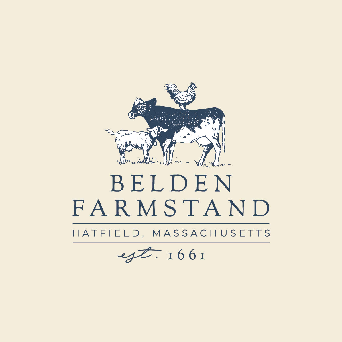
The primary logo achieves the balance of traditional and modern style, speaking to the history of the farm while presenting a fresh, clean look. Inspired by vintage farm illustrations, a cow, chicken, and goat come together in a playful way, complemented by a traditional serif font and just a touch of curvy handwriting. It tells a little story, one that is very personal to the farm, but relevant to the customer.
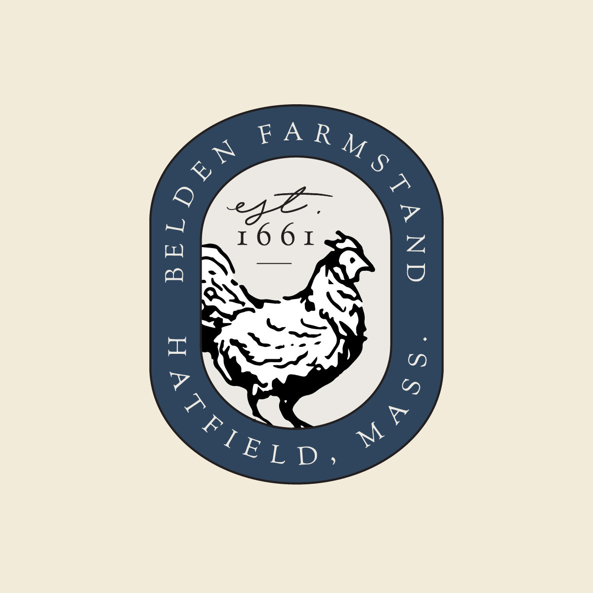
Expanding this story into larger branding was the fun part, as each animal got a chance to take center stage in their own sublogo! These will make perfect labels down the road.
My favorite brand element is the pattern we created. All of the animals come together with little brand details sprinkled in. It calls to mind a farmy toile print, and really shows off the illustrations nicely.
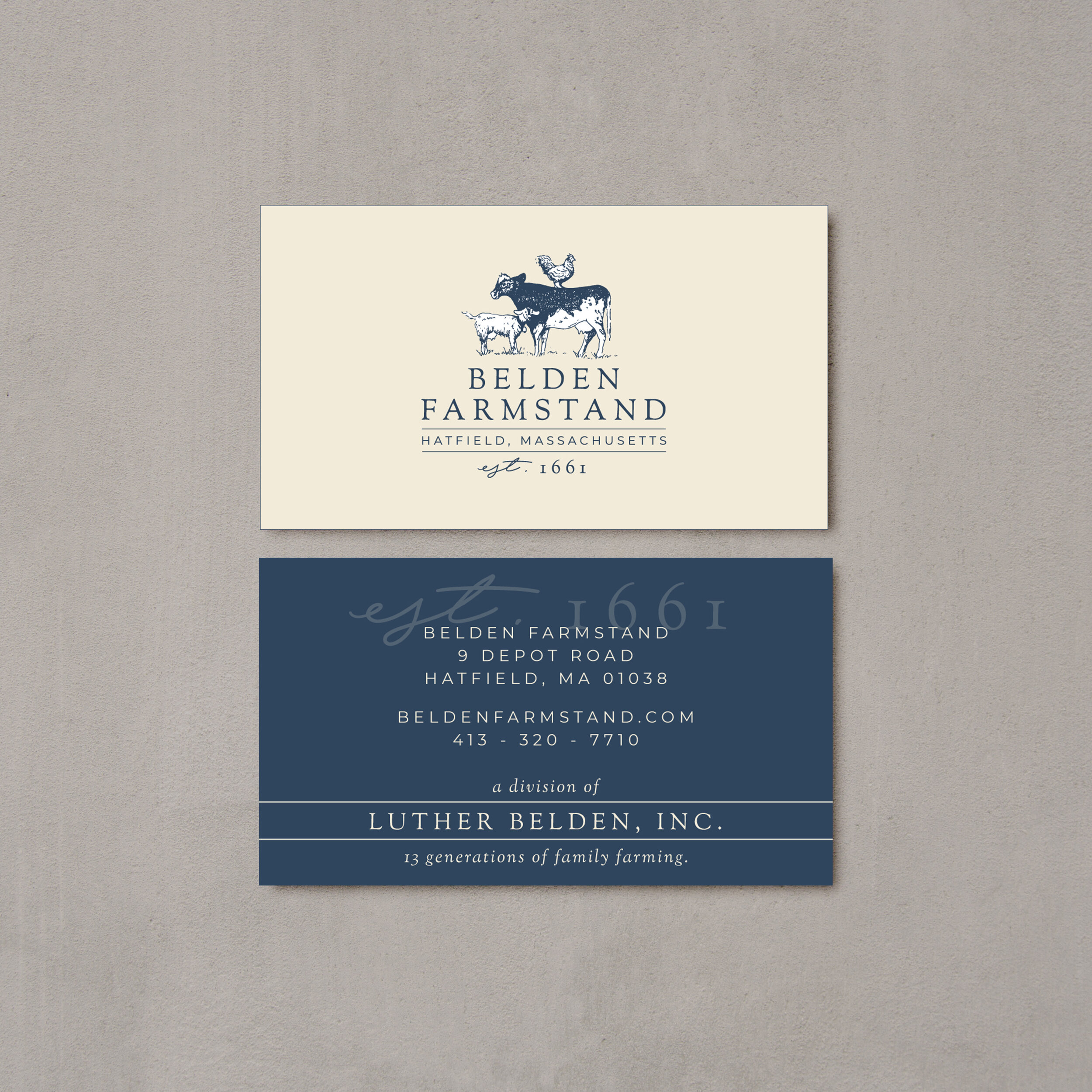
We also created a business card, which came with its own little challenge. We wanted this piece to showcase the new branding to consumers, but also stay relevant on the trade side, where most of the milk business still takes place. We did this by bringing in the larger company name “Luther Belden, Inc.” in an attractive way on the flip side, uniting both brands in a way that made sense to all audiences.
The result of all this is an enduring story of an old New England Farm, getting new life from the next generation. That really comes through in the branding, and in all the excellent products Belden Farmstand puts forth.
Speaking of new life – you MUST check out Belden Farmstand’s Instagram for regular baby goat updates. So much cuteness - they’ve had a busy spring!
It was such a pleasure getting to know Jillian and the whole Belden Farmstand family throughout this process, and I had so much fun helping bring their story to life. We accomplished all this in partnership with CISA, who does such a fabulous job of connecting local farmers with resources to help them succeed. Local farms - reach out to CISA and see how they can help you up your marketing game! (and don’t forget I offer a 15% discount to Local Heroes!)
Thank you CISA, and thank you Belden Farmstand!


