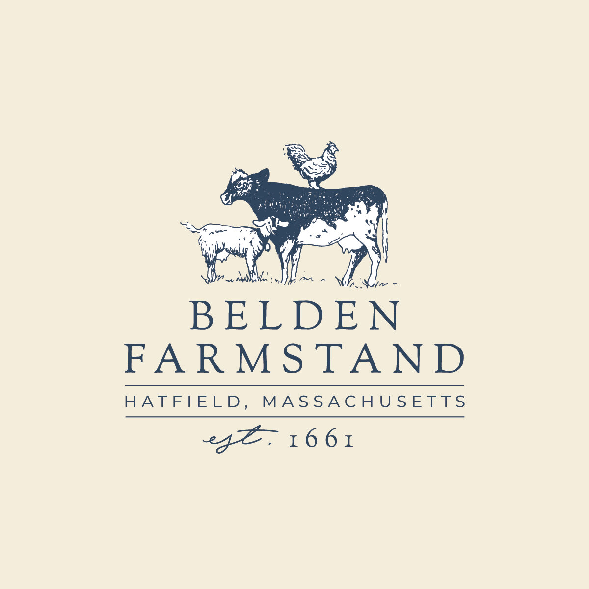
Branding: Brynhill Flower Farm

It’s never not fun to brand a flower farm. Being passionate about growing flowers myself, I always find it interesting to talk with flower farmers about how they are growing, selling, and setting themselves apart. And I love to draw flowers about as much as I love to plant them.

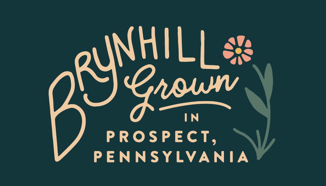
Working with Haley and Missy of Brynhill Flower Farm in Prospect, Pennsylvania was a particularly fun time. This mother-daughter team had extensive expertise in growing, specifically in the nursery setting for landscaping - but were passionate about cut flowers and ready to start a wholesale floral business. They had vision, enthusiasm, and a great sense of humor about it all. We hit it off right away.

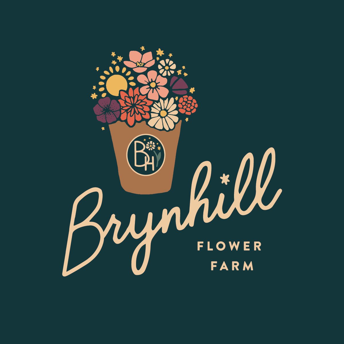
We wanted to create a strong sense of place with the logo and branding, showing where all these beautiful local flowers come from. The primary logo centers around their red barn, set deep amongst maples and gardens:

We developed a full brand from this scene, bringing together fun floral illustrations, hand lettering, and a jewel toned color palette to tell their full story.

Haley and Missy also produce maple syrup from the many maple trees on the farm. This little maple leaf sub logo is one of my favorite parts of the branding suite:

But my most favorite element is the repeat pattern - perhaps my favorite I’ve made! I just love these colors all together.

We got touched by our first frost over the weekend and I can’t believe this growing season is coming to a close - I’m not ready. Follow Brynhill for flower inspiration all year long - and if you’re in the Pittsburgh area, check out their gorgeous florals available wholesale through the Greater Pittsburgh Flower Collective! Thanks Haley and Missy for such a fun project!

Branding: Belden Farmstand

When you’ve been farming for thirteen generations, SINCE THE 17TH CENTURY, it’s sort of a big deal when you consider updating your brand! But that’s just what Belden Farmstand in Hatfield, Massachusetts decided it was time for, and I’m so glad they got in touch as a result.

With a business that well-established, change can feel a little daunting, but I was reassured completely after talking with Jillian out on the porch of Luther Belden Farm’s big old farmhouse. Jillian’s husband’s family has been farming the land in Hatfield since 1661, and over the centuries they have offered all sorts of farm products to the community. The prevailing product has been dairy, however, and the farm sends its milk to Agri-Mart to be used for local milk and Cabot cheese. Over 300 happy cows call Belden home.

Photo courtesy of Belden Farmstand.

Photo courtesy of Belden Farmstand.

Jillian and her husband understand the importance of diversification though, and have been exploring new ways to get farm products directly into the hands of consumers. It was in this way that the brand Belden Farmstand was established, under which they would be offering artisanal products beyond just milk, including goat’s milk products, soaps, farm fresh eggs, beef, and more.

Photo courtesy of Belden Farmstand.

Photo courtesy of Belden Farmstand.

With this new endeavor came a need for fresh branding, as the farm had been primarily focusing marketing efforts on the trade side of things. Now wanting to connect directly with local consumers, they needed a brand that really told the story of Belden Farmstand: their rich heritage, farm fresh products, and new focus on farm-to-table.

So we got to work on the logo and branding.

Belden Farmstand Logo - The Homegrown Studio.jpg

The primary logo achieves the balance of traditional and modern style, speaking to the history of the farm while presenting a fresh, clean look. Inspired by vintage farm illustrations, a cow, chicken, and goat come together in a playful way, complemented by a traditional serif font and just a touch of curvy handwriting. It tells a little story, one that is very personal to the farm, but relevant to the customer.

Expanding this story into larger branding was the fun part, as each animal got a chance to take center stage in their own sublogo! These will make perfect labels down the road.

Belden Farmstand Secondary Logo Goat - The Homegrown Studio.jpg
Belden Farmstand Secondary Logo Chicken - The Homegrown Studio.jpg
Belden Farmstand Secondary Logo Cow - The Homegrown Studio.jpg

My favorite brand element is the pattern we created. All of the animals come together with little brand details sprinkled in. It calls to mind a farmy toile print, and really shows off the illustrations nicely.

Belden Farmstand Pattern - The Homegrown Studio.jpg
Belden Farmstand Brand Mark - Blue on Grey-01.jpg

We also created a business card, which came with its own little challenge. We wanted this piece to showcase the new branding to consumers, but also stay relevant on the trade side, where most of the milk business still takes place. We did this by bringing in the larger company name “Luther Belden, Inc.” in an attractive way on the flip side, uniting both brands in a way that made sense to all audiences.

Belden Business Card Mock up square.jpg

The result of all this is an enduring story of an old New England Farm, getting new life from the next generation. That really comes through in the branding, and in all the excellent products Belden Farmstand puts forth.

Speaking of new life – you MUST check out Belden Farmstand’s Instagram for regular baby goat updates. So much cuteness - they’ve had a busy spring!

It was such a pleasure getting to know Jillian and the whole Belden Farmstand family throughout this process, and I had so much fun helping bring their story to life. We accomplished all this in partnership with CISA, who does such a fabulous job of connecting local farmers with resources to help them succeed. Local farms - reach out to CISA and see how they can help you up your marketing game! (and don’t forget I offer a 15% discount to Local Heroes!)

Thank you CISA, and thank you Belden Farmstand!

Branding: Familiars Coffee & Tea

When Familiars teased an opening in downtown Northampton back in January, I creeped their newly launched Instagram account and became immediately jealous of whoever got to do their branding. They were opening shop in a vintage red dining car steeped in charm and history, they had this mysterious, intriguing persona already well established, and their coffees and teas were high end and just plain sexy. My branding wheels turned.

Familiars went on to establish a pretty sweet business and I visited in the spring, when Cara Totman and I met to talk about her big branding project. I lusted after Familiars further, seduced by the absolutely gorgeous renovation the old dining car had undergone. It was dripping in vintage hardwood harvested from a Holyoke mill. Ugh. So good. I continued to brand subconsciously.

A few months later I launched Cara’s fancy new branding, and in a fateful turn of events, Familiars reached out to me. They were likewise seduced, and wanted to talk about collaborating on their branding. Imagine my excitement!!!!

I sat down with the owners, Danny and Isaac, and knew right off the bat that this was going to be a fun project. They already had such a good thing going, now it was just a matter of turning their vision into something visual.

An interesting challenge came up in the shop’s namesake. Familiars, as I had interpreted it, of course references the comfort and familiarity of your regular neighborhood coffee joint. But here it also had a second meaning: familiars are the animal helpers of witches, assisting in spell casting and magic making. Traditionally, they take the forms of cats, toads, ravens, and hares. This resonated deeply with both Danny and Isaac, and the ultimate brand would communicate this while remaining approachable to all audiences.

I’m happy to say with a little work and a lot of sketching, the final logo struck that balance. Incorporating all four of those critters, the cat, toad, raven, and hare form a nice little crest flanked by coffee and tea leaves - also very meaningful.

Familiars Coffee & Tea Logo.jpg

There’s nothing I love more than when a logo carries personal meaning and mass appeal at the same time. It’s clean and attractive on the surface, but tells a complex and important story. This is a great example of that.

We pushed this even further in the branding, expanding into complementary sublogos, a jewel-toned palette, retro-hip illustrations and patterns, and clean, cool fonts. Each animal even got their own avatar!

Familiars Launch 2.jpg
Familiars Coffee & Tea Pattern.jpg
Familiars Launch 6.jpg
Familiars Launch 4.jpg

Another big challenge with this branding project was the physical location itself. The vintage red dining car Familiars calls home is a huge presence; she carries her own memories, stories, heritage, and associations that precede Familiars the business, and linger here and there in the minds of customers. We wanted to honor that heritage, but also reclaim it. Familiars is no diner. Familiars ain’t stuck in the past. Familiars offers high quality products, friendly service, a little art, a lot of culture, and always a connection waiting to be made. It’s something the dining car hadn’t quite seen before.

So do we incorporate the iconic dining car, or no? We chose to own it, but in a more subtle way than smack on the logo. A stylized illustration of the car graces some of our branding materials, complementing our woodland helpers and adding to the overall intrigue. Check it out on the postcard! Greetings from Northampton!

More fun details came through in the form of gold foil business cards, a fun loyalty card, and finally, a big beautiful website. The elements really came together at their best here, fully showcasing all the mystery and magic while welcoming all with open arms.

Familiars Coffee & Tea Business Card.gif
Familiars+Print+Suite+-+Lpyalty+Card+Wood.jpg

This was a project all about balance and finesse, and I’m psyched with the results. Danny and Isaac were a dream to work with, and I’m so grateful they really let me run wild with the vision on this. Can’t wait to see this brand grow and flourish with their business - I hear there’s merch coming soon!!!

Branding: Cara Totman Photography

Cara Totman’s work has been catching my eye for years. Her photos have always stood out to me as having this magical atmosphere about them, capturing light and shadow in a way that elevates every one of her subjects and makes them sparkle. Whether it’s an engagement shoot, a wedding party, an intimate portrait, or a lush landscape, there’s this consistent mood in Cara’s photos that never fails to intrigue me.

Photo by Cara Totman Photography

Photo by Cara Totman Photography

So I was thrilled when she got in touch to work on some branding; designing for artists that inspire me is the very most satisfying!!! And, I was just so happy to finally meet Cara IRL! Turns out she is just as magical as her photos.

Cara wanted her logo and branding to embody a vintage, ethereal style, and wasn’t afraid to get a little quirky. She loves retro surf poster typography, and is very inspired by Oaxacan culture and art, where she recently spent time taking some seriously incredible film photos. My goal was to make sure we came up with something that complemented and spoke to the consistent style and atmosphere of Cara’s work.

Taking all that inspiration into account, we arrived at a logo that we both agreed was very her:

Cara T Color Logos-03.jpg

Cara is particularly good at capturing the female form, and it is a subject that speaks to many of the avenues she pursues with her business. I also think Cara is exceptionally good at inspiring a sort of radiant confidence in her subjects, no matter the context, and I wanted to convey that here. The woman in the logo is inspired by an actual photo by Cara, and when framed by stylize flora and vintage typography, the result is that retro, mystical, playful feeling we were going for.

IMG_8552.jpg

The fun part was expanding this logo into its larger branding. Secondary logos and marks came naturally, a feminine and earthy palette was pulled from themes in her photography, and the brand pattern was actually the crowning piece, where a fleet of ladies joins our logo woman, to create several little repeat scenes. I’m a little obsessed.

Cara Totman Secondary B pink-01.jpg
cara totman Business Card mock ups final.jpg
pattern test 4-02.jpg

This was a dream project for me, and I’m so excited to see it shine alongside Cara’s work as she begins her 2019 wedding season, holds super fun and empowering events like Celestial Sessions, and continues to flex her creative muscles in capturing the beauty of every day moments. Thanks Cara!

Fall Playlist

I can't believe how short the days are getting; it's proving deadly to my evening productivity. And chilly! I woke up to the first frost of the season and it was tough to leave my warm bed + cat. A good playlist helps, though.

2017 Autumn Playlist-03.jpg

So much good new music this fall! I'm loving the tracks Slaughter Beach, Dog is putting out especially. A few halloween themed items sprinkled in there too. Enjoy!