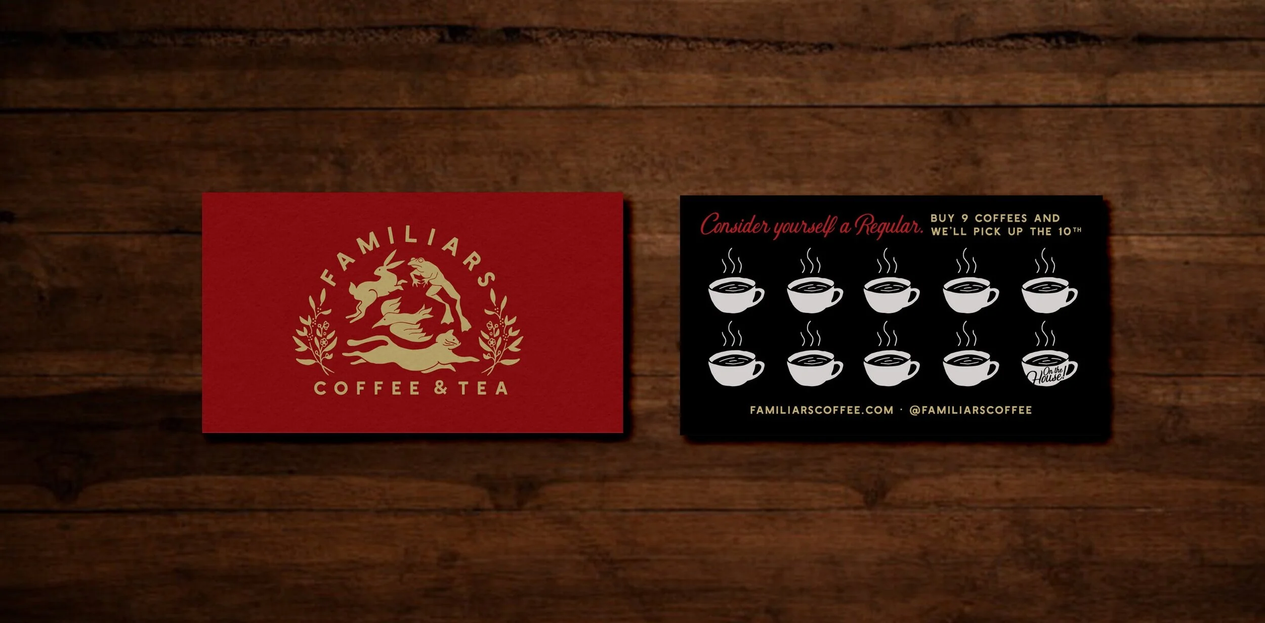
Branding: Summer on Strong

There’s nothing like the feeling of being right at the edge of summer, the whole glorious sunny season an expanse stretching out in front of us. This year I think it feels particularly exciting - pandemic restrictions are being lifted, we’re holding loved ones close again, going out for dinner and drinks, and it kinda just feels like everyone is ready for a big party.

Businesses on Strong Avenue in Northampton were picking up on that vibe, and wanted to give locals an opportunity to safely celebrate this summer. Together, they pitched a brilliant idea: close Strong Avenue to traffic and fill it with good food, live music, and happy people all summer long. It got the green light, and Familiars, The Eastside Grill, Local Burger, Progression Brewery, Homestead, and Mulino’s turned their block into a little slice of downtown summer paradise.

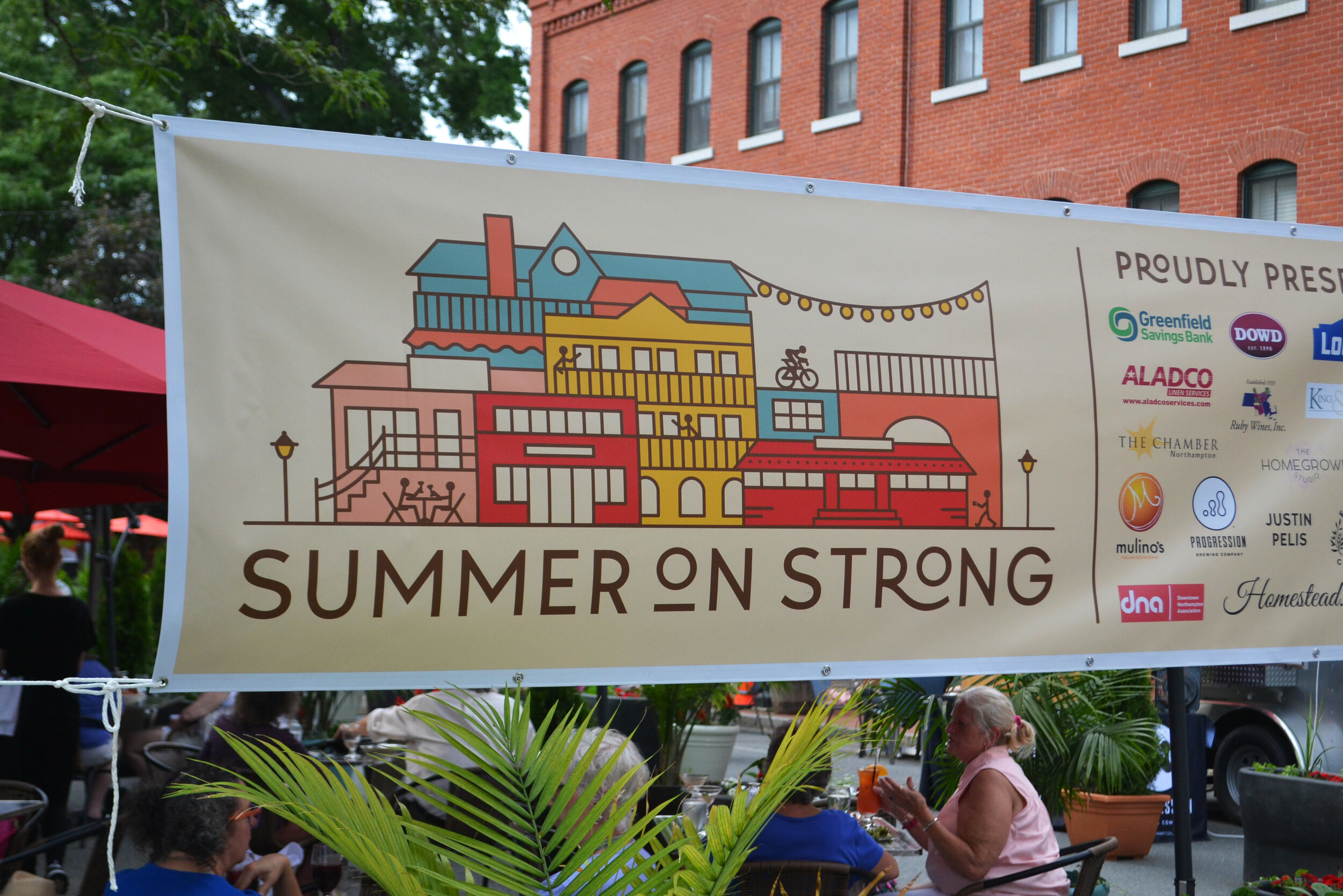
And I got to do the branding! We wanted to shout this celebration from the rooftops, and give it a real summer block party look and feel. I also really wanted to make this specific to Strong Avenue, and celebrate the local businesses that were coming together to make this all happen.

Summer on Strong Launch Graphic.jpg

The primary logo is a little composite landscape of many of the iconic buildings on Strong Avenue that these awesome businesses call home: Familiars’ cute dining car, the deck at Mulino’s, those stairs going up to Local Burger, the little peak and awnings of The Eastside Grill, the bike trail…it’s so Northampton.

Summer on Strong - Horizontal Logo - Full Color.jpg

This secondary logo really celebrated the outdoor dining atmosphere that’s at the center of this event: a little bistro table and chairs in the middle of the street, under shady trees and string lights. Wouldn’t you want to make a reservation?

Summer on Strong - Oval Logo - Full Color.jpg

From there we made banners, posters, postcards, and social graphics to get the word out - and it’s working! The street is bustling with diners, dancers, and locals just happy to see one another again. It’s a beautiful thing.

Summer on Strong Postcard.jpg
Summer on Strong Lamppost 2.jpg
Summer on Strong Poster Mockup.jpg
Summer on Strong Banner 1.jpg

THANK YOU to the wonderful businesses of Strong Avenue and their generous sponsors for bringing this vision to life for the whole community - my thanks especially to Danny and Isaac of Familiars and Deb of The Eastside Grill for entrusting me with this one.

Happy Summer!

Branding: Familiars Coffee & Tea

When Familiars teased an opening in downtown Northampton back in January, I creeped their newly launched Instagram account and became immediately jealous of whoever got to do their branding. They were opening shop in a vintage red dining car steeped in charm and history, they had this mysterious, intriguing persona already well established, and their coffees and teas were high end and just plain sexy. My branding wheels turned.

Familiars went on to establish a pretty sweet business and I visited in the spring, when Cara Totman and I met to talk about her big branding project. I lusted after Familiars further, seduced by the absolutely gorgeous renovation the old dining car had undergone. It was dripping in vintage hardwood harvested from a Holyoke mill. Ugh. So good. I continued to brand subconsciously.

A few months later I launched Cara’s fancy new branding, and in a fateful turn of events, Familiars reached out to me. They were likewise seduced, and wanted to talk about collaborating on their branding. Imagine my excitement!!!!

I sat down with the owners, Danny and Isaac, and knew right off the bat that this was going to be a fun project. They already had such a good thing going, now it was just a matter of turning their vision into something visual.

An interesting challenge came up in the shop’s namesake. Familiars, as I had interpreted it, of course references the comfort and familiarity of your regular neighborhood coffee joint. But here it also had a second meaning: familiars are the animal helpers of witches, assisting in spell casting and magic making. Traditionally, they take the forms of cats, toads, ravens, and hares. This resonated deeply with both Danny and Isaac, and the ultimate brand would communicate this while remaining approachable to all audiences.

I’m happy to say with a little work and a lot of sketching, the final logo struck that balance. Incorporating all four of those critters, the cat, toad, raven, and hare form a nice little crest flanked by coffee and tea leaves - also very meaningful.

Familiars Coffee & Tea Logo.jpg

There’s nothing I love more than when a logo carries personal meaning and mass appeal at the same time. It’s clean and attractive on the surface, but tells a complex and important story. This is a great example of that.

We pushed this even further in the branding, expanding into complementary sublogos, a jewel-toned palette, retro-hip illustrations and patterns, and clean, cool fonts. Each animal even got their own avatar!

Familiars Launch 2.jpg
Familiars Coffee & Tea Pattern.jpg
Familiars Launch 6.jpg
Familiars Launch 4.jpg

Another big challenge with this branding project was the physical location itself. The vintage red dining car Familiars calls home is a huge presence; she carries her own memories, stories, heritage, and associations that precede Familiars the business, and linger here and there in the minds of customers. We wanted to honor that heritage, but also reclaim it. Familiars is no diner. Familiars ain’t stuck in the past. Familiars offers high quality products, friendly service, a little art, a lot of culture, and always a connection waiting to be made. It’s something the dining car hadn’t quite seen before.

So do we incorporate the iconic dining car, or no? We chose to own it, but in a more subtle way than smack on the logo. A stylized illustration of the car graces some of our branding materials, complementing our woodland helpers and adding to the overall intrigue. Check it out on the postcard! Greetings from Northampton!

More fun details came through in the form of gold foil business cards, a fun loyalty card, and finally, a big beautiful website. The elements really came together at their best here, fully showcasing all the mystery and magic while welcoming all with open arms.

Familiars Coffee & Tea Business Card.gif
Familiars+Print+Suite+-+Lpyalty+Card+Wood.jpg

This was a project all about balance and finesse, and I’m psyched with the results. Danny and Isaac were a dream to work with, and I’m so grateful they really let me run wild with the vision on this. Can’t wait to see this brand grow and flourish with their business - I hear there’s merch coming soon!!!