Branding: Woven Stars Farm

Farming regeneratively is a mission I am learning more and more about from many of my farm clients, and it’s very exciting to hear all the different approaches, methods, and philosophies they’re exploring in support of a better future. The why and how of farming are becoming more important than ever, as we start to better understand how it all affects the land and our environment. This is so critical for all of us.

Woven Stars Farm in Ghent, NY has focused on regenerative farming from the beginning. They specialize in pasture raised meats and eggs, and emphasize rotational grazing as a means of keeping their livestock and the land happy and healthy. I found our Discovery conversation to be particularly inspiring, as Lizzie and Emerson explained the interconnectivity of all living things on their farm and how they work to best support those relationships - from the soil, to the microorganisms, to the plants, to the animals, to the people who eat, all the way to the cosmos. Hence the name - Woven Stars. Talk about an authentic brand! I loved it.

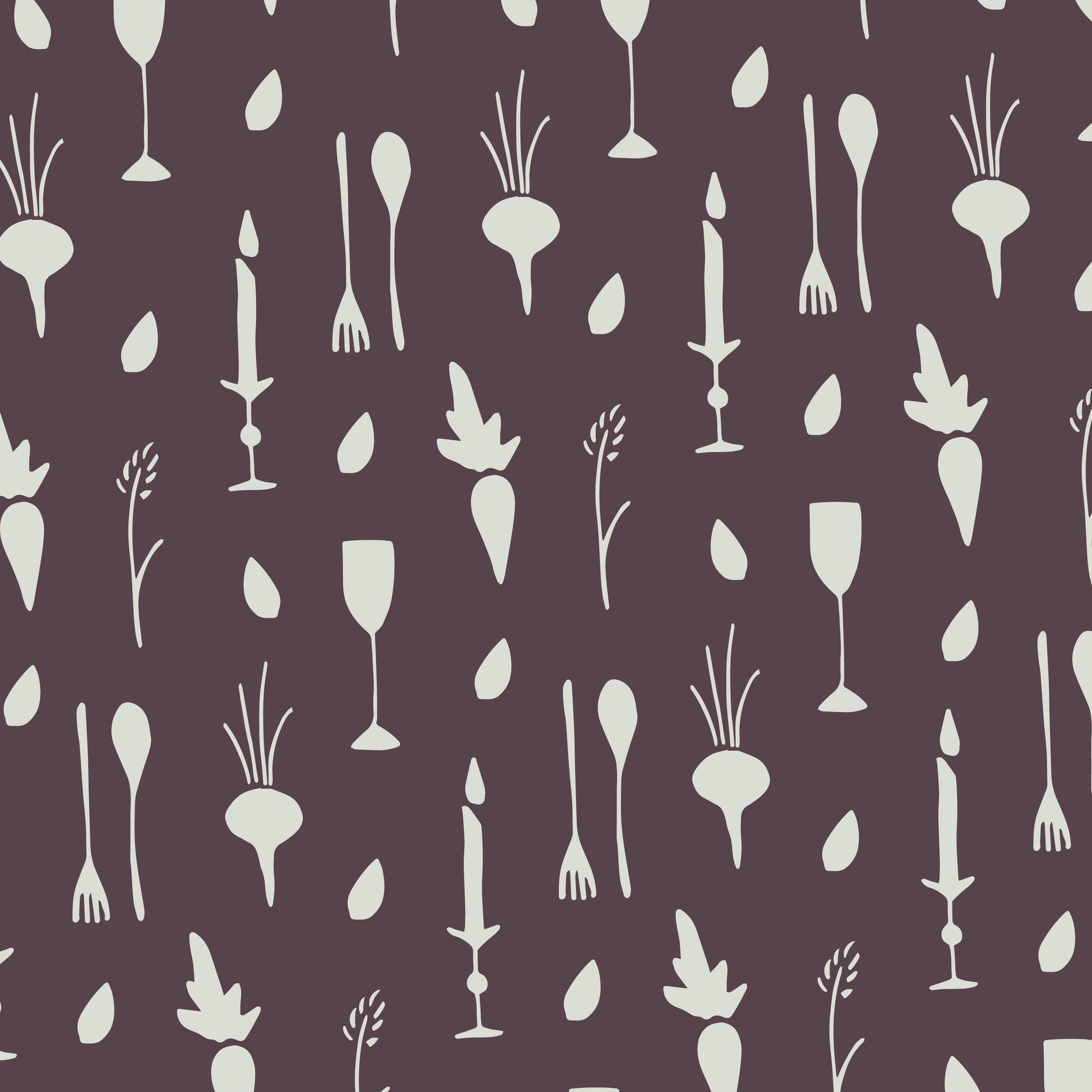
Interconnectivity was a concept I really wanted to get across in the logo design and branding, and give some visual representation to the connections and interdependencies that this farm has been built around.

Woven Stars Farm Logo -01.jpg

The primary logo addressed that by bringing in a variety of animals from the farm - cow, sheep, pig, chicken, and faithful guard dog. Woven Stars Farm is known for their incredible working Great Pyrenees, who keep careful, constant watch over the livestock. They’re all intertwined beneath the shade of a big farm tree, twinkling stars above. It’s all connected.

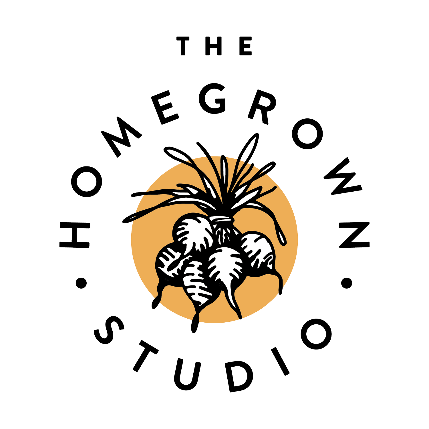
We carried this theme across a few versatile secondary logos…

Woven Stars Farm Round Logo-01.jpg
Woven Stars Farm Stacked Wordmark - Multicolor.jpg

Created a tagline to fully communicate their approach to regenerative agriculture…

Woven Stars Farm - Humanely Raised Tagline 1 - Light Yellow on Gold.jpg

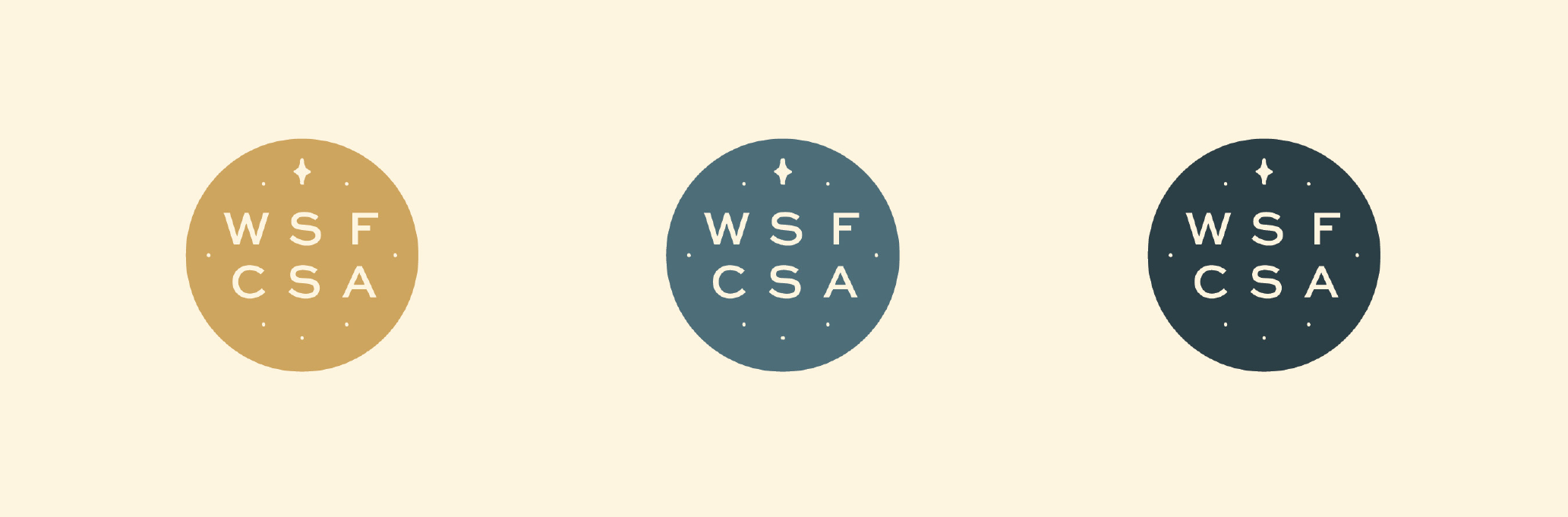
and a few other elements to help tell the fully tell the story of all this farm has to offer. I love this CSA badge in particular - Woven Stars is known for their amazing meat CSA.

Screen Shot 2021-06-30 at 11.25.29 AM.png

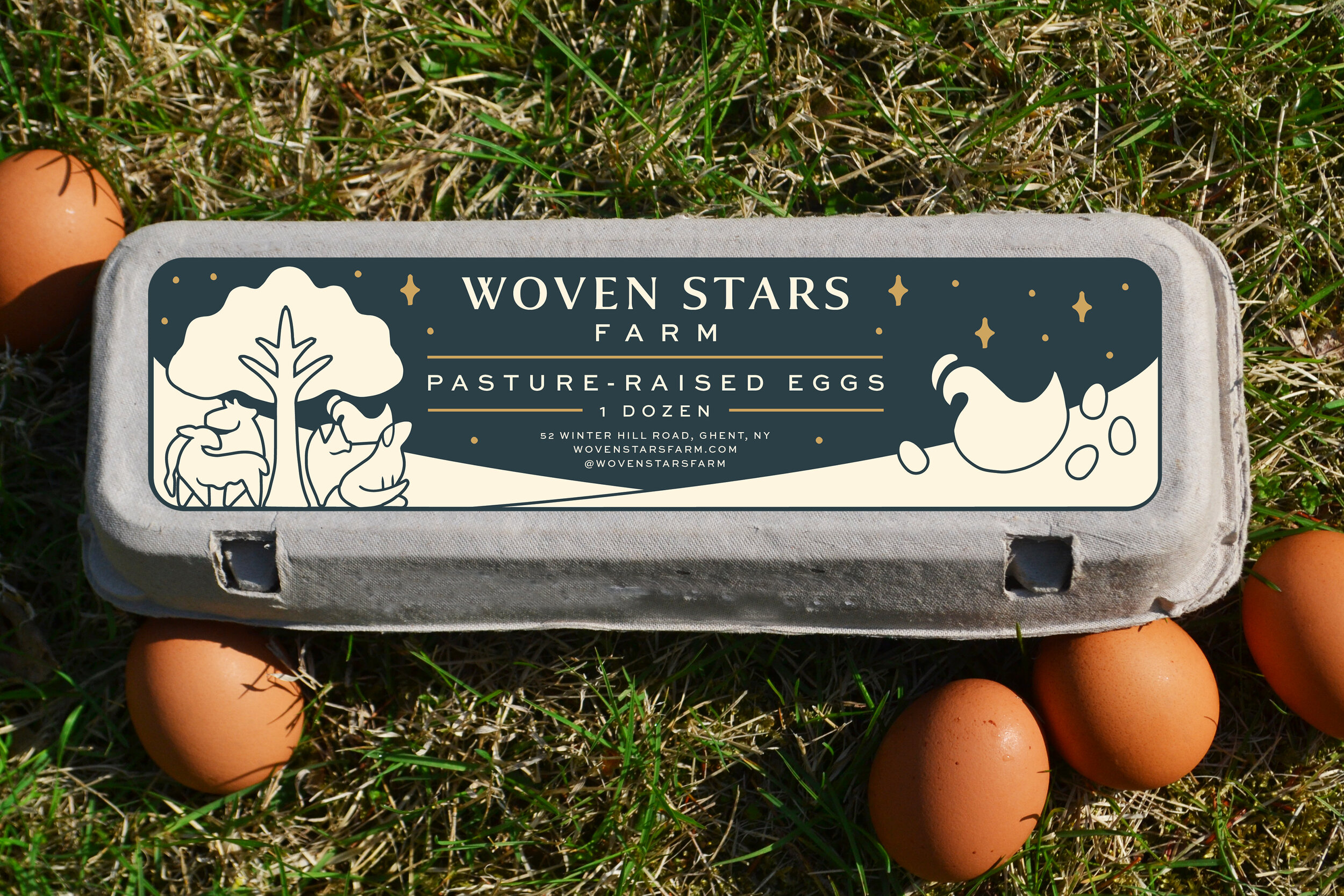
We also designed a label for their egg cartons. We really wanted this to stand out on the shelf, and fully embrace the new branding. We went for a label that covered the full length, and again celebrates that theme of interconnectivity.

Woven Stars Egg Carton Mockup round 2.jpg

Woven Stars has been busy applying their branding to all elements of their farm this season, and it’s been so fun to see it come to life. I just got a hat in the mail!!

Woven Stars Farm Hat.jpg

This one was a true pleasure to work on, and a story I was happy to help tell. Work like this is the future of farming, and it is so inspiring to see it in the hands of people like Lizzie and Emerson, who care so deeply for their land, their animals, and their community. Thanks Woven Stars Farm!

Branding: Field Notes

When I first met Joan and Kyle of Field Notes, we were still in a February deep freeze. I shuffled over a very solid layer of Hudson Valley ice to the Lansing Farm greenhouse, where it was nice and warm and smelled like dirt. Joan and Kyle pointed out all their varieties of newly started plants, which naturally flowed into their many plans for Field Notes’ second season of farm dinners: the seedlings were destined to feed many mouths this summer, after all.

Field Notes was established when the two chefs came to Colonie, New York from Vermont, looking to gain a better appreciation of where the food they were cooking came from. They did this by teaming up with the Lansing Farm family to establish a farm-to-table restaurant, using crops grown right on the farm to serve weekly meals on the same land. The first year was a success, with many delicious meals and memorable evenings against the backdrop of wildflowers and farm sunsets, and they were looking forward to expanding in their second year. They knew it was the right time to refresh their brand, and I couldn’t have agreed more.

We wanted the new logo and branding to not only reflect the beautiful experience of a rustic dinner on the farm, but also the hard work that goes into harvesting and preparing a meal. Joan and Kyle are big believers in understanding what goes into growing and raising the food we eat, and aim to tell that story with every meal. Their branding should of course do the same.

Field+Notes+Logo+Light+Green+on+Purple.jpg

In developing the logo, I wanted to give significance to the elements of those meals, as the ingredients journey from soil to plate. This approach really gives the details of that process an elegance, and makes it clear that there is a whole lot that goes into a well-prepared feast.

In the branding process, we expanded that concept even further, making the illustrations of the farm, kitchen and table elements front and center, translating them well into secondary logos and pattern, all in deep eggplant and leafy green colors that evoke the pallet of a late summer harvest.

Field Notes Secondary Logo B Purple on Light Green.jpg
Field+Notes+Pattern+8.5x11-01.jpg

This really came together in the menu design, which showcases Field Notes’ ever-changing and artful preparations of the freshest ingredients available.

Field Notes Menu Mock Up.jpg

And, because we didn’t want the warm, intimate aura of a summer farm dinner to be lost, this additional illustration is going to work in concert with the rest of the branding to call to mind those late moonlit evenings filled with laughter, good food, and great company.

Farm+Dinner+Illustration+green+on+purple-01.jpg

I am so pleased with the way this project came out, and am grateful to Joan and Kyle for inspiring me with their vision and then turning me loose with it. It was a fun one to work on and I can’t wait to see it come to life as they kick off their 2019 season!