Branding: Chase Hill Farm
/Warwick, Massachusetts sits wayyyyyyyy up on our Northern border, New Hampshire’s Mount Monadnock no more than an arm’s length away. It’s a bit of a journey up, but it’s become something of a destination for raw milk enthusiasts looking for the very best that local bovine have to offer - and that’s at Chase Hill Farm. Folks drive from hours away and miles around to get their hands on this 100% grass-fed organic raw milk.
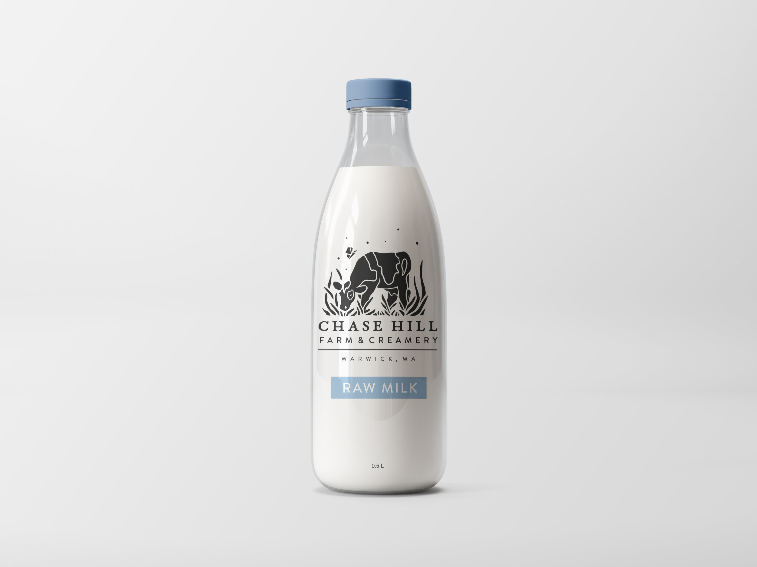
Why is Chase Hill raw milk so good? Ben and Laura, the owners, chalk it up to two main things: grass and love. Their exclusively grass-fed cows are considered part of the family, and are always treated as such. When it came time to develop a new logo for the farm, grass and love were two things Laura identified as absolute;y key to the brand.
I couldn’t have been happier to hear it. Working in a block print style that has been inspiring a lot my work lately, I created a design that embraced the lush grass so central to all that happens at Chase Hill Farm, and illustrated a well-loved cow, blissfully munching away.

Ben and Laura were totally on board with this, but an alternate concept I had presented to them caught their eyes too. We ended up reworking it to serve as a secondary logo; in total alignment with the chosen primary logo, but a bit of a different layout that offers a wider glimpse of all Chase Hill Farm has to offer.
A cow, pig, and chicken enjoy a little chase over a grassy hill - a quite literal interpretation of the farm’s name.

The little butterfly offers a nice consistency between the two logos too, and has an awesome story behind it. Chase Hill Farm has lots of native milkweed growing around their pastures, which encourages breeding of Monarch butterflies. Every summer, the farm is a sanctuary for Monarchs; a beautiful testament to the healthy ecosystem that the Chase Hill family works so hard to maintain.
These logos were such a pleasure to work on, and I was so happy we were able to bring two concepts together to create a solid foundation for the farm’s branding. Looking forward to seeing the new look on raw milk bottles soon!


