Ladies Drawing Night Western Mass

I’ve been feeling like talking in real life with other local creatives; exchanging ideas, learning about others’ processes, getting feedback, and enjoying a laugh together at all of this. I’ve long been inspired by the original Ladies Drawing Night movement in Brooklyn, and loved the book by Julia Rothman, Leah Goren, and Rachael Cole. So I put a little idea out there on Insta, and was thrilled to see an enthusiastic response both from people I know and don’t know, and local businesses offering to host. I fleshed out the idea a little more from there and came up with Ladies Drawing Night Western Mass.

Ladies Drawing Night.jpg

The first LDN will be Thursday, November 8 from 7:00 - 9:00 pm at Holyoke Hummus in Holyoke, Mass.! It will be a fun, casual atmosphere for local creative women to make some art, share ideas, get inspiration, make new connections, and enjoy the best falafel in the Pioneer Valley.

Ladies Drawing Night poster-06.jpg

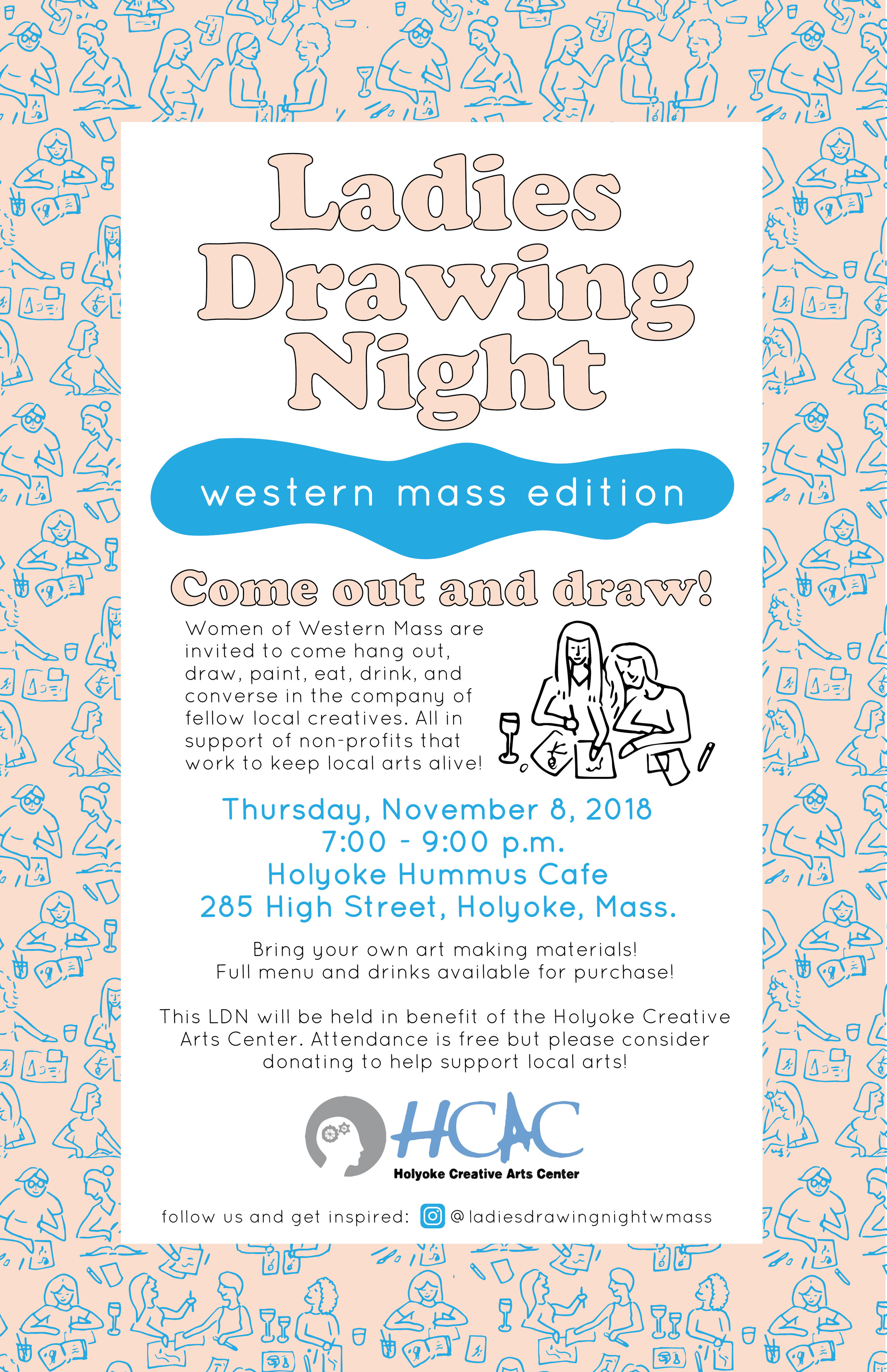
And, this will all be in benefit of the Holyoke Creative Arts Center, which provides low cost artistic instruction to the Holyoke community and beyond. They do a lot to support local arts and foster creative thinking in the community, and we’d like to show our support in return. Please consider donating when you come out to Ladies Drawing Night.

So, put LDN on your calendars, and I’ll look forward to seeing you on November 8! Can’t wait to meet you!

Logo Design: Riverwood Farm

The day I met Diego, I hopped in his farm truck and he drove us down a winding wooded path in Haydenville, leading to his one-acre plot of farm land along the Mill River. Riverwood Farm was in the August thick of it’s first full growing season, and it looked to be going well: tomatoes hung full and ripe from their vines, corn reached towards the towering trees above, and baby fall greens were already popping up in straight rows.

Diego had reached me through Community Involved in Sustaining Agriculture, CISA, which is an incredible resource for farmers in the Pioneer Valley. He’d been receiving support towards developing his business through their Beginning Farmer’s Program, which had guided him towards effectively branding his farm. That begins with a memorable logo, and I was so glad to hear from him when he saw my work and felt like it’d be a good match.

I was impressed by how much Diego was accomplishing on his acre in the woods; Riverwood Farm is truly a one man operation. He runs a no-till farm, as a means of keeping the soil healthy and fertile. The farm supplies vegetables to several local restaurants like Bistro Les Gras and The Freckled Fox Cafe. He also runs a farm stand up at Valley View Farm, making his fresh vegetables available to the community throughout the growing season.

Diego wanted his logo to be deeply personal, speaking to the hands-on, sustainable, small-scale operation he was running. His connection to the community and to his land needed to come through. So, what better way to do that than to put the farmer right in the logo?

Riverwood on Green-02.jpg

This illustration came to me first and most easily when I first began the process for this logo. I just drew what I had witnessed when I visited Riverwood Farm: Diego working his land by hand, under the shade of the forest by the river. Paired with a friendly hand drawn font, it instantly became full of personality. I was so glad he went with this option, I felt it suited his vision for the farm so well.

I won’t soon forget the other concepts for this project, though - here are the other three I presented to Diego.

They all paint a picture of Diego’s farm in their unique ways, but it’s the farmer in the chosen logo that really lets all that is at the core of Riverwood shine through.

I’m excited to see what’s next for Diego now that his brand is coming to life! Beginning farmers: make sure you get in touch with CISA, they have some incredible resources and grants that can take your farm and business to the next level. Take advantage! I’m looking forward to doing more with them in the future.

Images courtesy of Riverwood Farm

Into The White Mountains

I have a collection of vintage AMC trail guide books and maps, charting routes from Georgia to Maine. I’m no Appalachian Trail thru-hiker, but Jake and I have thumbed through the pages many times researching paths up and down the East Coast. 

IMG_5815.JPG

The White Mountains Guide is heavily earmarked by Jake, as he recounted family hikes up the Presidential Range as a kid, dutifully hauling the peanut butter and jelly supplies up steep trails. He’d described to me the rustic AMC huts that dot the ravines, offering warm bunks, thick oatmeal, and chess matches to weary hikers. 

So naturally, we had to plan our own expedition to the Lakes of the Clouds AMC hut, situated between the peaks of Mount Monroe and Mount Washington. And what better time than early September, squeezed in between the final heat wave and the first frost. 

Backpacks strategically loaded with the bare essentials, we drove up to New Hampshire on Friday morning. I saw the blue Presidential Range growing in the distance after a few hours, and began to wrap my head around the hill I was about to climb. Mount Washington is a big one, the highest in the Northeast, actually. And his co-patriots are no shrimps either. I got a little nervous but thought back to the time I concurred Camel’s Hump and the time I hauled up Zion and all the preparatory Berkshire hikes we’d done this summer, and figured I’d be at the top soon, one way or another.

IMG_5808.JPG

We set off on the Jewell Trail, waving goodbye to senior citizens aboard the Mount Washington Cog Railway, chugging so, so slowly up the mountainside (I think I can, I think I can). The Jewell is an instant entry into deep, cool forest covered in moss, mushrooms, and alpine trees. It smelled like Christmas the whole way up. The route twisted and turned at a consistent grade up the west side of the mountain. The first hour was tough – this was my first serious hike shouldering a full backpack, and I was feeling the added weight. I adjusted as we made progress though, and things got easier. 

About halfway to our destination, we broke through the tree line, welcomed with sweeping views. It was a clear day, the wind was thankfully light, and blue mountains faded into one another for all of eternity. We took it in while picking our way up the steep, rocky trail.

IMG_5809.JPG
IMG_5810.JPG

Veering right along the ridgeline, we took the Gulfside Trail over to the Crawford Path – the oldest maintained hiking trail in the country. We could see the hut as just a glimmering speck in the distance, and watched it slowly, slowly come into view and get closer. 

Crawford.jpg

We arrived at Lakes of the Clouds ten minutes before dinner was to be served at 6:00 sharp. We claimed our top bunks in room seven, and took our seats at the long tables as The Croo began clanging on pots and pans with their chef’s spoons; a mountaintop dinner bell. The menu was announced and large bowls of steaming food were passed happily around as the glowing sun set behind us. Chicken, cous cous, corn and peas, black bean soup and cheesy garlic bread were devoured, the clean-plate policy hardly an issue.

IMG_5811.JPG

Reenergized, we bundled up and took a walk outside to take in the stars. The wind had picked up, but the sky was perfectly clear. The hut’s naturalist pointed out constellations, galaxies, and clusters, offering a peer through his telescope. You could see it all, and for miles. 

IMG_5812.JPG

Sufficiently exhausted, we maneuvered the bathrooms and crawled up ladders into our sleeping bags, headlamps guiding us through the dark cabin. I read some Annie Dillard and listened to the winds howl outside, having picked up to 50 mph.

Jake and I were up at dawn; neither of us had exactly had our beauty sleep that night. We bundled back up and shuffled around the cold hut, listening to a chorus of breakfast sounds coming from the kitchen. We were soon served oatmeal, nutmeg pancakes, bacon, and eggs, well-fueled for the journey back down. We’d be setting off on the Ammonoosuc Ravine Trail, the most popular and direct route to and from the hut. 

IMG_5813.JPG

This trail was absolutely beautiful, stimulating from beginning to end to make the time pass quickly. It brought us under tree cover almost immediately, which we were grateful for with winds still whipping. The trail follows the Ammonoosuc River, so there are no shortage of waterfalls and scenic stops along the way. It was steep though; my quads and calves were aching, but things are always a little more pleasant coming down. We cheerily greeted oncoming hikers making their way up to the hut, recommending they put on a jacket soon. 

IMG_5814.JPG

We emerged at the train station a few hours later, gazing at the slope and distant peak well behind us. Now that is a good feeling, second only to the hot shower that would soon follow.

The road back brought us luckily upon Lonesome Woods in Bethlehem, an antique and apothecary shop I’d spotted before on Instagram. We browsed their vintage backwoodsy cabin goods, and I came away with one of their handmade candles that smelled just like the piney Jewell Trail. 

IMG_5817.JPG

We burned the candle at home last night, the weather having turned like clockwork to chilly New England autumn. We rested our tired bones under layered blankets, heads still up in the clouds. 
 

Logo Design: Rockingstone Farm

Rockingstone Farm in Barre, Mass. has just the kind of story I love - old local farmland being reenergized by a new generation. Lindsay Higgins first got into contact with me in the spring, looking to create a logo for the farm she and her family had been developing over the last year.

This effort has been particularly exciting for Lindsay because it is a new chapter in her family's history: the land was originally her grandfather's. The farmhouse was built in 1776, and now Lindsay and her husband Liam were working to create a farm and home of their own on the 100 acre property, and raise their two children there. They'd already been bottling and selling maple syrup from 350 trees, and opened a farm stand on Route 122.

The name Rockingstone Farm is after a natural landmark in Barre, just minutes down the road from the farm. Two boulders are balanced on top of the other in a seemingly impossible way; a teetering monument in the woods. The spot has been visited by generations in Lindsay's family; she sent me this photo of her mother at the rocking stones in the '70s, and also one of her children playing there today. 

For this reason, it was important to Lindsay that the rocks be incorporated in the logo, and the unique namesake was immediately where I wanted to go with the project. It proved to be no easy task though - rocks aren't always the easiest subjects to draw. After pages and pages of doodling and countless attempts from every angle employing several mediums, a few renderings were finally starting to do the rocking stones and all their natural wonder some justice. 

Here's the final logo we agreed would be the face of Rockingstone Farm:

Rockingstone Farm Final Logo on Grey.jpg

The detailed ink drawing of the stones went beyond my typical style and comfort zone, but definitely described the rocks best. Maple leaves fall around the the rocks, speaking to the farm's current focus on maple syrup production. The traditional serif font nods towards the rich heritage and history behind the farm, but a clean, sharp layout keeps things modern as the next generation builds a future. I think this will be the start of a strong brand for the farm, representing all it has been and all it's going to be. 

I came up with a wide variety of options for this logo, playing with the best ways to describe and incorporate the rocks, and suggesting some different directions all together. Both Lindsay and I liked the concept that incorporated the old red barn on Route 122, but agreed the rocks should be given priority. Hoping we can still use the barn illustration in some future pieces!

RSF alternates-01.jpg

I'm very excited with the concept Lindsay chose, and can't wait to see how she uses it to brand her farm. 

Photos courtesy of Lindsay Higgins

Summer Playlist

Deep July is upon us and we are due for a Summer Jamz playlist:

Summer Playlist-02.jpg

The Carters and Big Red Machine are the clear stand-outs, but there's so much good new hot weather music lately. 

We're making our annual pilgrimage to Umpachene Falls this weekend, and are looking forward to trying Cantina 229's tacos. If that isn't summer I don't know what is. 

Hope this playlist finds you on a summer adventure this weekend, enjoy!

The Farm in 35mm: Spring

A few days post-solstice, I'm looking back on spring at the farm via a fresh envelope of 35mm prints. It all began with our magnolia tree bursting into bloom and concluded with bowlfuls of strawberries, the days in between flaunting all shades of pinks and greens.

81616426.jpg
Pepe Smile Garden.jpg
Baby Plants in Box.jpg
Baby Radish.jpg
Peony.jpg
JoJo.jpg
Strawb Flowers.jpg
Hay Path.jpg
Pepe and Brooke.jpg
Fence Post.jpg
Strawberries.jpg
Jesse.jpg

That last one is my favorite, my little meerkat Jesse in his jungle. 

36 exposures later summer came right on cue, muggy days giving way to dramatic afternoon storms. I'm trying my best to slow the days down and enjoy tomatoes, fireflies, trail rides, and swimming holes to the fullest. Capturing what I can on a roll of film certainly helps.


Logo Design: Cedar View Polo Club

It's always nice to reconnect with old friends. I was so happy when Debi Gale got in touch a few weeks ago - my sister and I rode horses with her for years when we were growing up, and leased a wonderful quarter horse named Kramer from her for a while. She and her family had since built their own gorgeous farm in Somers, CT, and her son Drew is in the process of establishing a polo club there. Games would be starting soon and they were in need of a logo. 

I came out to their property on a sunny afternoon, a quiet haven among towering cedar trees. I was so impressed to see the polo field they had been grooming for the last five years - it sat finally ready to see games this season. Debi and Drew showed me around as we caught up, and described the logo they were after - something classy and fun and built around the iconic pines that would become the symbol for the team: Cedar View Polo Club.

This was one of those logos where the inspiration and creativity just flowed, especially after I was just off of a trip to Lexington, KY for my full time job, where life revolves around horses. I was excited to draw some polo ponies and bring in elegant fonts that would be the core elements for this brand.

cedar view gold mock up.JPG

I was so pleased with the design they chose - a crest logo that gestures towards traditional, preppy branding for the sport of kings, but is softened with retro, fun touches. The focus remains on the horse and cedar trees, and I think the whole logo will remain very versatile for all sorts of contexts - particularly for team shirts and hats, which I am eager to see!

I was excited about some of the other concepts too, but definitely felt like they went with the strongest design. Here are some of the alternates:

Still kinda in love with the one in the middle though. Hoping to pull elements from it for something else someday, we'll see.

Looking forward to developing this branding further - and for games under the cedar trees this August! Thank you Debi and Drew!

Spring Farro Salad

I hosted Mother's Day at my home this year, where the policy is typically bring your own chair / bring your own steak knife, as I'm still at the point in my life where I am acquiring things like silverware sets for eight in rather tight quarters. It's a process, and it's very cozy.

With the weather nearly warm, I put together a cookout, chicken and steak tips on the grill, with Hadley asparagus and salads. My favorite dish was a farro salad I made up, which included all sorts of spring garnish. 

Farro is a staple in my pantry; in my opinion it's the superior ancient grain. I'm always throwing roasted vegetables into it, hot or cold, putting an egg on top, and calling it a meal. 

IMG_3548.JPG

For this Mother's Day edition farro salad, I went with chopped kale, snow peas, radish, mint, and feta. I tossed the veggies with cold farro and dressed with olive oil, lemon, sea salt, and pepper. 

IMG_3566.JPG

The dish came out light and refreshing, with all the earthy and nutty flavors essential to springtime. Everyone loved it, but I was glad to see there would be just enough for leftovers the next day. 

Spring Playlist

It doesn't really feel like it, but we are apparently knee deep in spring. So it's time for a playlist! 

Spring Playlist-01.jpg

It looks like things may hit 60 degrees this weekend so roll down those windows and play that Sylvan Esso song real loud. Any minute now we'll be digging up the garden, shedding sweaters and socks, and packing a picnic, right? 

Also in music! Lord Huron put out their third album today, Vide Noir. It is mystical af. Love.

"In the spring, at the end of the day, you should smell like dirt." - Margaret Atwood

Branding: Kelly & Co.

Spring is the best time for a brand refresh. Last fall I worked on a new logo for Kelly & Co., a favorite local maker of linen clothing and home goods, and recently I've been working with Erin to expand the new look on to tags, packaging details, and more. I'm loving the way everything is coming together!

IMG_2726.jpg

First we created some small and large sew-in tags for Erin's clothing items, as well as napkins, dish towels, and linen coffee filters. Then we went a bit larger with wrappers to package up the coffee filters, and hang tags for wearable favorites like the Everyday Dress and Pinafore Apron. I love the way the flax branch drawing from the logo looks as a pattern, and we ended up carrying that look through all of the branding. The soft neutral shade works well against Erin's variety of brightly colored linens. 

I was lucky enough to receive a handmade Pinafore Apron and dish towel in the mail last week! The apron will see plenty of use in the kitchen, studio, and garden this summer. The linen Erin works with is durable and practical but so elegant and lightweight too. 

DSC_1254.jpg

Looking forward to developing this brand further; it's always a pleasure to work with Kelly & Co.!