Logo Design: Rockingstone Farm
/Rockingstone Farm in Barre, Mass. has just the kind of story I love - old local farmland being reenergized by a new generation. Lindsay Higgins first got into contact with me in the spring, looking to create a logo for the farm she and her family had been developing over the last year.
This effort has been particularly exciting for Lindsay because it is a new chapter in her family's history: the land was originally her grandfather's. The farmhouse was built in 1776, and now Lindsay and her husband Liam were working to create a farm and home of their own on the 100 acre property, and raise their two children there. They'd already been bottling and selling maple syrup from 350 trees, and opened a farm stand on Route 122.
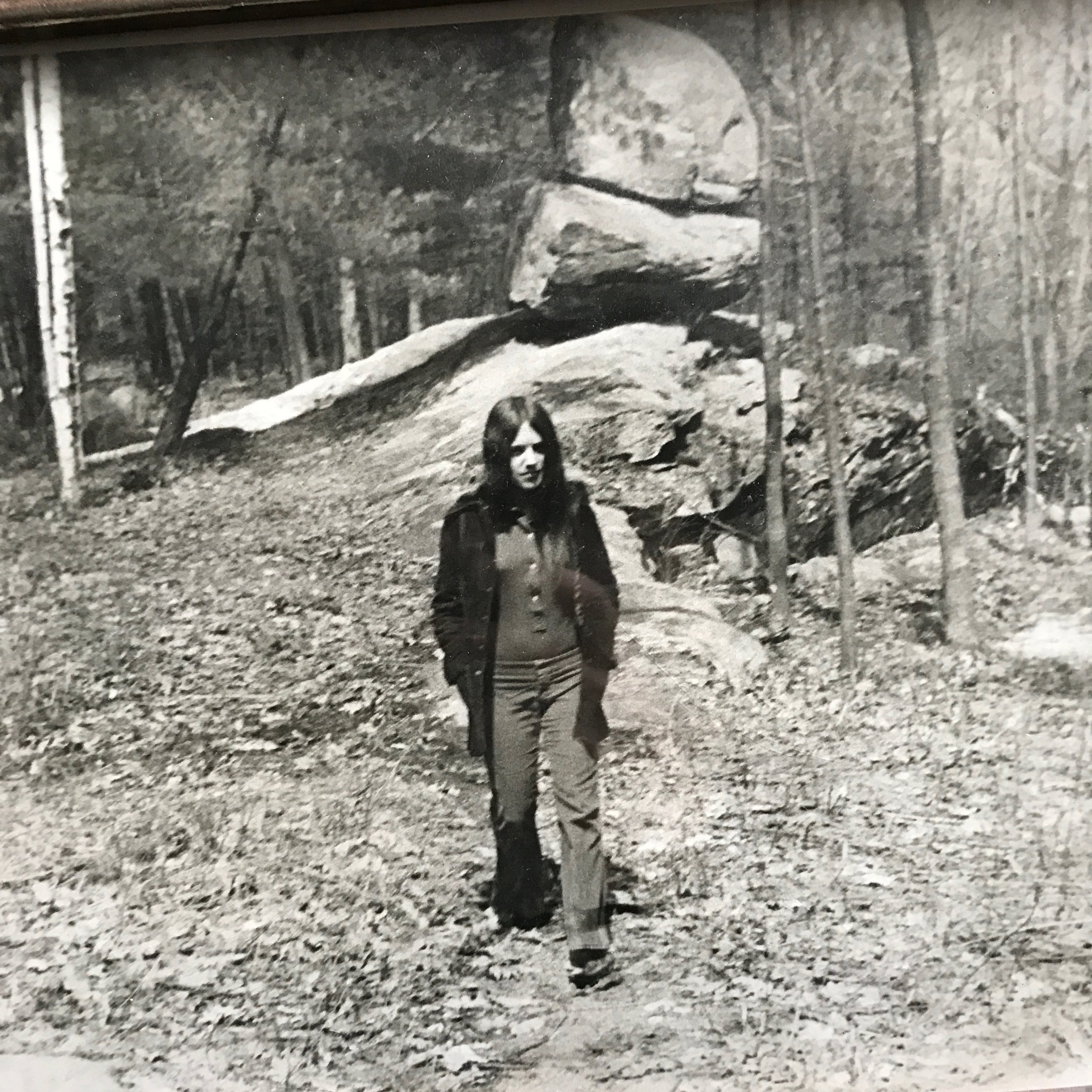
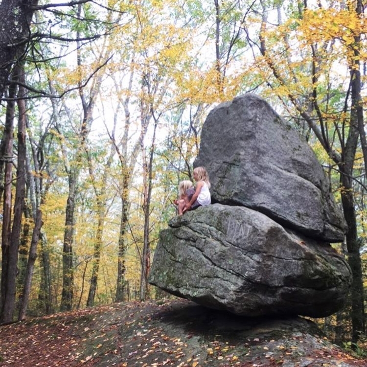
The name Rockingstone Farm is after a natural landmark in Barre, just minutes down the road from the farm. Two boulders are balanced on top of the other in a seemingly impossible way; a teetering monument in the woods. The spot has been visited by generations in Lindsay's family; she sent me this photo of her mother at the rocking stones in the '70s, and also one of her children playing there today.
For this reason, it was important to Lindsay that the rocks be incorporated in the logo, and the unique namesake was immediately where I wanted to go with the project. It proved to be no easy task though - rocks aren't always the easiest subjects to draw. After pages and pages of doodling and countless attempts from every angle employing several mediums, a few renderings were finally starting to do the rocking stones and all their natural wonder some justice.
Here's the final logo we agreed would be the face of Rockingstone Farm:
The detailed ink drawing of the stones went beyond my typical style and comfort zone, but definitely described the rocks best. Maple leaves fall around the the rocks, speaking to the farm's current focus on maple syrup production. The traditional serif font nods towards the rich heritage and history behind the farm, but a clean, sharp layout keeps things modern as the next generation builds a future. I think this will be the start of a strong brand for the farm, representing all it has been and all it's going to be.
I came up with a wide variety of options for this logo, playing with the best ways to describe and incorporate the rocks, and suggesting some different directions all together. Both Lindsay and I liked the concept that incorporated the old red barn on Route 122, but agreed the rocks should be given priority. Hoping we can still use the barn illustration in some future pieces!
I'm very excited with the concept Lindsay chose, and can't wait to see how she uses it to brand her farm.
Photos courtesy of Lindsay Higgins


