Logo Design: Stephanie Boyd Works
/When Stephanie Boyd led me down the stairs to her pottery studio in Williamstown, I was blown away by the depth and breadth of her work, and the evidence of an intense practice. Finished mugs lined shelves, several works in progress awaited colorful patterns and a final glaze, and new ideas were sketched out not far from her throwing wheel. Stephanie was particularly excited about a new process she was trying out involving monoprinting right onto her clay, creating funky patterns and interesting textures.

I get so excited to see other artists' workspaces, getting a window into their unique creative process. There was a lot going on this one; Stephanie has played with an impressive variety of styles and methods since she devoted herself to pottery full time four years ago, creating an exciting body of work under the business Stephanie Boyd Works. She was feeling like it was time to start bringing it all together under a recognizable brand though, so we started on a logo!


We wanted something clean and versatile that would speak well to her wide breadth of work, from timeless tablewares to bold statement pieces, as well as whatever new direction she may take next. It was important to keep things fun, too, because Stephanie's work is super fun. Did you see that monster plate?!
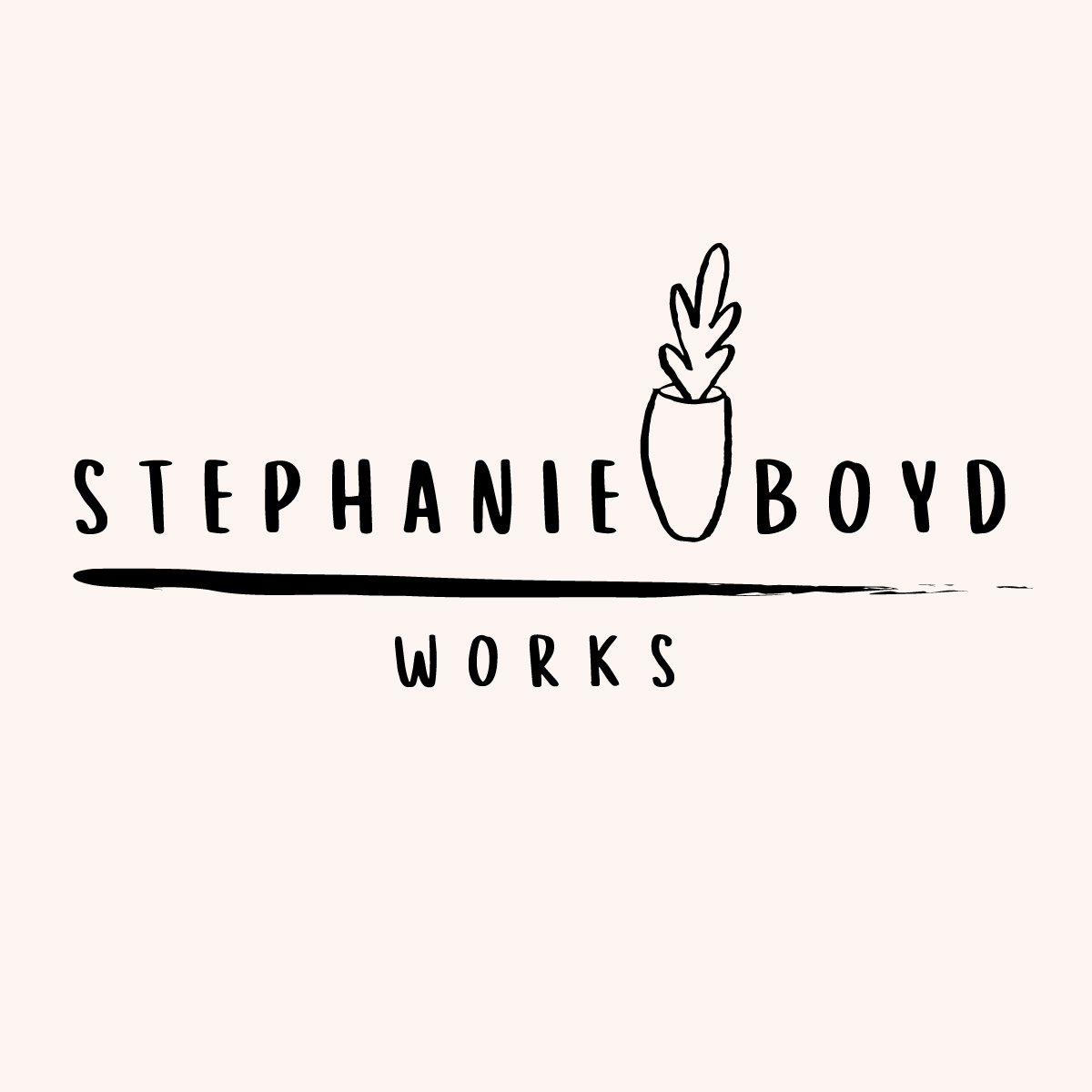
The final logo makes use of one of my hand drawn potted plants, with a little Matisse flair that Stephanie has been infusing into her own work lately too. Each element of this one is brush stroke heavy, reflecting Stephanie's artistic approach to each piece and the confidence and freedom she does so with.
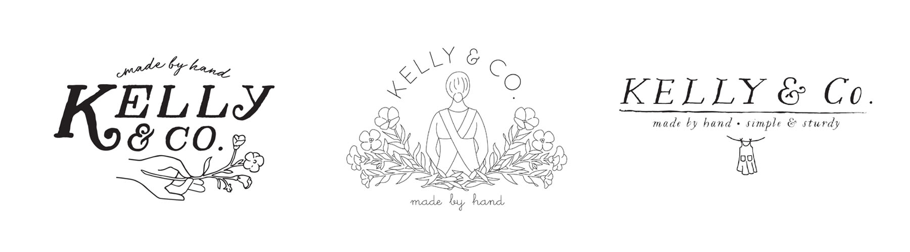
Here's a few alternates that I will not soon forget. Pottery is so relaxing to doodle, bringing me back to freshman year drawing class where hours were spent with in front of colossal still life sets with dusty charcoal in hand.

The empowered mug hand was meant to speak to some of her more socially and politically focused work. Stephanie is organizing an impressive collaborative art project called Vessels for Change, in which local potters and artists are joining forces to create and sell mugs to benefit the Berkshire Immigrant Center. They've already sold out on the mugs, but you can still make a donation!
This was such a fun project to work on; developing brands for artists is particularly important work to me and I'm happy with the direction this logo took. Thanks Stephanie!