Logo Design: Kelly & Co.
/We are so lucky to have a robust community of makers and creatives in Western Massachusetts that is growing every day. A few months back, I came across one such local maker Kelly & Co. on Instagram, and fell in love with the handmade clothing and home goods like this linen pinafore apron. I was so excited when Erin reached out, interested in revamping her logo and further developing some branding.


Simplicity, durability, and beauty are crafted into every one of the small-batch goods available in Erin's shop, and she wanted the logo to exude those ideals in a single mark.

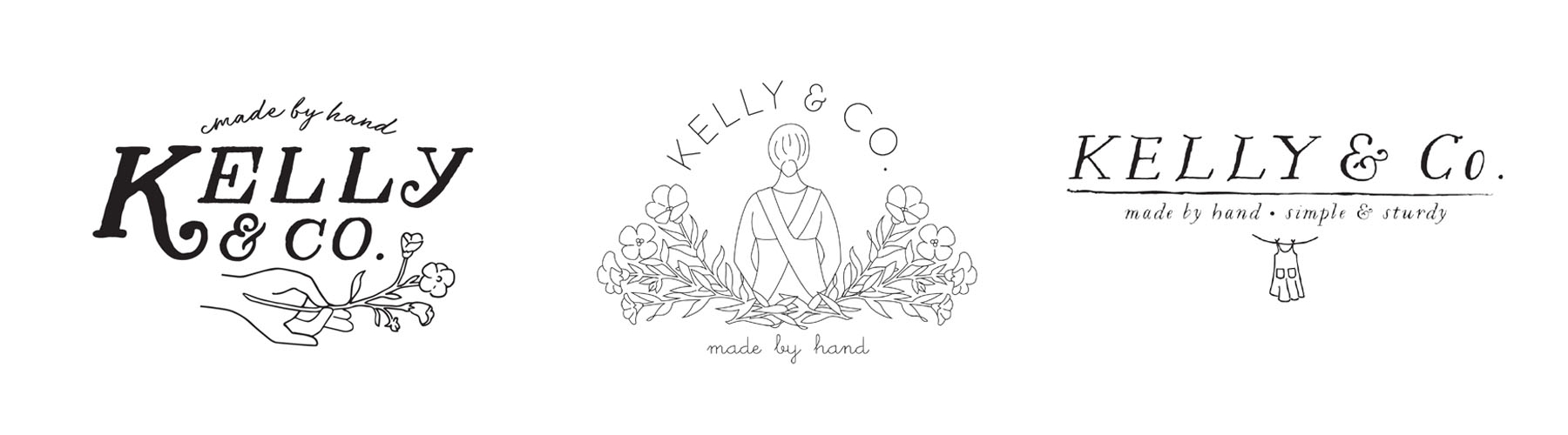
The flax flower is a significant symbol for Kelly & Co., and Erin was keen on incorporating it from the beginning. Erin crafts most of her wearable goods from natural linen, which is woven from the fibers of the flax plant. The final logo utilizes a silhouette I drew in effort to complement the calssic serif font.
I played around with a lot of other flax symbols leading up to this though, and even a little doodle of the everyday dress. Here are some interesting alternates that came about in process:
The entire project of crafting a clean, elegant logo that spoke to Kelly & Co.'s goods for good living mantra was so much fun; it's always most satisfying to design for a brand you already believe in and admire.


