Winning Work at the 2022 Ad Club of Western Mass Creative Awards!

What a pleasure to announce that several of our recent projects were recognized as award-winning at the 2022 Ad Club of Western Massachusetts Creative Awards!

First up: a SILVER award in the category of Integrated Advertising Campaign for our work on the Downtown Northampton Association Holiday Campaign!

A Bronze award was earned for the BIG SIGN we designed for 25 Central!

Another BRONZE in Packaging Design for the Thomas Farm & Dairy cheese labels!

And finally, one more BRONZE in Brand Identity Design for Summer on Strong!

We are so proud of this work and grateful for all the client collaboration that went into making each project great - and we’re especially proud that these are all LOCAL projects! It means the world to be able to help the small businesses, organizations, and farms that make up our community SHINE. Thank you to our beloved clients at The Downtown Northampton Association, 25 Central, Thomas Farm & Dairy, and Summer on Strong for putting your trust in us and believing in us - it is an absolute privilege to work with each of you.
Award-Winning: Apis Apotheca Packaging & Diemand Farm Logo

We received some phenomenal news this week! Our packaging design work for Apis Apotheca and our logo design work for Diemand Farm have been recognized as award-winning by the Ad Club of Western Massachusetts, as part of their 2021 Creative Awards. This event recognized work completed during the Worst Year Ever, 2020.

We are proud to report that we took home a gold medal for the Apis Apotheca packaging in the category of Series of Packages!

Apis Packaging - Ad Club Awards-02.jpg
Apis Packaging - Ad Club Awards-01.jpg
Apis Packaging - Ad Club Awards-04.jpg

The work I’ve done for Apis Apotheca has been so near to my heart. My lovely friend Aviva gave me all sorts of creative freedom when designing the bottles, jars, and product boxes for her skincare line, and it was a particular privilege to design for products that I genuinely love - I use Golden Milk and Resin every. single. day. The final designs were the result of a truly fun collaboration, and I COULD NOT WAIT to submit these to the annual creative awards. Sure enough, they brought home the gold. So proud of this one!

And, we received a silver medal for the Diemand Farm logo in the category of Logo Design!

Diemand Farm Logo - Ad Club Awards-01.jpg

Diemand Farm is another branding project that just bursts with love. The Diemand family was so open to my ideas throughout our collaboration, and they have trusted me unconditionally with their farm’s image. That’s no small thing - they’ve been in operation since 1936 - and it means the world to me. The logo design really set the tone for the whole branding project, and I’m particularly proud of the subtle “diamond” symbolism of the illustration. It’s been so much fun to expand on this brand over the last year, and this logo will always be one of my favorites.

I’m so glad to be a part of the Ad Club of Western Massachusetts, and completely honored to have been included in this impressive showcase of local talent. Thank you most of all to my wonderful clients Apis Apotheca and Diemand Farm, who granted me the creative freedom to bring these visions to life. Here’s to more great work ahead!

Familiars Branding Wins Awards

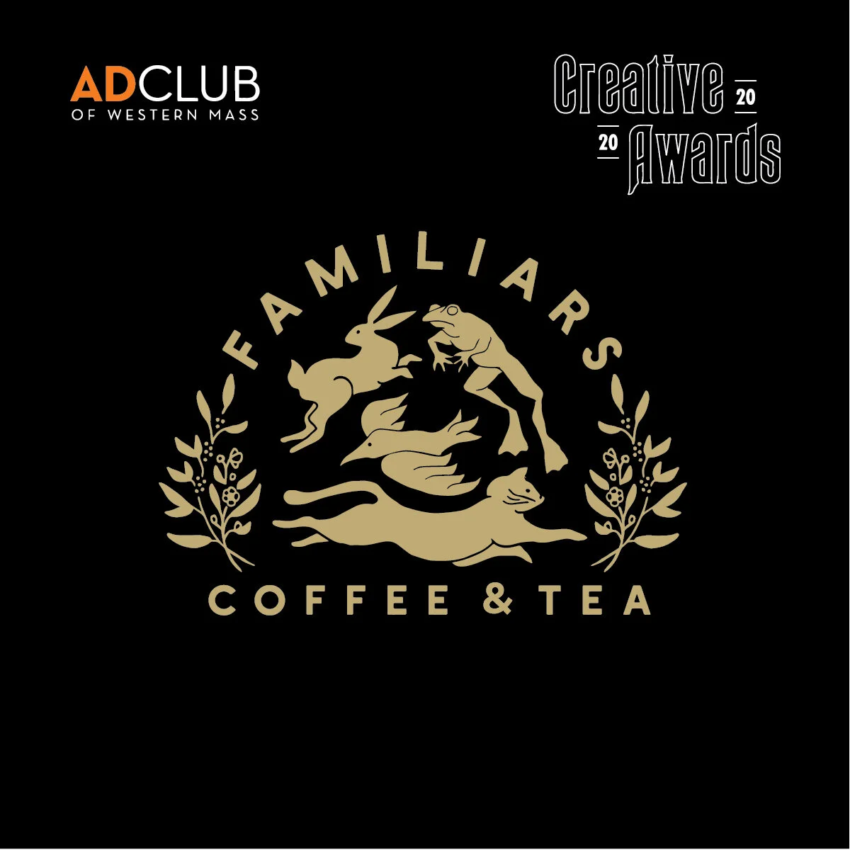
We got some great news last Thursday! One of our all-time favorite projects - branding for Familiars Coffee & Tea - received recognition in the Ad Club of Western Massachusetts’ 2020 Creative Awards.

Familiars Ad Club 2020 Creative Awards.jpg

We took home two bronze medals: one in the category of Logomark Design, and one in Brand Identity.

Familiars Ad Club 2020 creative awards - postcard.jpg

This was particularly exciting because it was the first time I had submitted work for any sort of judgement. I was blown away upon seeing the full list of entries this year; a huge variety of thoughtful, inventive designs bursting with creativity - many executed by veterans of the industry and larger ad agencies. I was honored to be included in the first place, and pleasantly surprised with the recognition.

Familiars Ad club Instas-06.jpg

The Familiars brand identity is one I’m particularly proud of, because it truly told an authentic story of a business, bringing together the owners’ personal taste and vision, and a look and feel that was relevant to their audiences. Here’s the description I included in the entry:

“Familiars Coffee & Tea opened up their Northampton, MA shop in one of the most iconic storefronts in town: a 1930s train car that had housed many a retro diner. Unlike their predecessors, Familiars was focused on offering specialty drinks and high quality, locally-sourced foods, so they needed a brand to reinvent their well-known location and communicate the big upgrade it was getting. Named for woodland creatures that help witches cast spells, the term “Familiars” also embraces the feeling of visiting your favorite coffee spot ever day. The resulting logo and larger brand identity united both of those concepts, elevating the establishment well above any diner assumptions.”

Familiars Ad club 2020 creative awards loyalty card.jpg

I’m so glad to now be a part of the Ad Club of Western Massachusetts, and am completely honored to have been included in this phenomenal showcase of local talent. Thank you most of all to Familiars, who granted me the creative freedom to bring this vision to life. Here’s to more great work in the year ahead!

Be sure to check out all the 2020 Creative Awards Winners - congratulations to all!