Logo & Packaging: The Shelburne Honey Company
/I met Tim Smith and Courtney Basil of Apex Orchards last winter, at a marketing workshop I taught with CISA. While a lot of the farmers in attendance were just starting out, Tim and Courtney were there representing a farm that had been in business since 1828. Tim is a fourth-generation farmer, and Courtney helps him manage the operation, which is largely focused on apples and other tree fruits.
Marketing a farm with so much history is an interesting challenge, as the needs of modern consumers and the rich heritage of a place press up against each other. One area of the business Tim and Courtney really felt needed updating was their honey products, which are sold under the name The Shelburne Honey Company. The delicious honey was lacking a consistent logo, and the labeling needed a refresh.
Tim has been producing honey since 1972, and wanted to maintain the heritage of the locally established honey, while making sure his products were standing out on shelf. The original label included hand drawn floral details by his aunt, which I thought was really special. I thought playing with the original design would be a great way to transition the products into a new era, while still paying homage to its roots.
I spent a lot of time cleaning the original floral drawings up, rearranging, and creating a brand new logo out of them:

Tim, Courtney and I really liked the results; it felt like a great balance of old and new. When applied to labeling, it really cleaned the products up and made them look like a family.
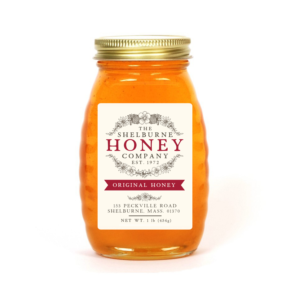
We used the established Apex Orchards red color to draw a subtle connection to the main business, and color-coded the banners to distinguish between different products: Original, Clover, and Creamed Honey.

I really like the way they all look together, and can’t wait to see them printed out and on the shelf in the fall!


