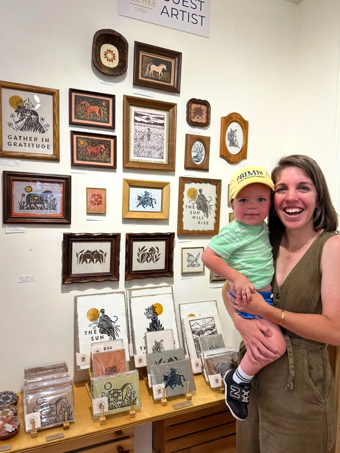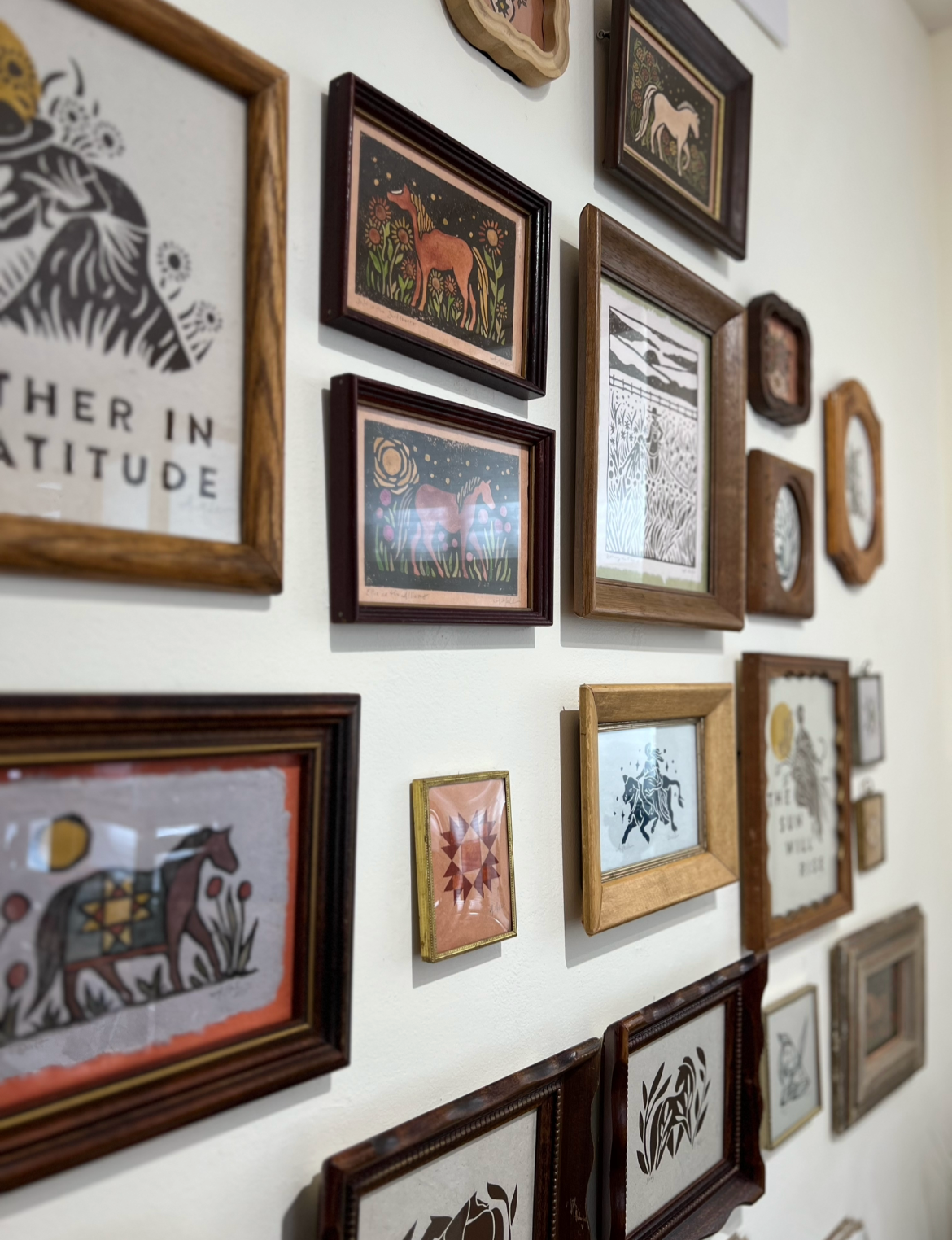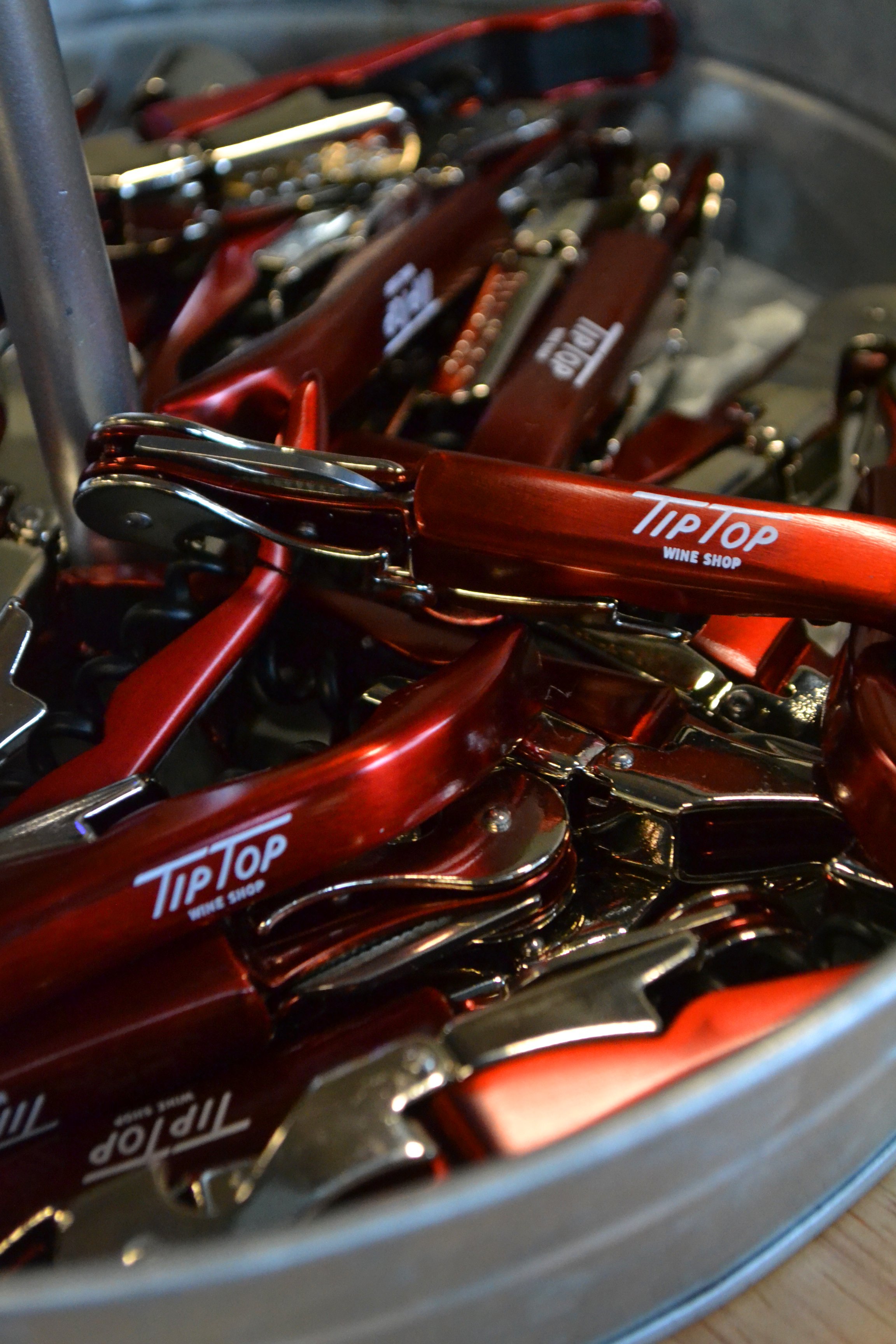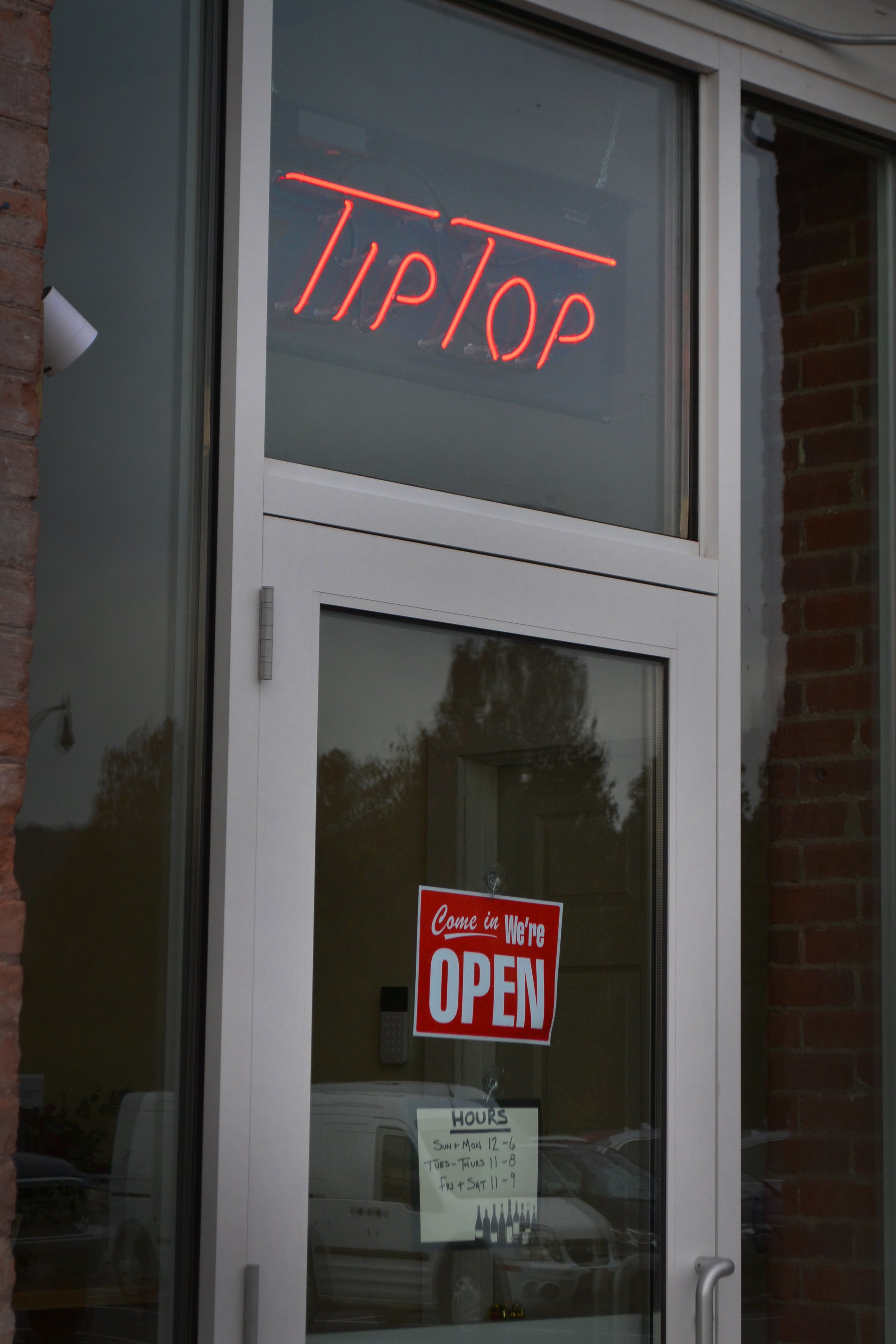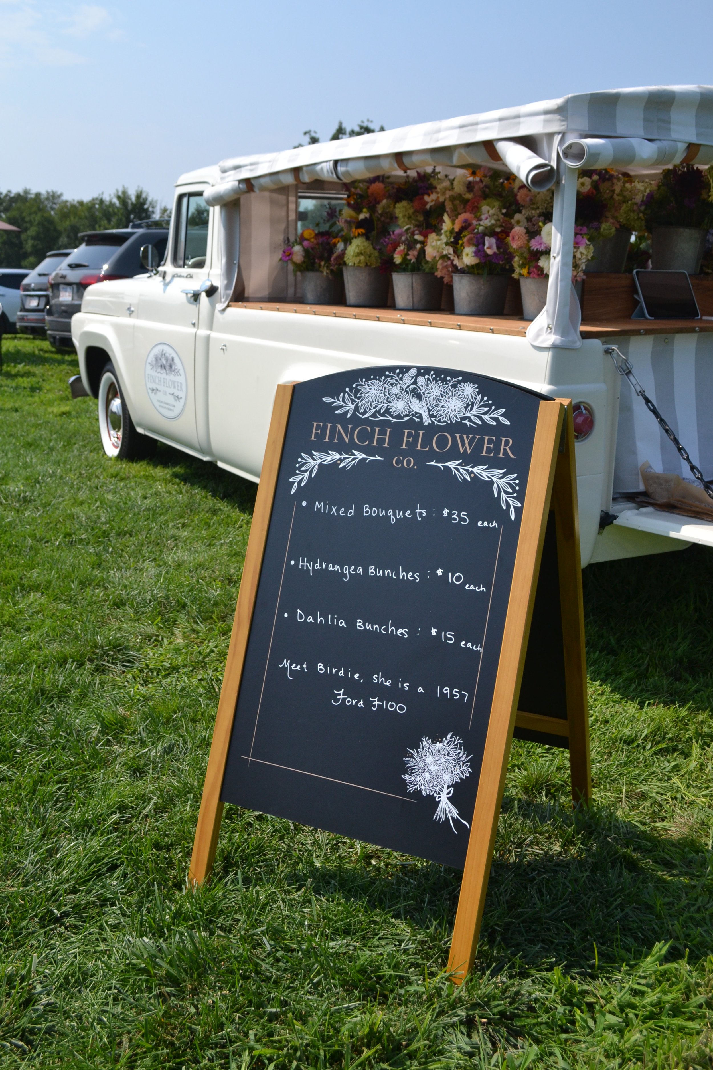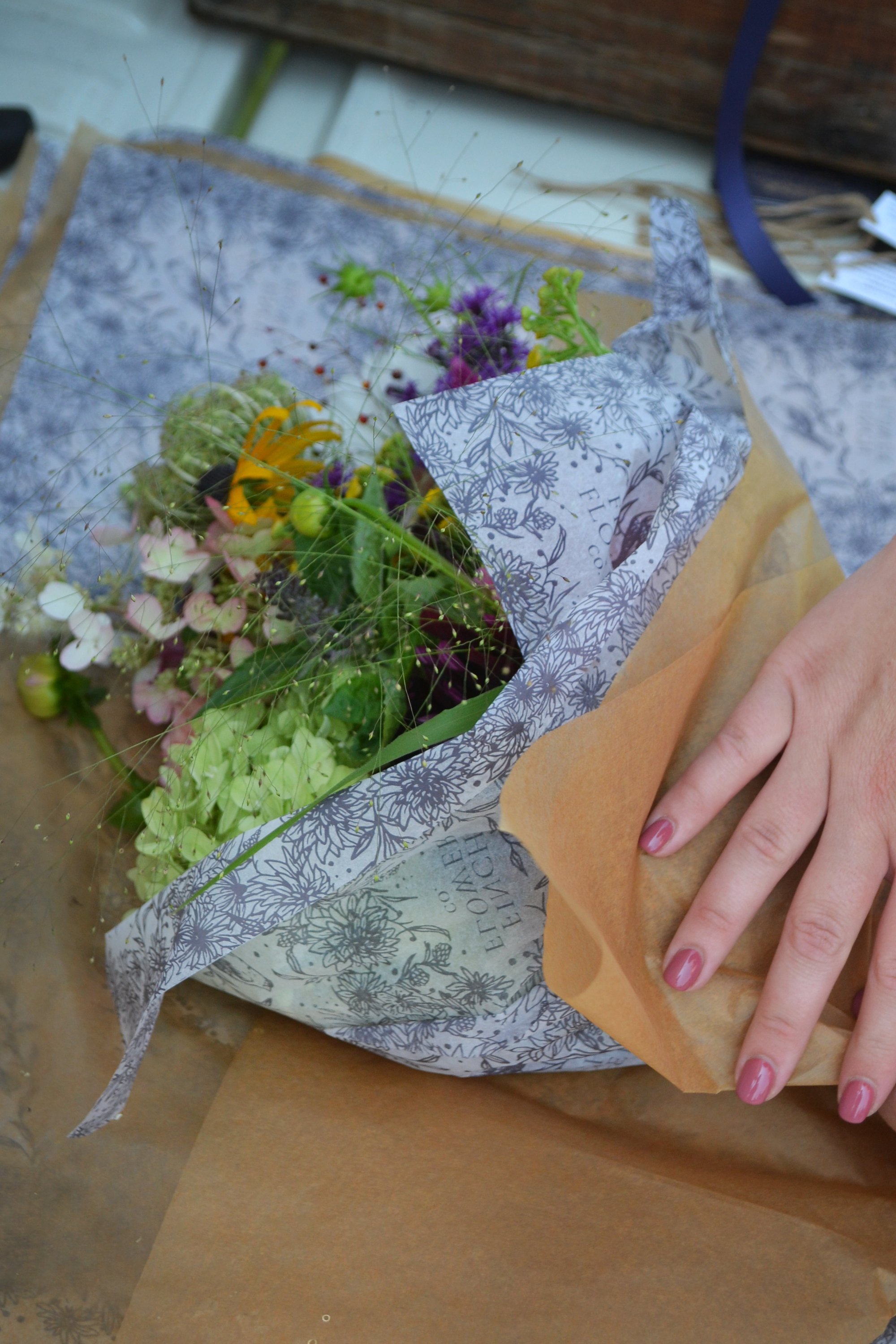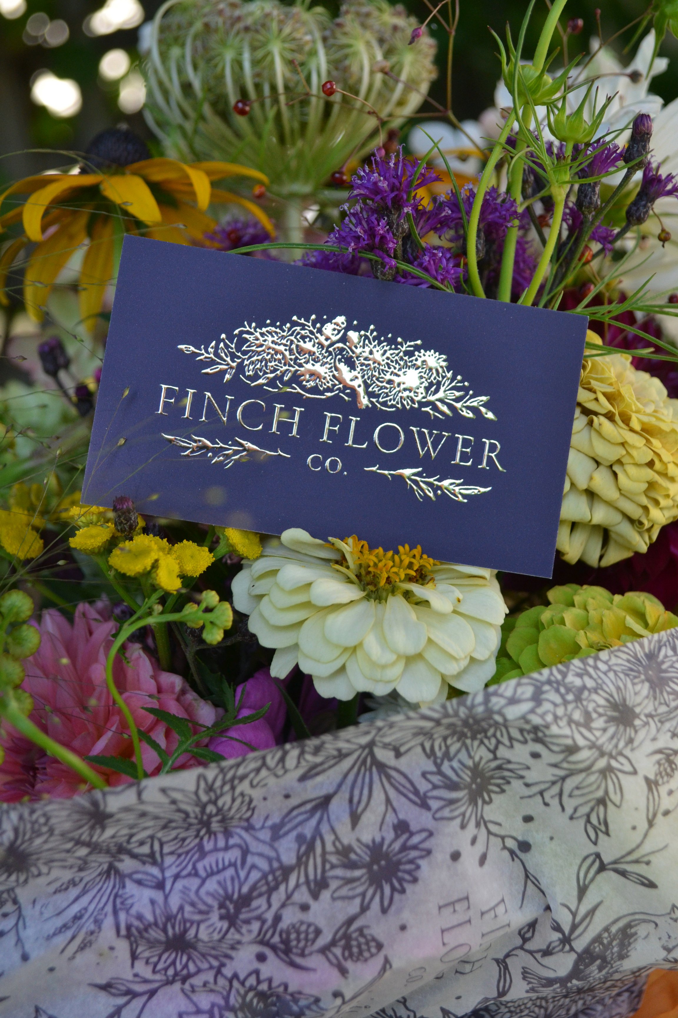
Framed Work on Display at Familiars Coffee & Tea
/My heart is bursting for the recent opportunity to have ALL of my framed pieces on display (and for sale!) at Familiars Coffee & Tea throughout the winter!


Photos by Emma colwell photography
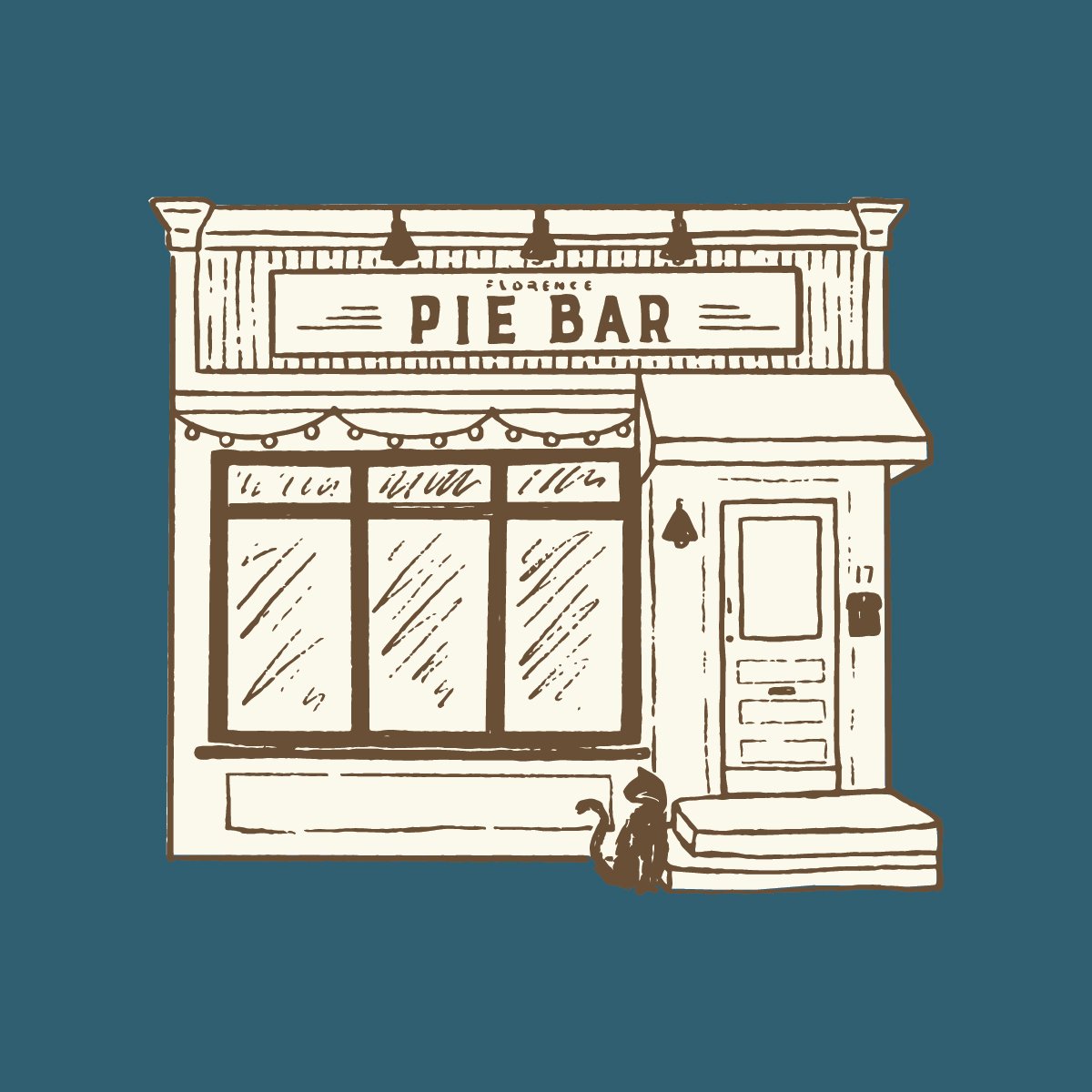
Owners Danny and Isaac have been incredibly supportive of me and my work through every season of my career; first as clients when they entrusted me to design a brand for Familiars - and later on its sister shop, Florence Pie Bar - and over the years they have become creative collaborators on all sorts of projects and moreover, they are really good friends.


Photos by Emma colwell photography
My work feels at home in their beautiful antique lunch car, and seeing it serve as a backdrop to the wonderful community they’ve built is so fulfilling.

Photos by Emma colwell photography
Please go get a coffee and egg sandwich and see for yourself - like I said, all of the work hanging is for sale and I’ll be refreshing over the coming months. Thank you Familiars ❤️ and thank you Emma Colwell for these photos! So thoughtfully captured, always.