Campaign Design: The Northampton Sidewalk Sales

The city of Northampton has become something of a branding playground for us. We’re so grateful many small businesses that call the city home have trusted us with their brand identities - like Familiars, 25 Central, and Firetype - and we’ve also had the opportunity to create cohesive, fun marketing campaigns for events like Summer on Strong and the DNA’s holiday shopping initiative. What a privilege to make cool things for the city we love!

Northampton’s annual Sidewalk Sales event is pretty iconic, a decades-long tradition of supporting local shops out in the sunshine each July. The sales are the best all year, and shoppers come from miles around to take advantage of the deals. We were thrilled at the opportunity to create branding and marketing materials that would unite participating shops, and create the feeling of a big celebration all weekend long.

We created a brand identity, custom illustrations, poster, postcards, website, and lots of other fun little details and goodies to arm downtown shops with, and generate lots of excitement around the weekend.

The big sale kicks off this Thursday and runs through the weekend - don’t miss out! Visit northamptonsidewalksales.com to plan your day.
Branding: Firetype Chocolate

Late October. We are right on the precipice of prime chocolate-eating season: that delicious stretch of time that spans between Halloween and Easter when every holiday-shaped chocolatey peanut butter treat is more than well justified. It brings me peace.

And so what a TIME to launch what must be our funnest branding project of 2022. Over the summer, Dan, who runs that wonderful chocolate shop kiosk in Thornes fka Heavenly Chocolate, reached out with big exciting plans. He had taken ownership of the long-standing business about two years prior, and was feeling ready to spread his wings and make the shop all his own - carrying forth all of the heritage and tradition of handmade chocolate we know and love, but with an exciting new twist. It was high time for a total rebrand - how I love those sweet words.

“What’s the new name?” I asked

“Firetype!” Dan said with confidence.

Hmmm. An interesting choice indeed. Certainly a departure from “Heavenly Chocolate” to say the least. I politely asked my new client Dan to tell me more, please.

So, Dan is into Pokemon. I mean yes I am too but Dan is really into Pokemon. He explained the spicy nature of Fire-type Pokemon, and how it relates to his own approach to running the shop. He also talked about the larger mission of this business beyond delicious handmade chocolate, in which he strives to always do right by his employees and make a positive impact on our community. I bought into the new name 100% by the end of our chat. There’s nothing I love more than a brand that carries deep personal significance, but remains approachable and appealing to the masses. My absolute favorite kind of design challenge.

So, we set out to create a Pokemon-inspired brand for a chocolate shop. Here’s what we came up:

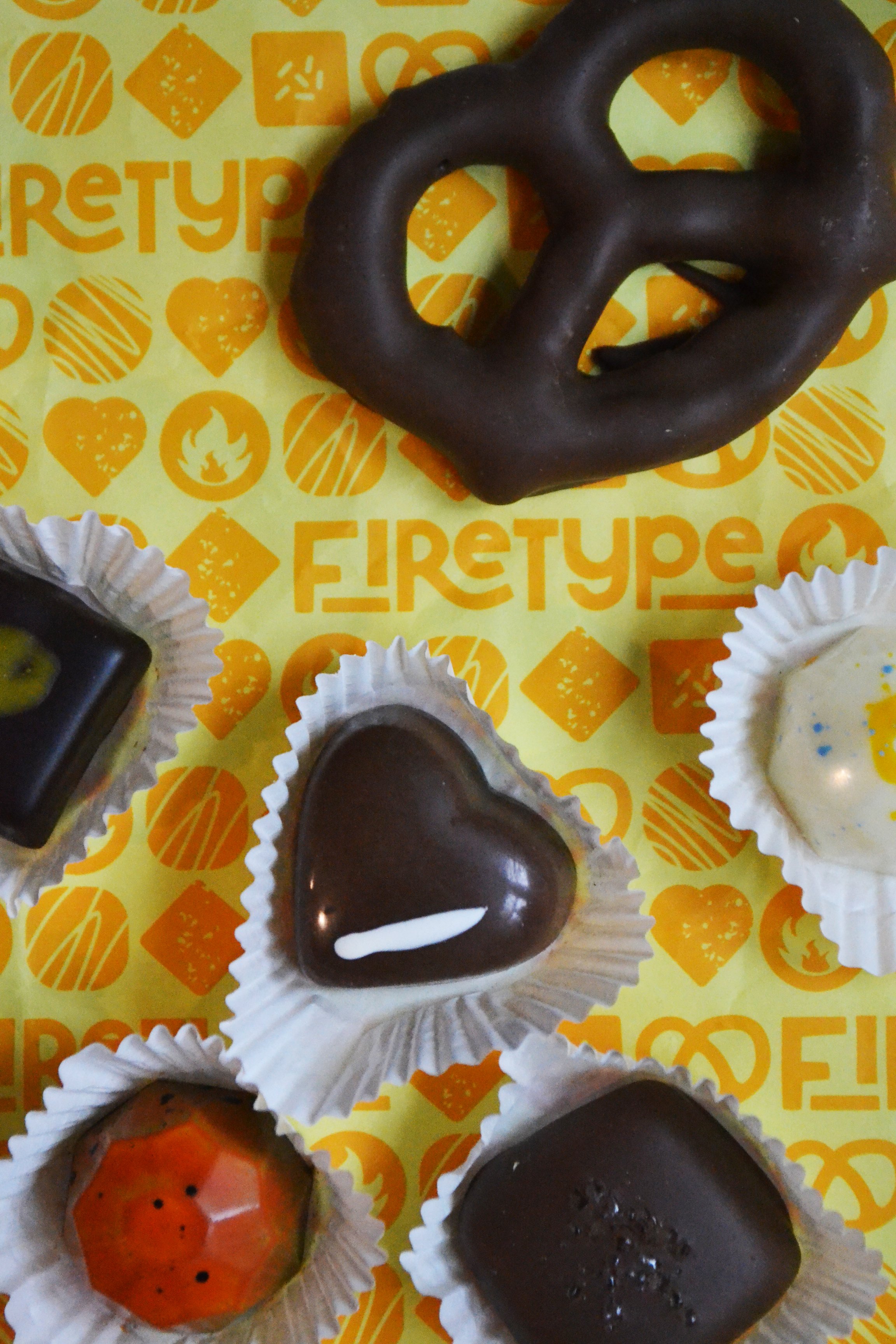
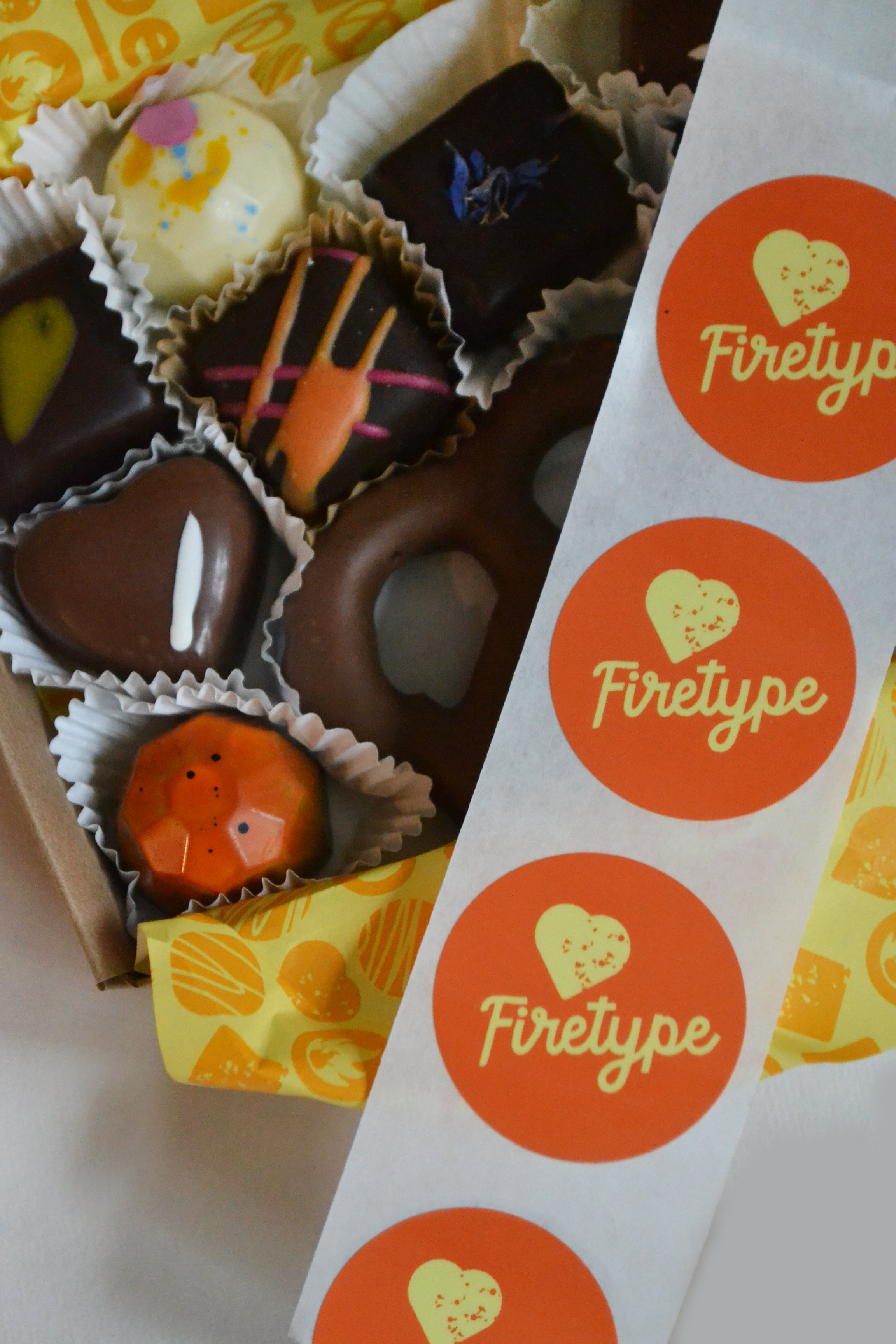
For the main logo, we worked a Firetype symbol in between two favorite chocolate shapes - which opened up a whole world of possibilities for these cute little chocolately icons. They are perched atop fun, bold, slightly wonky lettering, which gets even a touch more chaotic with alternating fire-y colors. It all fits together nicely though - and feels surprisingly balanced.

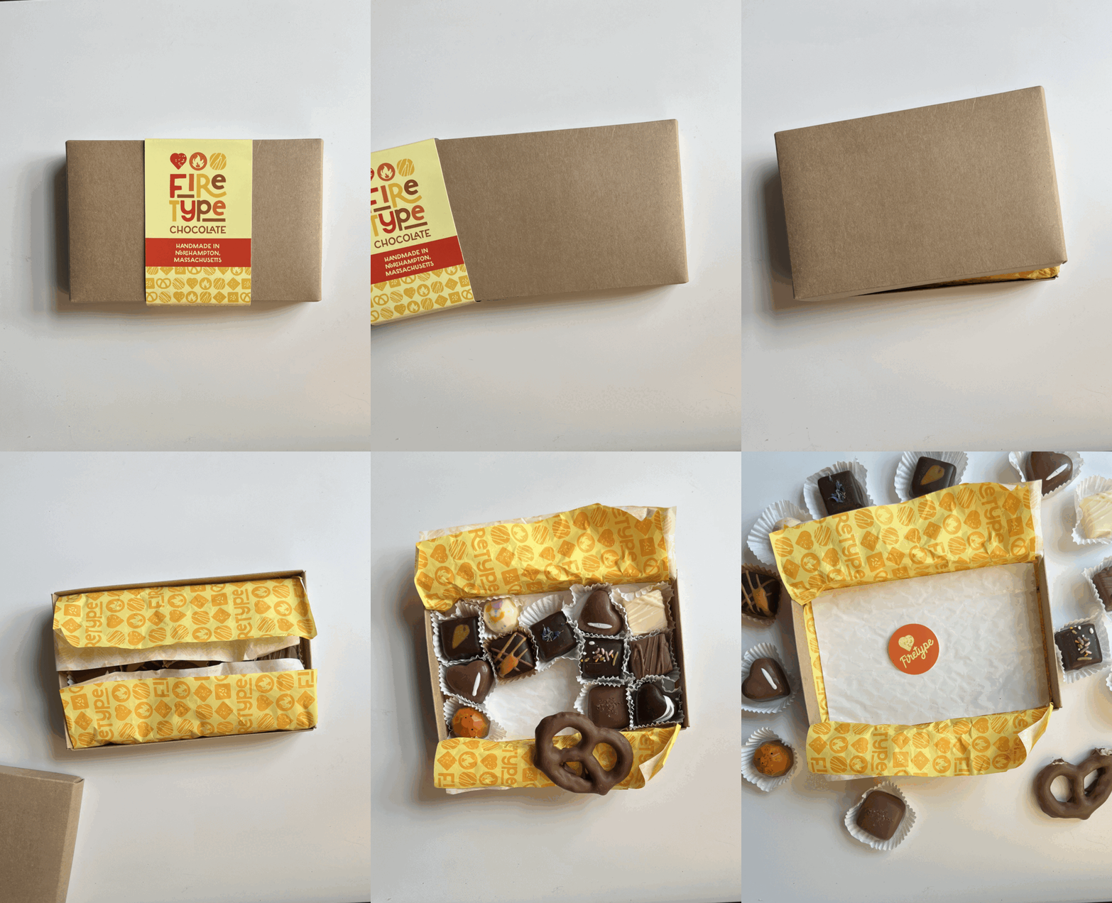
When it came to expanding the brand and applying it to packaging, this is one of those projects where it all just flowed. Those little chocolatey minions, bright colors, Dan’s sense of humor, and all of the fun details that make this shop unique made for a rich story to illustrate.

I love chocolate so yes this was a fun one for me - but really, it was Dan who made this one a blast. He was so open to my ideas, his witty email correspondence remains unparalleled within the depths of my inbox, his Instagram captions are savage, and he really does make a mean peanut butter puck - not to mention a mean peanut butter miso. Need to try for yourself? Obviously you do. He ships confections nationwide from the Firetype website, and you can’t beat stopping by the booth in Thornes and just eating a dozen on the spot. Highly recommend. Happy Chocolate Season!

Branding: 25 Central

Surely every Western Mass Girl remembers her first visit to Thornes Marketplace, babysitting cash burning a hole in that knock-off Coach bag. I think I was in eighth grade or so, and a whole new level of cool christened me as I pushed open those swinging doors and shuffled down the creaky hallway - this was no Holyoke Mall. I remember following my gaggle of friends straight to the back corner of the first floor - there was a fall dance on Friday and we were going to 25 Central.

25 Central never lost its cool factor. Whether it was a flirty dress, a quirky scarf, or a little bling - there was always something to catch my eye when I visited the shop here and there over the next two decades of womanhood.

So, when Katie - the shop’s fabulous proprietor - called me up back in the spring with some big news, middle-school me did a happy dance.

25 Central was making a big move over the summer - straight out to Main Street. Katie had taken ownership of the Northampton shop about five years earlier, and had been working on growing the brand, expanding the inventory, and keeping things young, hip, and fresh. 25 Central has been around since the 80’s, and Katie’s hard work was feeling hidden way in the back of Thornes. She found the perfect storefront, signed on the dotted line, and her next big project was a rebrand. I couldn’t have been more excited!

When Katie and I chatted about the look and feel of 25 Central over the years, there was one iconic element to the scattered branding that customers knew and loved: the store’s leopard print shopping bags. This gave me an idea that I was thrilled Katie was willing to run with:

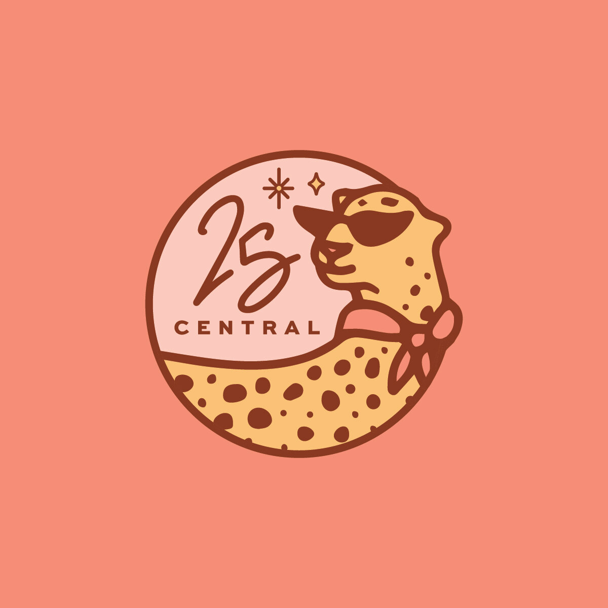
25 Central Logo - Full Color.jpg

This chic leopard. She was going to be the mascot for our brand, and help bring some well-deserved attention to the new 25 Central.

I let the rest of the branding be inspired by Katie’s bubbly personality. Her enthusiasm is what makes the store a truly fun place to be, and it’s what keeps customers coming back. She always has a great recommendation, knows how to brighten every shopper’s day, and was always telling me, “it needs more sparkle!!!!!” If that doesn’t sum up this brand, I don’t know what does.

25 Central - So Good - Full Color 2.jpg
25 Central - Round Logo - Full Color on Pink.jpg

We made some cute business cards, a gift card, and bunch of fun stickers…

Business Card Mockup.jpg
gift card mockup.jpg
Sticker Mockup2.jpg

…and the crown jewel: the storefront sign. We defied the downtown Northampton regulatory odds in making this giant, sparkling, party of a sign, and I am so glad we did. It’s bring the fun back to Main Street. Big thanks to Porcupine Signs for helping us bring this to life.

25 Central Sign.jpg

I love the way this brand came together because it exudes the personality of a business without reservation. It celebrates the shop’s beloved customers and the vibrant community it lives in, and gets everyone around it excited.

Thank you for an AMAZING project, Katie and 25 Central!!!!!

Branding: Summer on Strong

There’s nothing like the feeling of being right at the edge of summer, the whole glorious sunny season an expanse stretching out in front of us. This year I think it feels particularly exciting - pandemic restrictions are being lifted, we’re holding loved ones close again, going out for dinner and drinks, and it kinda just feels like everyone is ready for a big party.

Businesses on Strong Avenue in Northampton were picking up on that vibe, and wanted to give locals an opportunity to safely celebrate this summer. Together, they pitched a brilliant idea: close Strong Avenue to traffic and fill it with good food, live music, and happy people all summer long. It got the green light, and Familiars, The Eastside Grill, Local Burger, Progression Brewery, Homestead, and Mulino’s turned their block into a little slice of downtown summer paradise.

And I got to do the branding! We wanted to shout this celebration from the rooftops, and give it a real summer block party look and feel. I also really wanted to make this specific to Strong Avenue, and celebrate the local businesses that were coming together to make this all happen.

Summer on Strong Launch Graphic.jpg

The primary logo is a little composite landscape of many of the iconic buildings on Strong Avenue that these awesome businesses call home: Familiars’ cute dining car, the deck at Mulino’s, those stairs going up to Local Burger, the little peak and awnings of The Eastside Grill, the bike trail…it’s so Northampton.

Summer on Strong - Horizontal Logo - Full Color.jpg

This secondary logo really celebrated the outdoor dining atmosphere that’s at the center of this event: a little bistro table and chairs in the middle of the street, under shady trees and string lights. Wouldn’t you want to make a reservation?

Summer on Strong - Oval Logo - Full Color.jpg

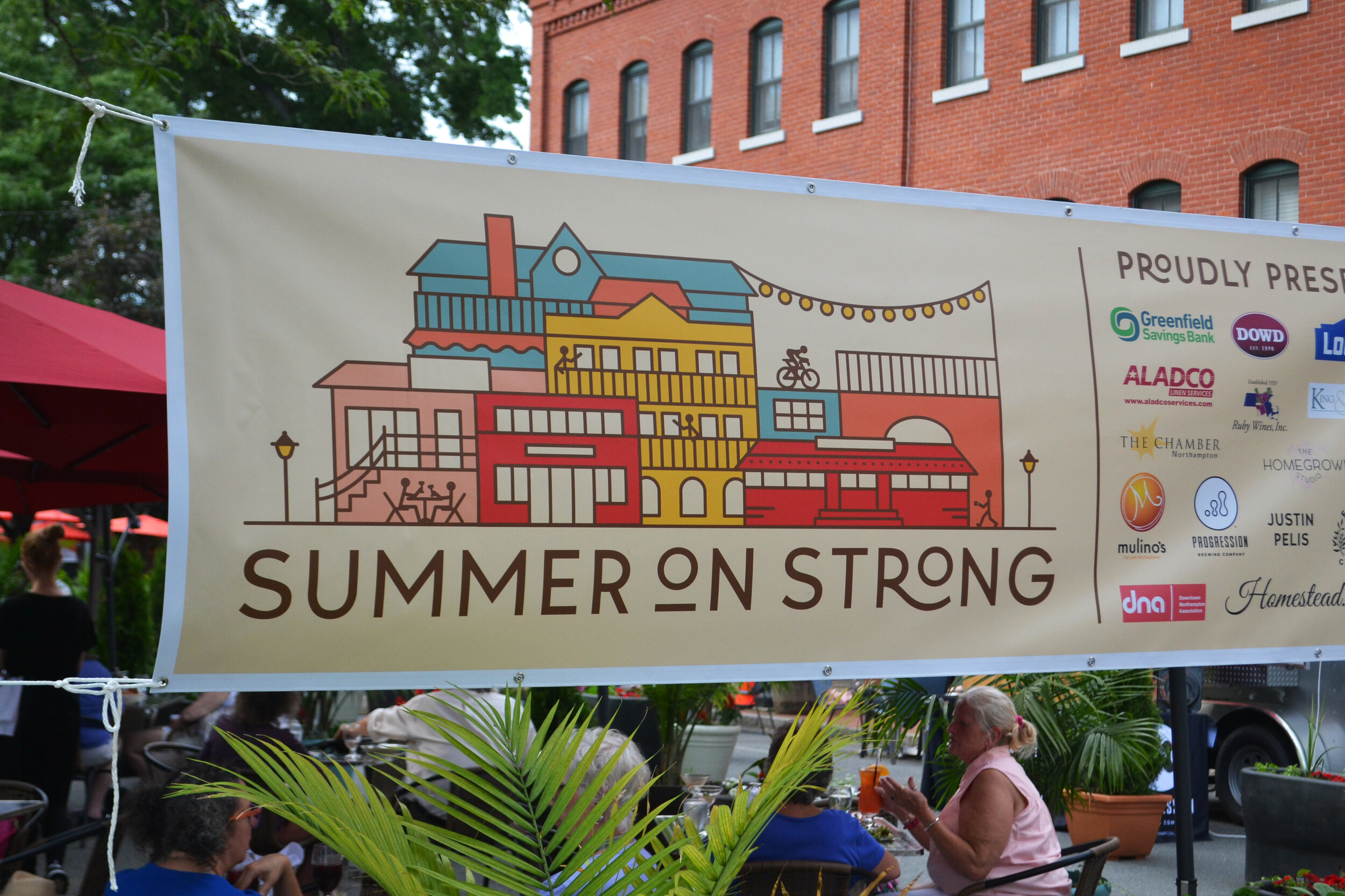
From there we made banners, posters, postcards, and social graphics to get the word out - and it’s working! The street is bustling with diners, dancers, and locals just happy to see one another again. It’s a beautiful thing.

Summer on Strong Postcard.jpg
Summer on Strong Lamppost 2.jpg
Summer on Strong Poster Mockup.jpg
Summer on Strong Banner 1.jpg

THANK YOU to the wonderful businesses of Strong Avenue and their generous sponsors for bringing this vision to life for the whole community - my thanks especially to Danny and Isaac of Familiars and Deb of The Eastside Grill for entrusting me with this one.

Happy Summer!

Branding: Familiars Coffee & Tea

When Familiars teased an opening in downtown Northampton back in January, I creeped their newly launched Instagram account and became immediately jealous of whoever got to do their branding. They were opening shop in a vintage red dining car steeped in charm and history, they had this mysterious, intriguing persona already well established, and their coffees and teas were high end and just plain sexy. My branding wheels turned.

Familiars went on to establish a pretty sweet business and I visited in the spring, when Cara Totman and I met to talk about her big branding project. I lusted after Familiars further, seduced by the absolutely gorgeous renovation the old dining car had undergone. It was dripping in vintage hardwood harvested from a Holyoke mill. Ugh. So good. I continued to brand subconsciously.

A few months later I launched Cara’s fancy new branding, and in a fateful turn of events, Familiars reached out to me. They were likewise seduced, and wanted to talk about collaborating on their branding. Imagine my excitement!!!!

I sat down with the owners, Danny and Isaac, and knew right off the bat that this was going to be a fun project. They already had such a good thing going, now it was just a matter of turning their vision into something visual.

An interesting challenge came up in the shop’s namesake. Familiars, as I had interpreted it, of course references the comfort and familiarity of your regular neighborhood coffee joint. But here it also had a second meaning: familiars are the animal helpers of witches, assisting in spell casting and magic making. Traditionally, they take the forms of cats, toads, ravens, and hares. This resonated deeply with both Danny and Isaac, and the ultimate brand would communicate this while remaining approachable to all audiences.

I’m happy to say with a little work and a lot of sketching, the final logo struck that balance. Incorporating all four of those critters, the cat, toad, raven, and hare form a nice little crest flanked by coffee and tea leaves - also very meaningful.

Familiars Coffee & Tea Logo.jpg

There’s nothing I love more than when a logo carries personal meaning and mass appeal at the same time. It’s clean and attractive on the surface, but tells a complex and important story. This is a great example of that.

We pushed this even further in the branding, expanding into complementary sublogos, a jewel-toned palette, retro-hip illustrations and patterns, and clean, cool fonts. Each animal even got their own avatar!

Familiars Launch 2.jpg
Familiars Coffee & Tea Pattern.jpg
Familiars Launch 6.jpg
Familiars Launch 4.jpg

Another big challenge with this branding project was the physical location itself. The vintage red dining car Familiars calls home is a huge presence; she carries her own memories, stories, heritage, and associations that precede Familiars the business, and linger here and there in the minds of customers. We wanted to honor that heritage, but also reclaim it. Familiars is no diner. Familiars ain’t stuck in the past. Familiars offers high quality products, friendly service, a little art, a lot of culture, and always a connection waiting to be made. It’s something the dining car hadn’t quite seen before.

So do we incorporate the iconic dining car, or no? We chose to own it, but in a more subtle way than smack on the logo. A stylized illustration of the car graces some of our branding materials, complementing our woodland helpers and adding to the overall intrigue. Check it out on the postcard! Greetings from Northampton!

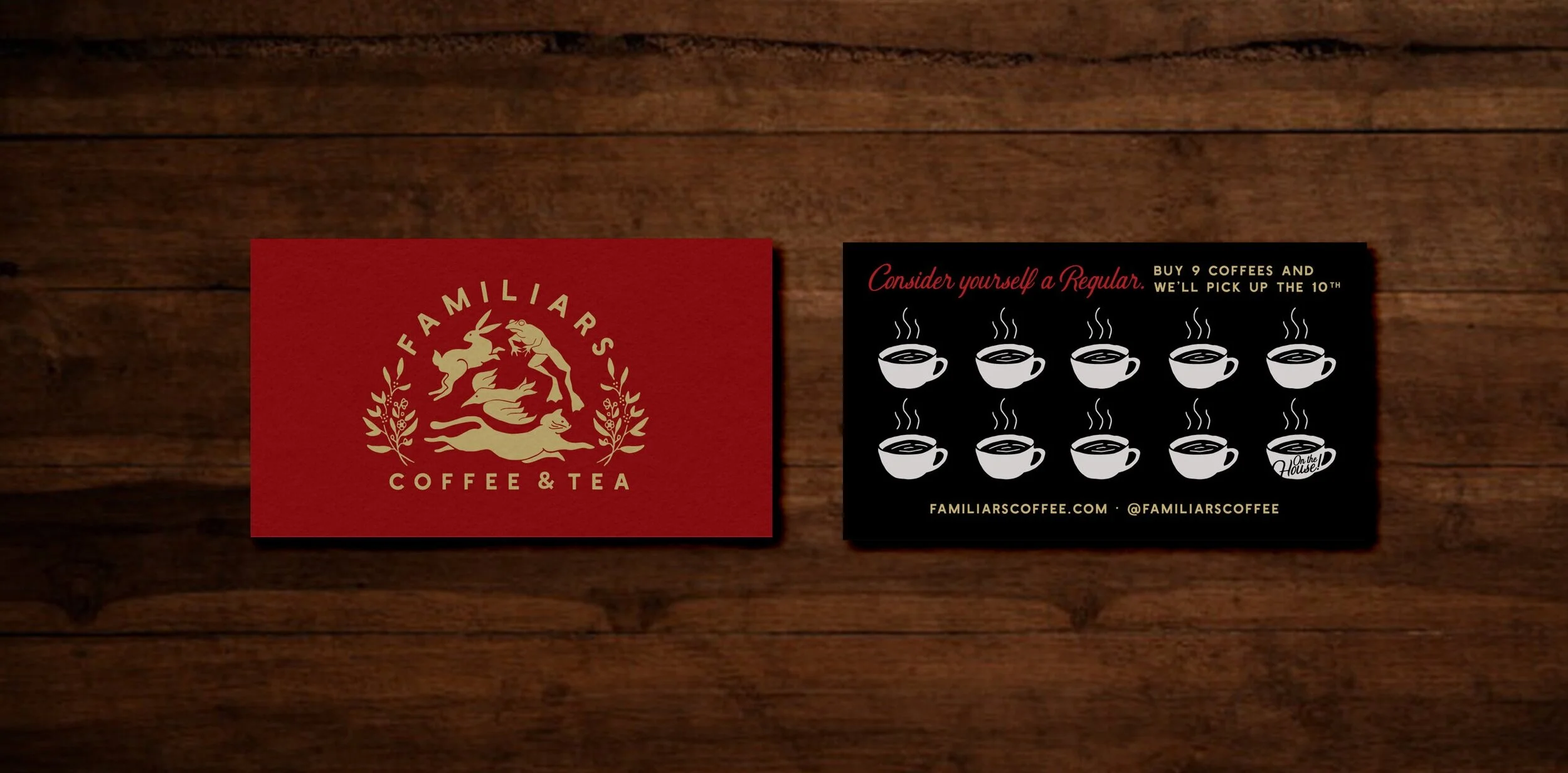
More fun details came through in the form of gold foil business cards, a fun loyalty card, and finally, a big beautiful website. The elements really came together at their best here, fully showcasing all the mystery and magic while welcoming all with open arms.

Familiars Coffee & Tea Business Card.gif
Familiars+Print+Suite+-+Lpyalty+Card+Wood.jpg

This was a project all about balance and finesse, and I’m psyched with the results. Danny and Isaac were a dream to work with, and I’m so grateful they really let me run wild with the vision on this. Can’t wait to see this brand grow and flourish with their business - I hear there’s merch coming soon!!!

A Quick Escape from Winter

Winter on the farm means pulling on my heavy insulated overalls, breaking through frozen water bucket after frozen water bucket, lugging hay out to barren pastures, and a host of other frigid, less-fun chores that often leave me dreaming of a warmer escape. Luckily there is one nearby that I can always count on, offering chilled bones and runny noses some tropical humidity, lush flora, and soft white light from every direction. That's the Botanic Garden at Smith College.

IMG_1078.JPG

I spent the 20 degree morning on Saturday getting the horses set up for the day out in their frosted pasture (they don't mind), and arrived home chilly but game to finish a little last minute holiday shopping with Jake in downtown Northampton. The weekend before Christmas, you can imagine the chaos. Pushing through Thornes at noontime I was still pretty frozen and feeling sleepy. We made the executive decision that the only good, right place to be in that town at that moment was the Botanic Garden.

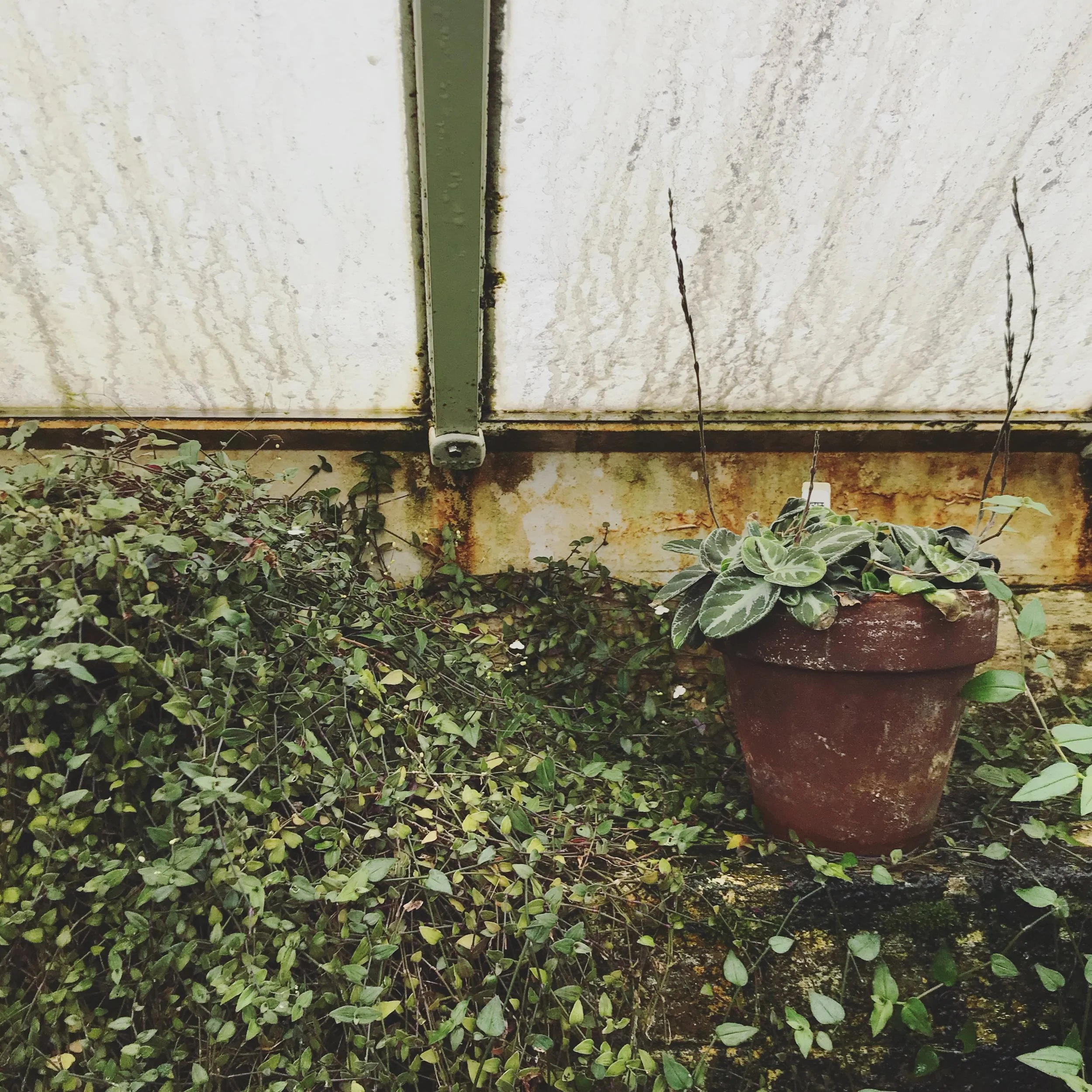
Passing through the first door to the Warm Temperate House, the first deep breath of dewy air is like a drug. How had we forgotten August so quickly? Layers are shed in the heat, attention turned to the omnipresent plant life. Every shade of green, every strange variety, blooming from the ground, creeping along walls, and cascading from the ceiling. 

IMG_1075.JPG
IMG_1074.JPG
IMG_1053.JPG

The greenhouses became a labyrinth, and we wandered along the paths from glass door to glass door. The stillness was such a relief after being caught up in a swell of panicked shoppers downtown, plants oblivious to the number of days until Christmas. 

IMG_1054.JPG
IMG_1077.JPG

I felt so much better after submerging in that tropical cleanse for an hour, fingers, toes, and mood thoroughly defrosted. Green plant life, natural light, and warmth are actual medicine. (The happiest of memories are too. Jake and I went to the Botanic Garden on our first date.)

IMG_1076.JPG

This winter, don't forget about the Botanic Garden. Treat yourself to a little time in there and suddenly spring won't seem so far away.