Branding: Firetype Chocolate
/Late October. We are right on the precipice of prime chocolate-eating season: that delicious stretch of time that spans between Halloween and Easter when every holiday-shaped chocolatey peanut butter treat is more than well justified. It brings me peace.
And so what a TIME to launch what must be our funnest branding project of 2022. Over the summer, Dan, who runs that wonderful chocolate shop kiosk in Thornes fka Heavenly Chocolate, reached out with big exciting plans. He had taken ownership of the long-standing business about two years prior, and was feeling ready to spread his wings and make the shop all his own - carrying forth all of the heritage and tradition of handmade chocolate we know and love, but with an exciting new twist. It was high time for a total rebrand - how I love those sweet words.
“What’s the new name?” I asked
“Firetype!” Dan said with confidence.
Hmmm. An interesting choice indeed. Certainly a departure from “Heavenly Chocolate” to say the least. I politely asked my new client Dan to tell me more, please.
So, Dan is into Pokemon. I mean yes I am too but Dan is really into Pokemon. He explained the spicy nature of Fire-type Pokemon, and how it relates to his own approach to running the shop. He also talked about the larger mission of this business beyond delicious handmade chocolate, in which he strives to always do right by his employees and make a positive impact on our community. I bought into the new name 100% by the end of our chat. There’s nothing I love more than a brand that carries deep personal significance, but remains approachable and appealing to the masses. My absolute favorite kind of design challenge.
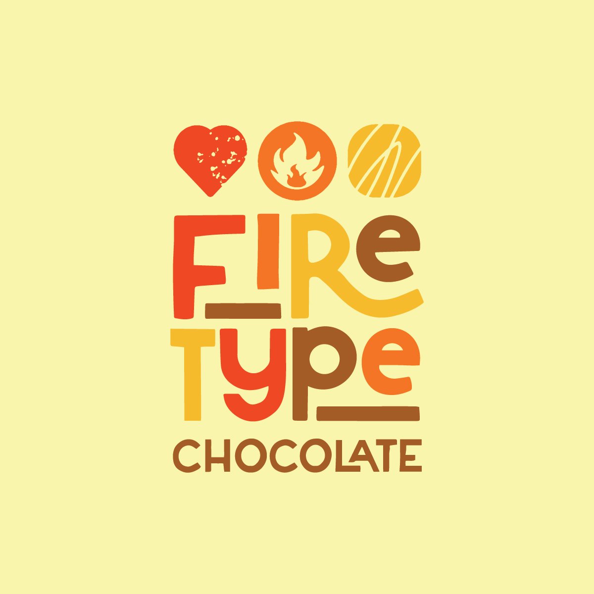
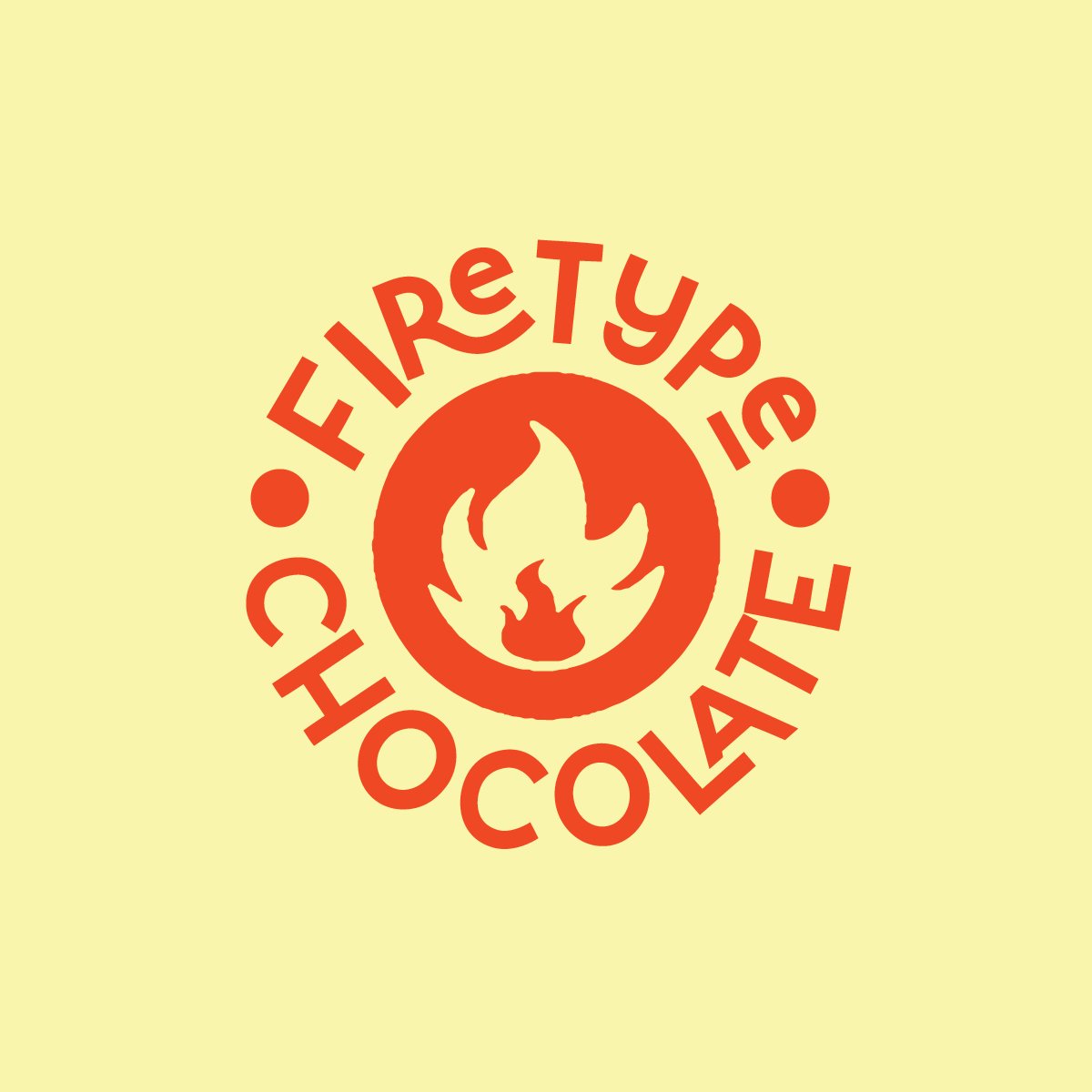
So, we set out to create a Pokemon-inspired brand for a chocolate shop. Here’s what we came up:
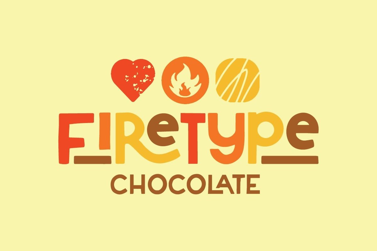
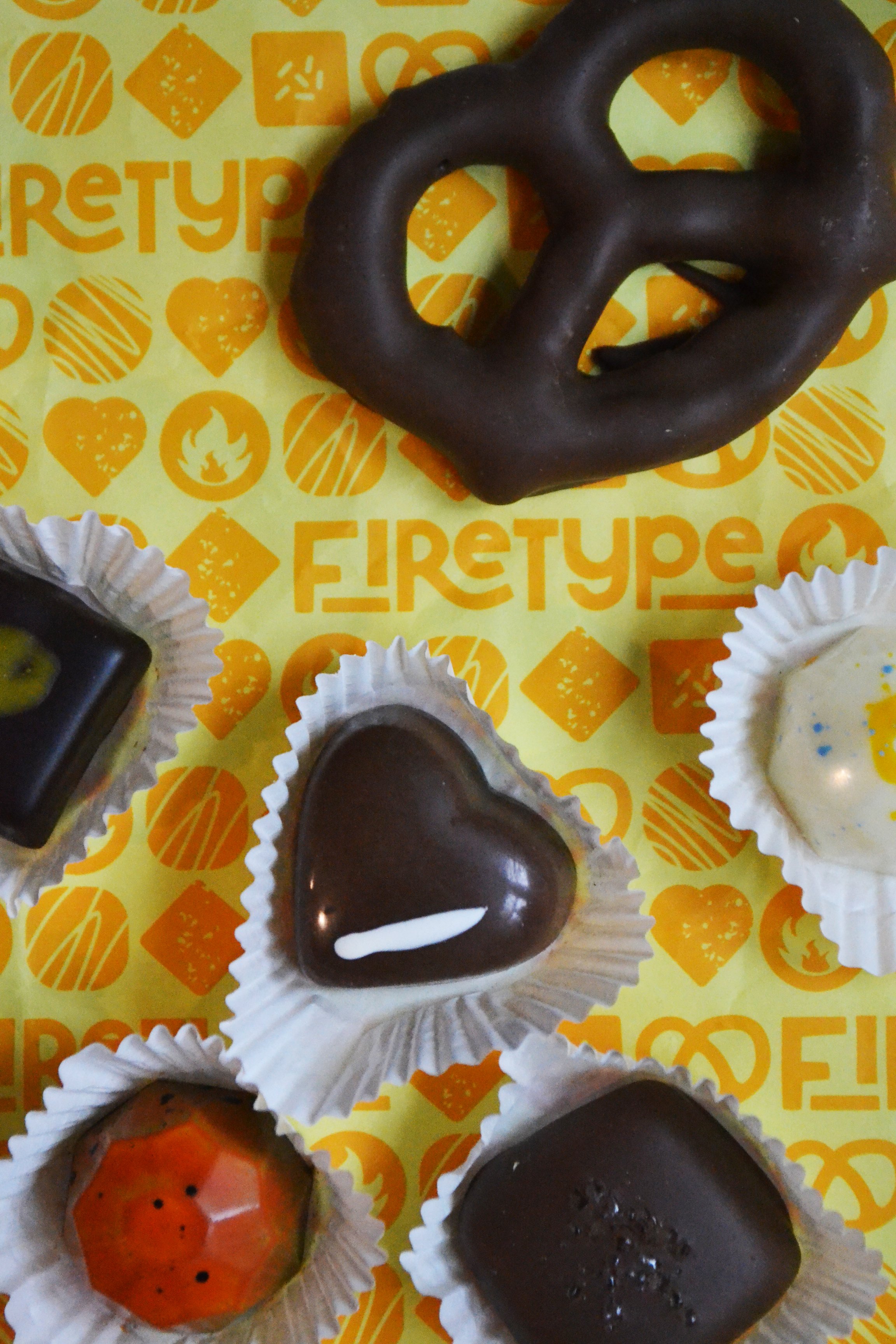
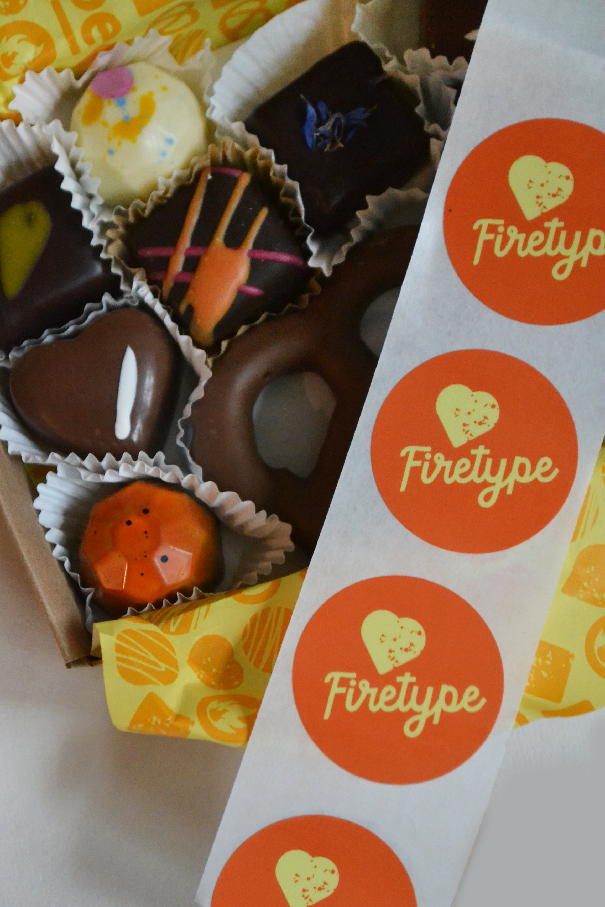
For the main logo, we worked a Firetype symbol in between two favorite chocolate shapes - which opened up a whole world of possibilities for these cute little chocolately icons. They are perched atop fun, bold, slightly wonky lettering, which gets even a touch more chaotic with alternating fire-y colors. It all fits together nicely though - and feels surprisingly balanced.
When it came to expanding the brand and applying it to packaging, this is one of those projects where it all just flowed. Those little chocolatey minions, bright colors, Dan’s sense of humor, and all of the fun details that make this shop unique made for a rich story to illustrate.
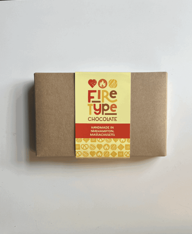


I love chocolate so yes this was a fun one for me - but really, it was Dan who made this one a blast. He was so open to my ideas, his witty email correspondence remains unparalleled within the depths of my inbox, his Instagram captions are savage, and he really does make a mean peanut butter puck - not to mention a mean peanut butter miso. Need to try for yourself? Obviously you do. He ships confections nationwide from the Firetype website, and you can’t beat stopping by the booth in Thornes and just eating a dozen on the spot. Highly recommend. Happy Chocolate Season!