Brand Refresh: Florence Pie Bar
/I remember when I first discovered the Florence Pie Bar, probably around 2014ish, fresh out of college. It was definitely one of my earlier perceptions of good local branding: the name alone intrigued me, the handmade pies filled with local ingredients were picture perfect, and the little Accidentally Wes Anderson building just begged to be Instagrammed. It was more than a place to buy a pie, it was a feeling. That feeling resonated widely, as the bakery quickly became an iconic spot in Western Massachusetts, drawing visitors from miles away and the neighborhood regulars alike.
What happy news when we heard that our good friends at Familiars Coffee & Tea were to become the new proprietors of The Pie Bar - and how honored we were to be asked to collaborate on a brand refresh for the business. This definitely felt like a bit of a delicate job; it was top priority to maintain that feeling customers had come to know and love so well - after all, the recipes, location, and pies weren’t changing - but it was also important to announce this new chapter, highlight expanded offerings, and most fully tell the story of a beloved local bakery.
The logo was first to be considered. The original font and brand colors held up, but we needed a more visually balanced and versatile layout to work across a variety of applications:


A round stamp-type mark did the job, complete with a hand drawn pie. This set the tone for some expanded branding, as we created a whole new toolbox of elements to tell the Pie Bar story.
Secondary logos made the branding even more versatile…

And you can bet we were ready to go crazy on illustrations here. Spoons, whisks, bowls, hand pies…


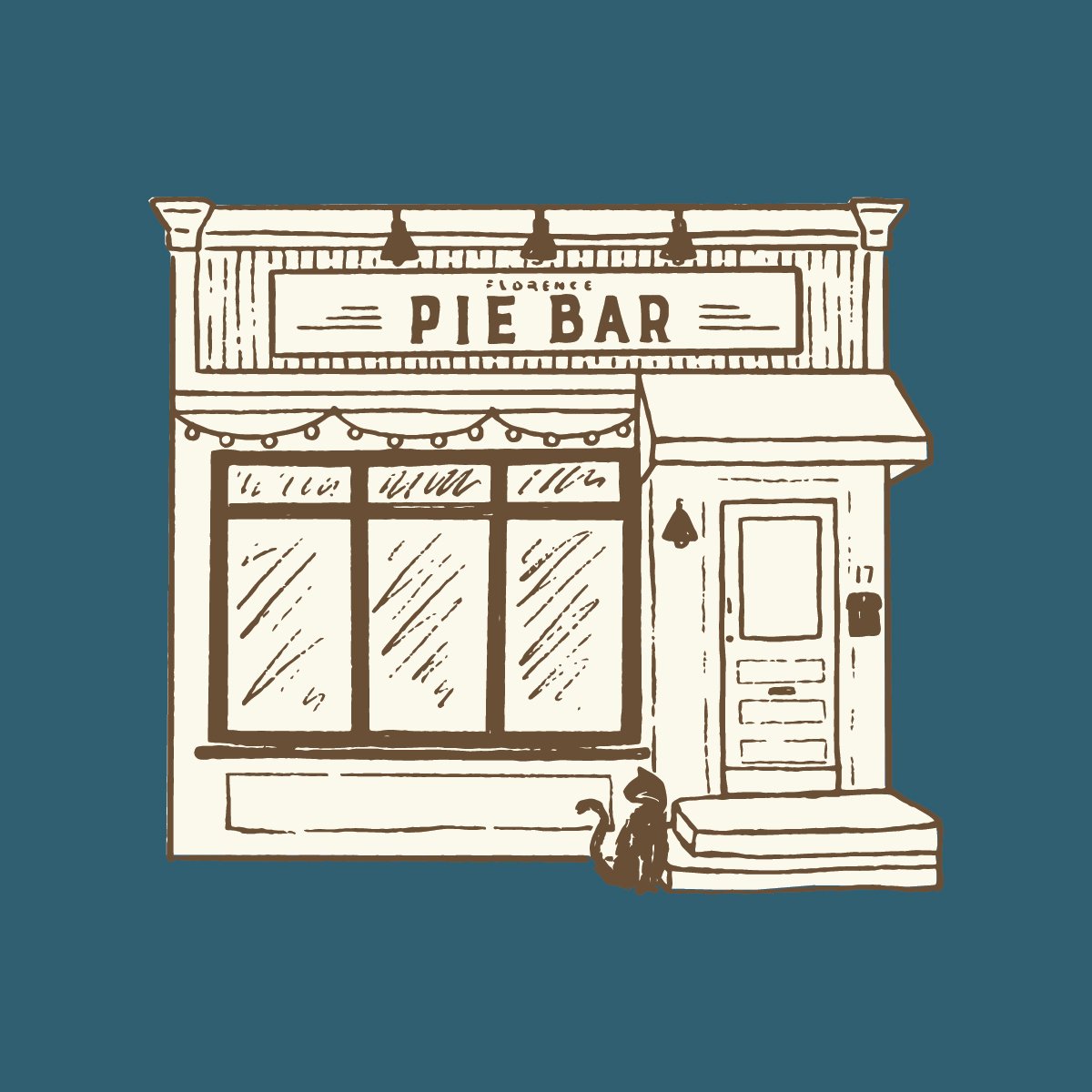
of course the iconic storefront…
…and obviously some tattooed Pie Ladies. Obviously! It’s a whole gritty sexy retro-glam vibe, inspired by the badass baker herself.

We threw around lots of punny pie taglines but it came down to some pretty direct verbiage:

After all, MORE PIE IS BETTER!
Applying the polished up branding, there were some practical matters to attend to. The Pie Bar has posted a daily menu on social media since always, which customers have become accustomed to checking before their visits. We gave that a serious glow up, fully branding the template while still keeping it simple enough to easily update daily.

The pastry cases needed cute labels highlighting daily confections and pie flavors, so a template was made for those as well:

And, the cherry on top: a full color coffee sleeve featuring all of the illustrations. The back features a neat little area for writing in the customer’s name or a cheeky little note.

Finally, we incorporated this branding into a delectable website, fully telling the story of The Pie Bar, showcasing all of their offerings, and clearly directing to online orders in a user-friendly manner.

Like I said, this project was a distinct honor to be involved in, and we are absolutely thrilled for our friends Danny & Isaac in this wonderful new expansion. Go check out the refreshed Pie Bar as soon as you possibly can - we can indeed confirm the chocolate pecan pie alone is truly a whole feeling.


