Branding: Tip Top Wine Shop
/Easthampton has become very cool in the last decade or so – we have so many favorite spots in that town these days. One thing it was lacking was a very cool wine shop; a void that Lauren Clark and Miranda Brown fortunately recognized and decided to address. We were thrilled for good wine – and even more thrilled to create the branding for this shop.
This weekend was the grand opening of Tip Top Wine Shop over in the Paragon Arts & Industry Building and it was so fun to see it all come together.
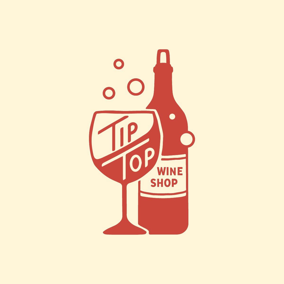
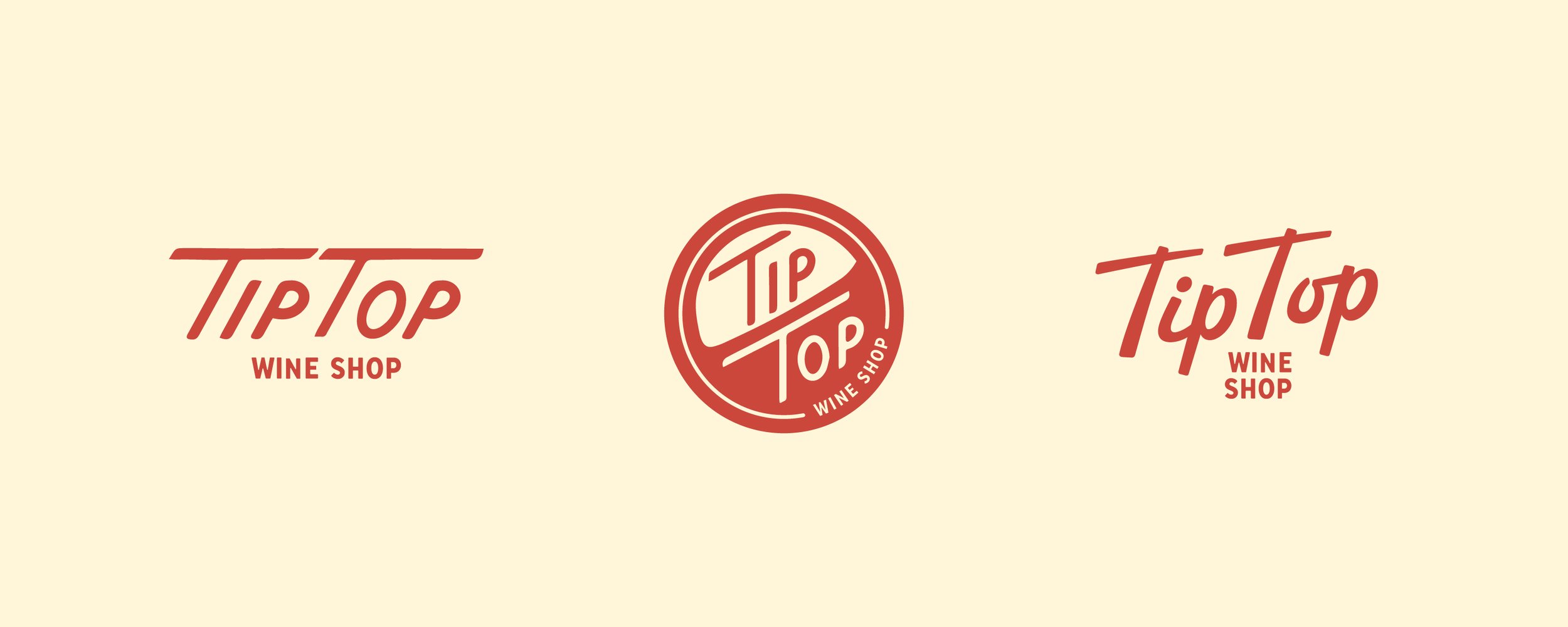
The primary logo set the tone for the project right away: retro, but not too retro. We pulled a lot of inspiration from vintage cocktail napkins, neon signs, matchbooks, and old print ads – and then modernized it all a bit.
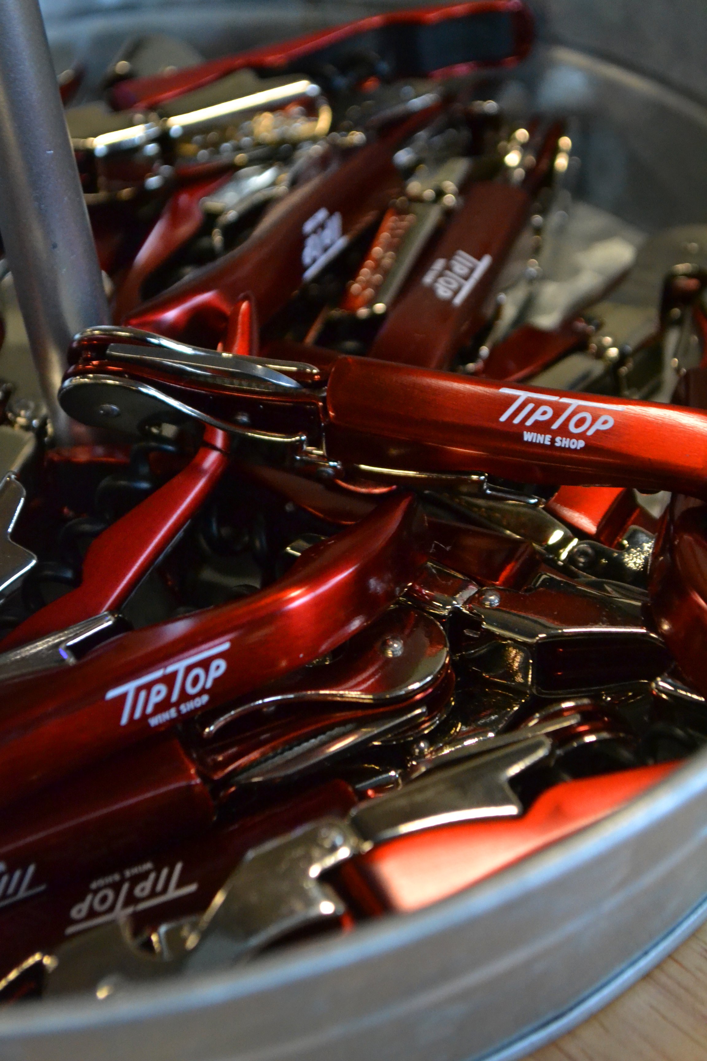
We made this brand nice and versatile with some secondary logo variations. The main “Tip Top” wordmark features my own hand lettering – something I’ve always been a little tentative with, but find I’m getting justtttt comfortable enough with to be dangerous.
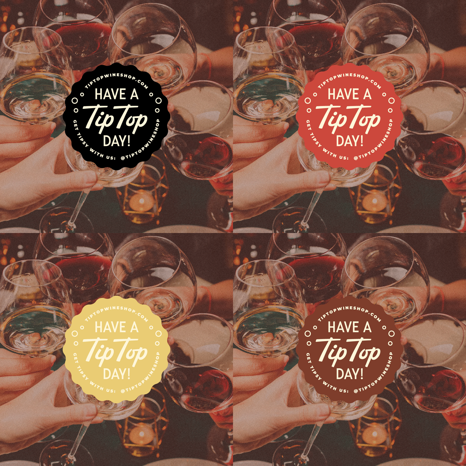
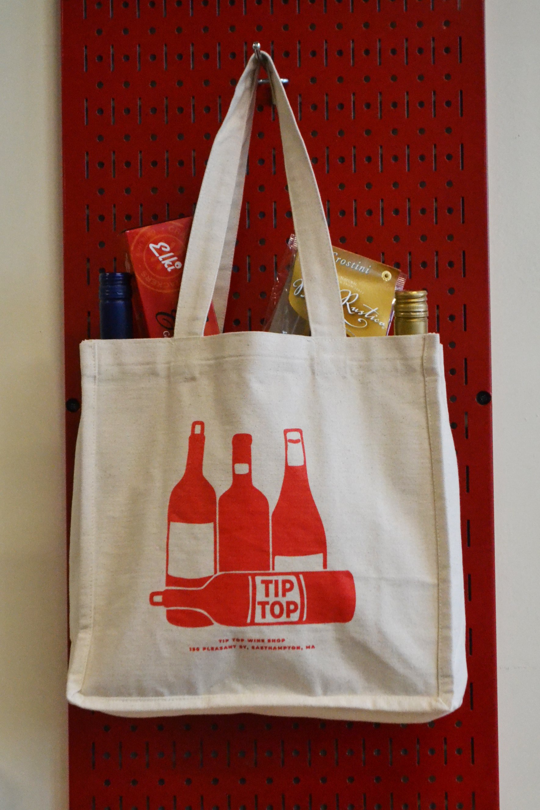
And then we went pretty wild building out all the fun little brand details. I think we could have gone forever on taglines, illustrations, etc. on this one.
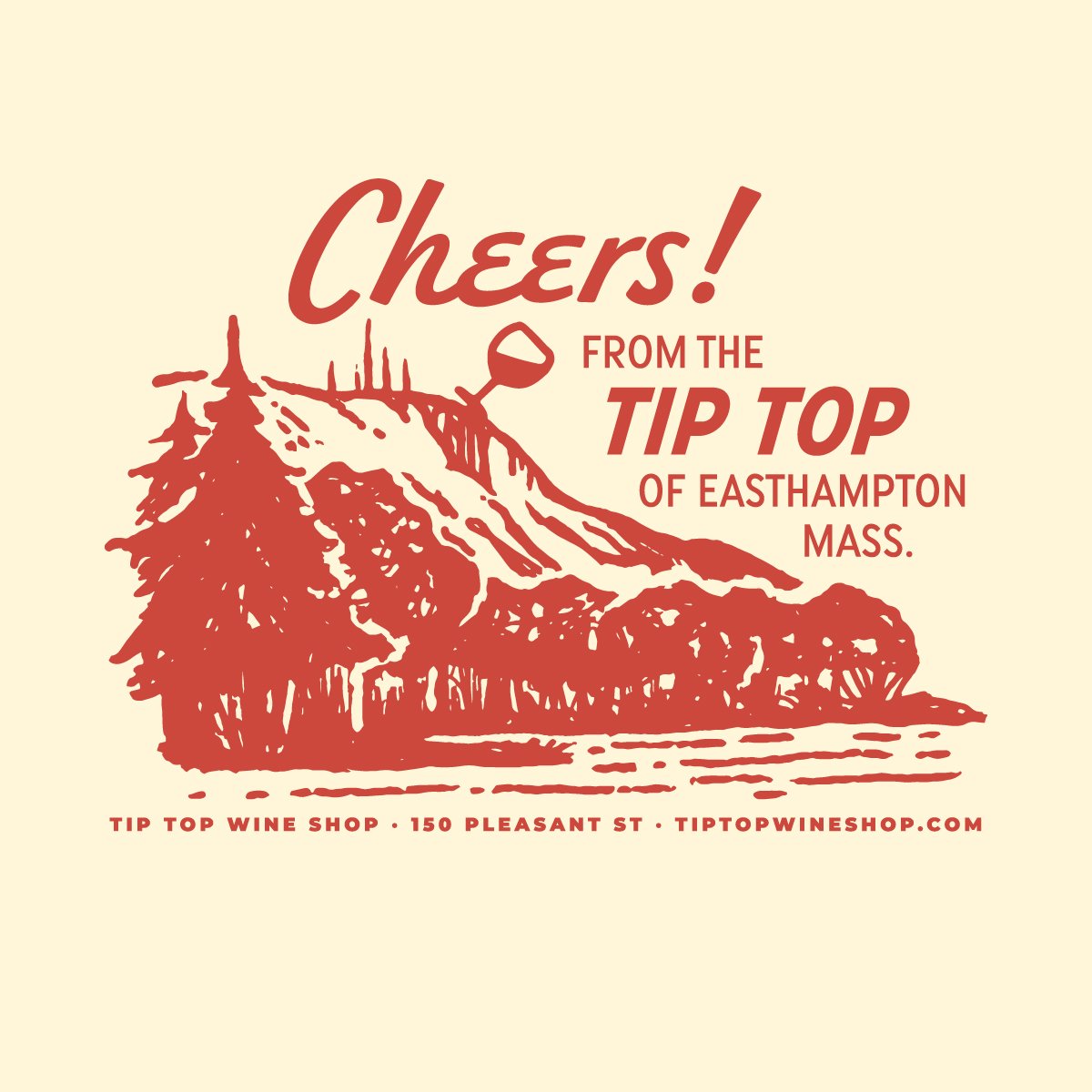
A little illustration of Mount Tom is by far our favorite element. The shop has a picture-perfect view of the iconic mountain, and we couldn’t resist adding in a little tipsy humor. Worked perfectly on merch!
A little humor became a theme actually, subtly sprinkled into just the right places.
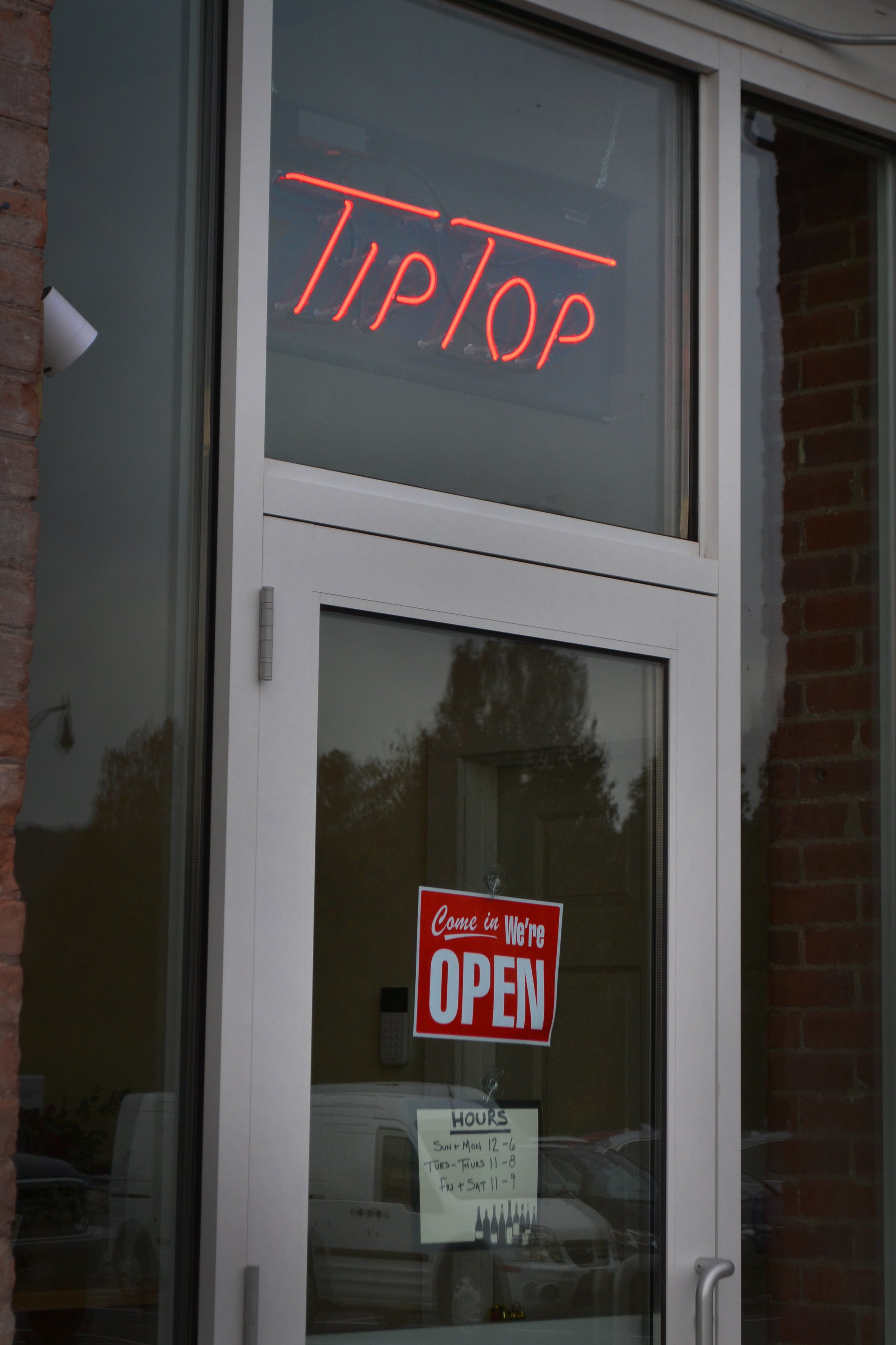
Application of these elements was awesome to see; our trusted collaborator Jess at Hired Hand Signs turned the logo into a stunning hand painted sign, and the wordmark suited a neon entrance sign just perfectly.
And this one just about did us in: a branded entryway mosaic!!!!!
The details really made this project special, and it was a treat to see them all come together in an exciting new space. We’re so excited for Miranda and Lauren, and for the Easthampton community - Tip Top is very cool. Stop in and find your new favorite wine!
