Branding: Tip Top Wine Shop

Easthampton has become very cool in the last decade or so – we have so many favorite spots in that town these days. One thing it was lacking was a very cool wine shop; a void that Lauren Clark and Miranda Brown fortunately recognized and decided to address. We were thrilled for good wine – and even more thrilled to create the branding for this shop.

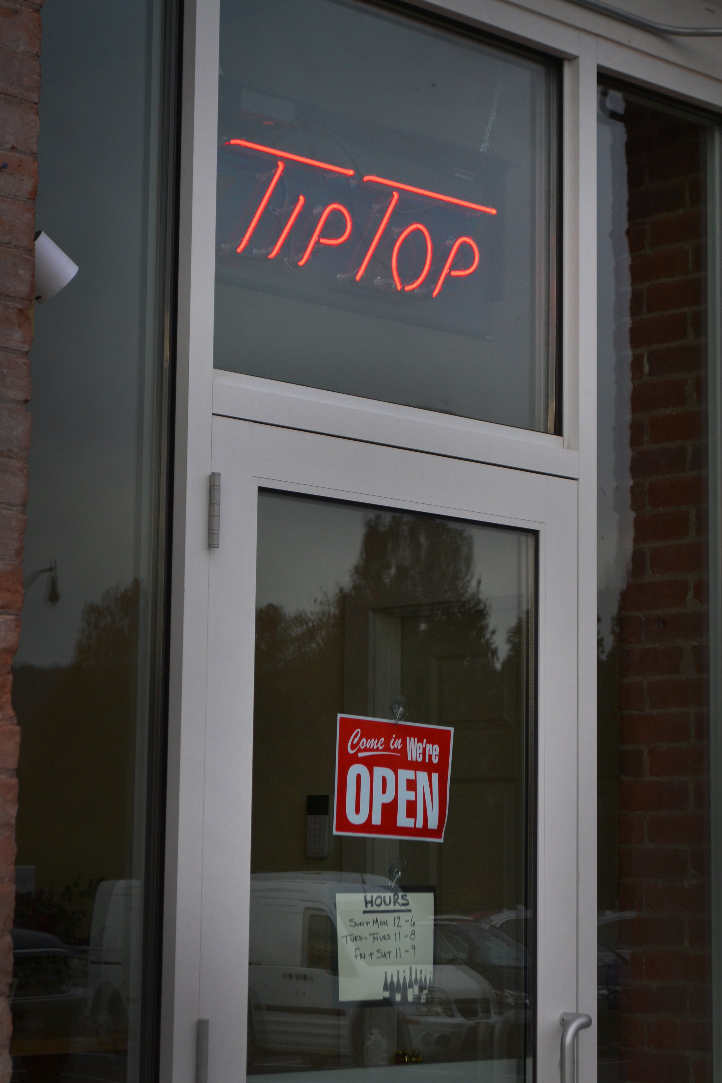
 This weekend was the grand opening of Tip Top Wine Shop over in the Paragon Arts & Industry Building and it was so fun to see it all come together.

The primary logo set the tone for the project right away: retro, but not too retro. We pulled a lot of inspiration from vintage cocktail napkins, neon signs, matchbooks, and old print ads – and then modernized it all a bit.

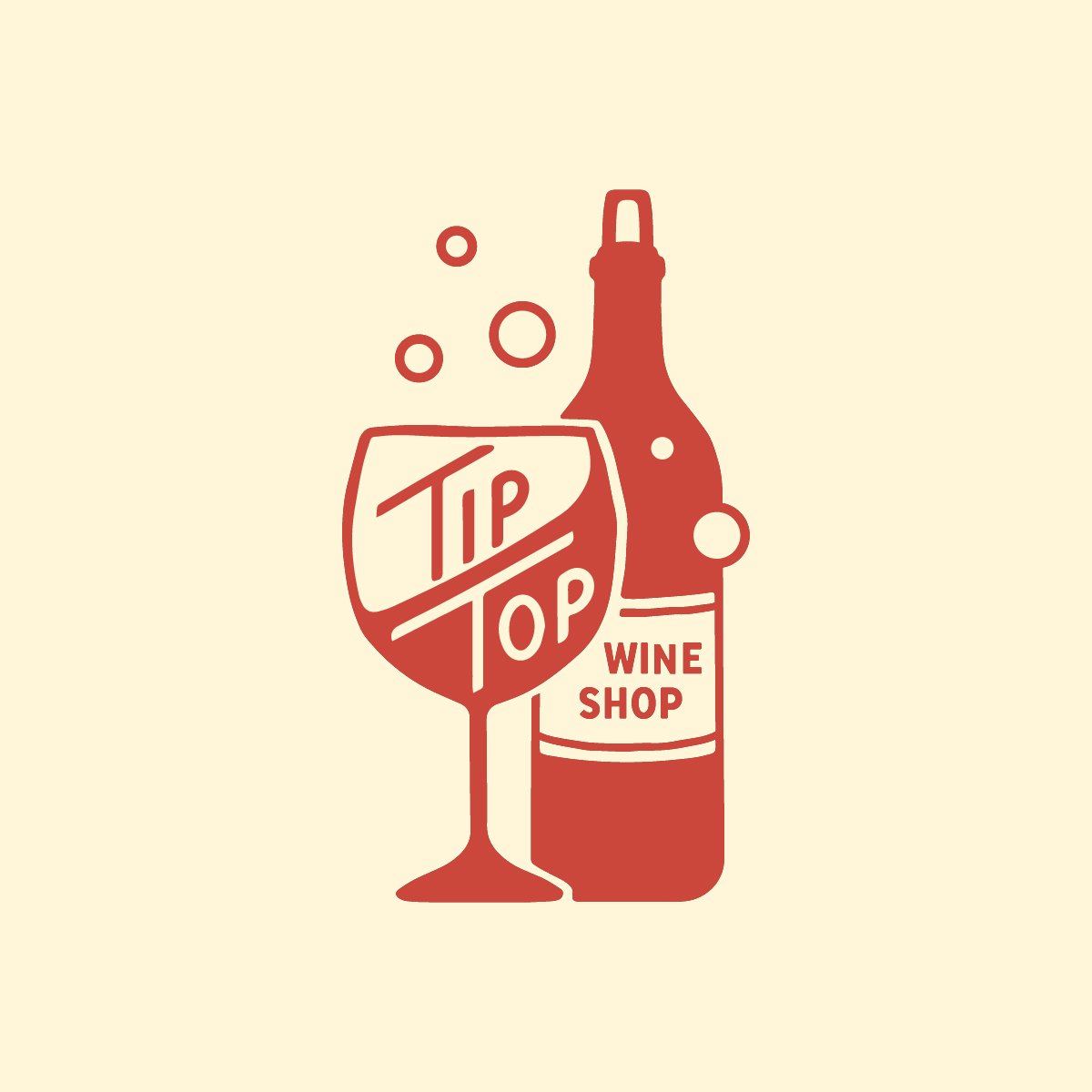
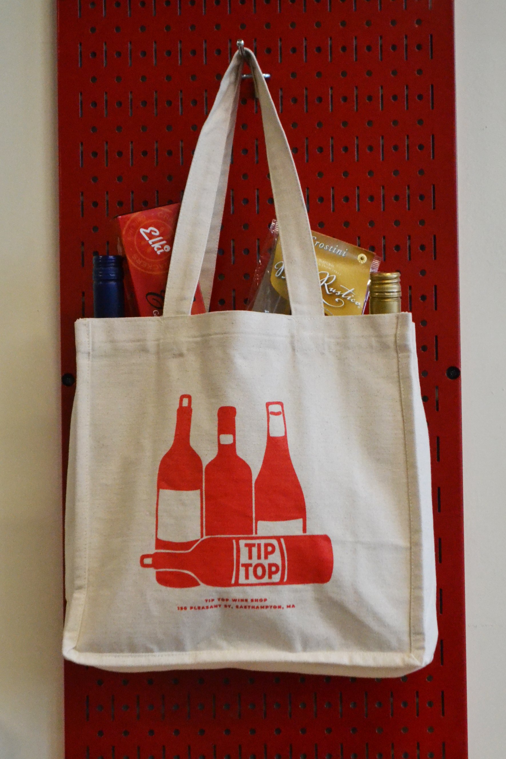
 We made this brand nice and versatile with some secondary logo variations. The main “Tip Top” wordmark features my own hand lettering – something I’ve always been a little tentative with, but find I’m getting justtttt comfortable enough with to be dangerous.

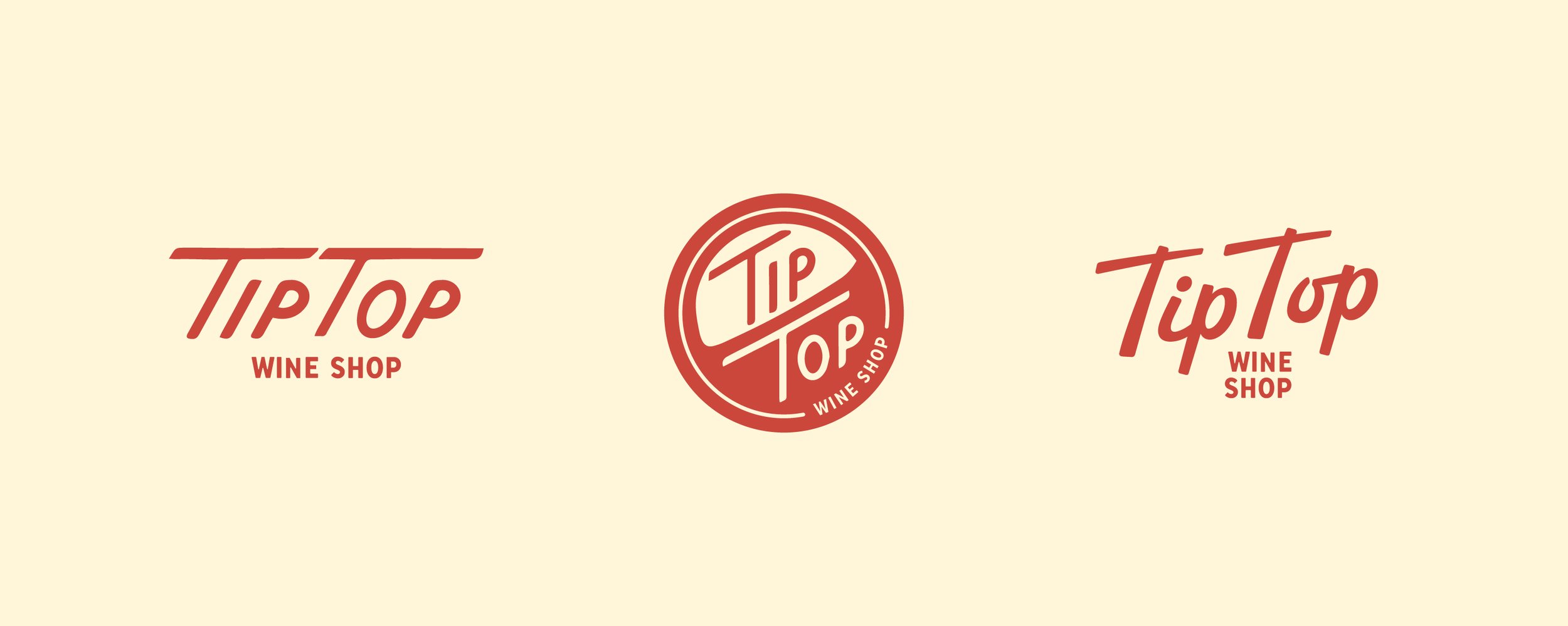
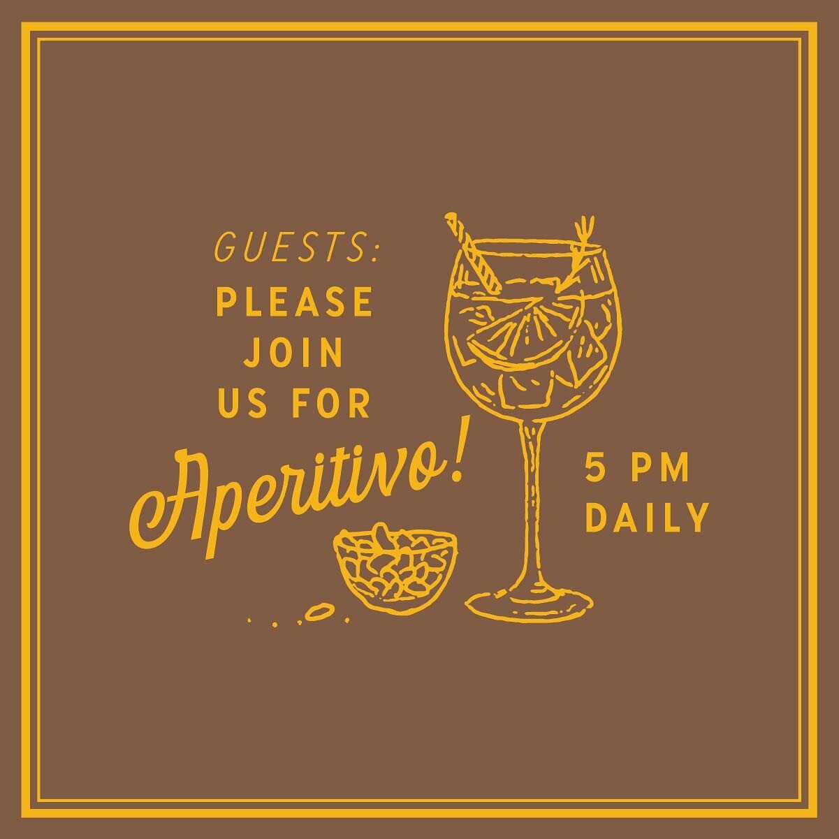
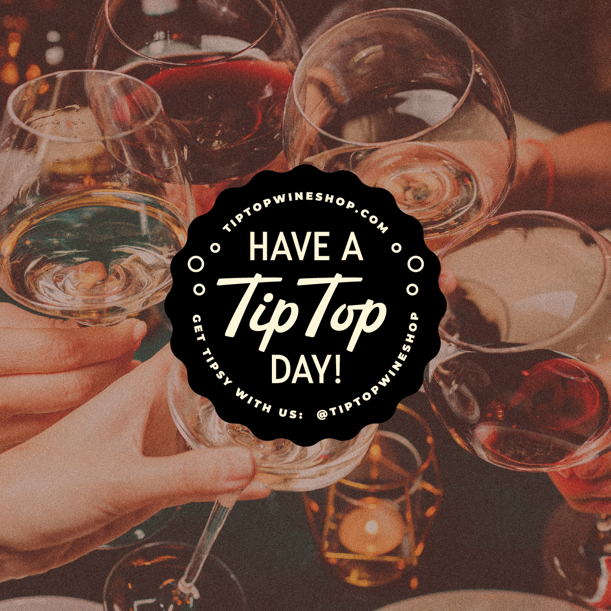
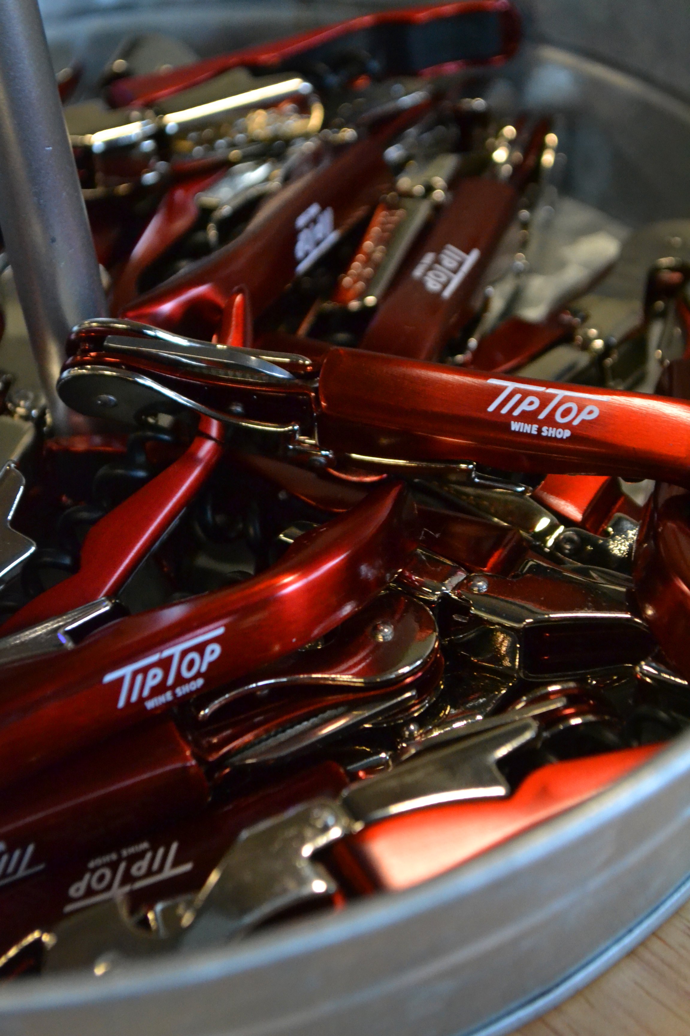
And then we went pretty wild building out all the fun little brand details. I think we could have gone forever on taglines, illustrations, etc. on this one.

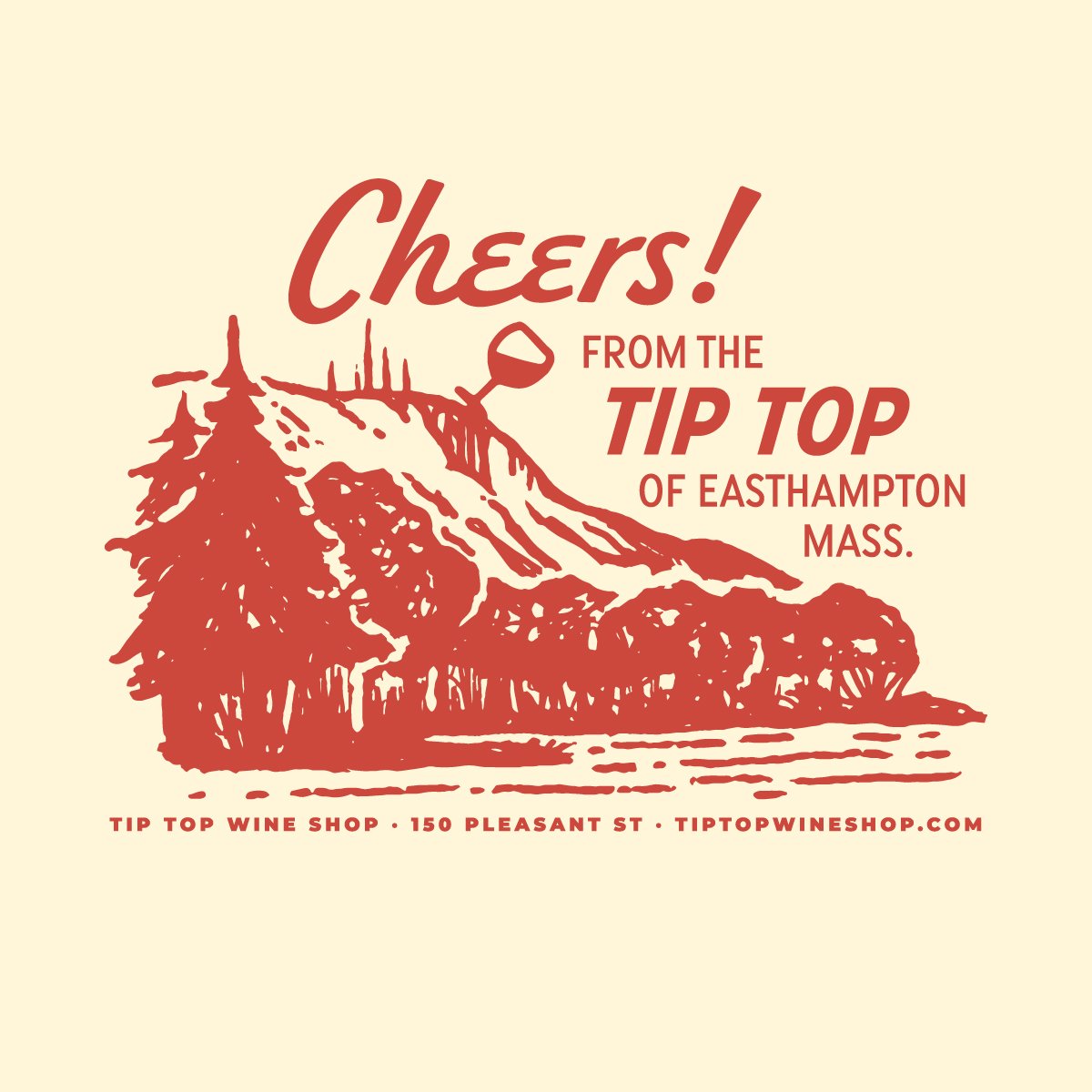
A little illustration of Mount Tom is by far our favorite element. The shop has a picture-perfect view of the iconic mountain, and we couldn’t resist adding in a little tipsy humor. Worked perfectly on merch!

 A little humor became a theme actually, subtly sprinkled into just the right places.

 Application of these elements was awesome to see; our trusted collaborator Jess at Hired Hand Signs turned the logo into a  stunning hand painted sign, and the wordmark suited a neon entrance sign just perfectly.

 And this one just about did us in: a branded entryway mosaic!!!!!

The details really made this project special, and it was a treat to see them all come together in an exciting new space. We’re so excited for Miranda and Lauren, and for the Easthampton community - Tip Top is very cool. Stop in and find your new favorite wine!

Branding: Finch Flower Co.

Flowers have certainly been a big theme for many of our branding endeavors this year – but there was one floral-themed project in particular that we couldn’t wait to get started on. Nina got in touch back in the spring with an idea that made us just giddy: an antique flower truck! She had just secured the keys for a 1957 Ford F100, and was ready to launch her dream business, Finch Flower Co, here in Western Massachusetts.

The image of locally-grown bouquets adorning the bed of this cream-colored vintage pick-up was nothing short of inspiring, and we wanted to complement that iconic look with branding that told the full story of a unique business.

Starting with the logo, it was all romance and floral wildness centered around a signature finch.

We built off that ethereal look and feel to both tell the story of the truck – affectionately called “Birdie”! – and create a memorable aesthetic. Secondary logos, custom illustrations, brand marks, monograms, call-outs, and a fun pattern all came together to do the job.

All of these elements were designed with application top-of-mind, as customer experience was at the center of the business. We wanted every interaction with the flower truck to be special and memorable, and looked to achieve that in the details of the bouquet packaging and truck adornments.

A custom A-frame chalk board and subtle, elegant truck signage made for a versatile and flawless presentation at events.

Gilded business cards really elevated the whole look and feel - there’s nothing like seeing your logo set in gold foil!!!

Custom floral tissue was a place where we really maximized the floral illustrations into a repeat brand pattern - and then subdued it just a bit by pairing it with a more neutral brown kraft paper.

It was fun to sprinkle our little finch throughout this brand!

The silk floral ribbon may be our most favorite element of this project - elegantly tying it all together, quite literally. Paired with a tag (which doubles as a mini business card!) each bouquet really delivers the full brand experience in a tasteful way.

We couldn’t have been more pleased with the way this brand came together. It has been so much fun to see Nina and Birdie out on the road this summer, at events and gatherings all over the Pioneer Valley. Follow her travels over on instagram and learn more about booking the truck for events on the Finch Flower Co. website - designed and developed by our trusted partner, Emily King at Wheel Horse Digital!

Thank you Nina for this incredible vision - it was a thrill to help bring it to life and we are so glad to have this gem of a small business in our community!

Branding: Little Farmhouse Flowers

Continuing right along with our flower farm themed spring - next up we have Little Farmhouse Flowers, tucked away in the Adirondacks of New York. Linda D’Arco is one-half of The Tulip Workshop, and saw an opportunity to further develop the brand of her own farm, too, considering how it had evolved and grown over the past few years.

Before she became a flower farmer and floral designer, Linda was a teacher, and she has found her passion for education and sharing skills resurfacing in exciting ways. Through Little Farmhouse Flowers, she offers the chance for other farmer-florists to discover ways to grow both their floral crops and their businesses, through initiatives such as workshop opportunities, the @littlefarmhouseflowerspro subscription, and one-on-one consultations.

As Linda shifts focus to these educational aspects of her business, we wanted to make sure her branding was communicating those values, and connecting with the appropriate audiences.

We started with a barn swallow, a long-standing symbol for Little Farmhouse Flowers, and evolved it into an eye-catching, versatile logo that expanded nicely into a larger brand that really tells the full story of the farm.

The pattern is one of my favorite elements from this project - and works so well on kraft floral wrap.

We also created elements specifically for Linda’s signature workshop, The Cold Climate Rose Grower’s Program - including a ‘Rosarian’ badge that became fun stickers for flower farmers who completed the workshop!

Thank you Linda for such a fun and inspiring project! We love to see farms thinking about how their skills are shared and passed down - and Linda is doing that in a really inspiring way. Check out Little Farmhouse Flowers and follow all of the floral beauty over on Instagram to learn more.

Branding: The Tulip Workshop

It’s always pleasant to work on flower farm brands, but it is particularly satisfying to be drawing nothing but flowers right on the cusp of spring. We’ve had a slew of flower-themed projects coming our way lately, and it just really fits the mood as my tulips are popping up from the ground.

Tulips have been top of mind especially these past few months. I couldn’t help but notice a trend over the winter, as many of my beloved flower farm clients were harvesting armfuls of homegrown tulips on the coldest, darkest days of the year. Turns out they had all taken the same course with The Tulip Workshop - a collaboration between Linda D’Arco of Little Farmhouse Flowers, and Emily von Trapp of von Trapp Flowers.

When Linda and Emily got in touch about branding their workshop series, along with their respective flower farms, I have to say was a little starstruck, dabbling in cut flowers myself. These two are complete powerhouse growers and I really admire the businesses they’ve built.

I’m thrilled we’re now wrapping up all three projects just in time for spring! First, I want to share our work on The Tulip Project, which was all about the partnership of these two awesome women sharing knowledge, building a community, and learning from one another.

This was so lovely to work on, and it’s been exciting to start seeing the new brand reaching the vast network of students benefiting from The Tulip Workshop courses. We’ll be sharing branding for Linda and Emily’s own farms in the coming weeks - happy spring!

Branding: Firetype Chocolate

Late October. We are right on the precipice of prime chocolate-eating season: that delicious stretch of time that spans between Halloween and Easter when every holiday-shaped chocolatey peanut butter treat is more than well justified. It brings me peace.

And so what a TIME to launch what must be our funnest branding project of 2022. Over the summer, Dan, who runs that wonderful chocolate shop kiosk in Thornes fka Heavenly Chocolate, reached out with big exciting plans. He had taken ownership of the long-standing business about two years prior, and was feeling ready to spread his wings and make the shop all his own - carrying forth all of the heritage and tradition of handmade chocolate we know and love, but with an exciting new twist. It was high time for a total rebrand - how I love those sweet words.

“What’s the new name?” I asked

“Firetype!” Dan said with confidence.

Hmmm. An interesting choice indeed. Certainly a departure from “Heavenly Chocolate” to say the least. I politely asked my new client Dan to tell me more, please.

So, Dan is into Pokemon. I mean yes I am too but Dan is really into Pokemon. He explained the spicy nature of Fire-type Pokemon, and how it relates to his own approach to running the shop. He also talked about the larger mission of this business beyond delicious handmade chocolate, in which he strives to always do right by his employees and make a positive impact on our community. I bought into the new name 100% by the end of our chat. There’s nothing I love more than a brand that carries deep personal significance, but remains approachable and appealing to the masses. My absolute favorite kind of design challenge.

So, we set out to create a Pokemon-inspired brand for a chocolate shop. Here’s what we came up:

For the main logo, we worked a Firetype symbol in between two favorite chocolate shapes - which opened up a whole world of possibilities for these cute little chocolately icons. They are perched atop fun, bold, slightly wonky lettering, which gets even a touch more chaotic with alternating fire-y colors. It all fits together nicely though - and feels surprisingly balanced.

When it came to expanding the brand and applying it to packaging, this is one of those projects where it all just flowed. Those little chocolatey minions, bright colors, Dan’s sense of humor, and all of the fun details that make this shop unique made for a rich story to illustrate.

I love chocolate so yes this was a fun one for me - but really, it was Dan who made this one a blast. He was so open to my ideas, his witty email correspondence remains unparalleled within the depths of my inbox, his Instagram captions are savage, and he really does make a mean peanut butter puck - not to mention a mean peanut butter miso. Need to try for yourself? Obviously you do. He ships confections nationwide from the Firetype website, and you can’t beat stopping by the booth in Thornes and just eating a dozen on the spot. Highly recommend. Happy Chocolate Season!

Branding: Brynhill Flower Farm

It’s never not fun to brand a flower farm. Being passionate about growing flowers myself, I always find it interesting to talk with flower farmers about how they are growing, selling, and setting themselves apart. And I love to draw flowers about as much as I love to plant them.

Working with Haley and Missy of Brynhill Flower Farm in Prospect, Pennsylvania was a particularly fun time. This mother-daughter team had extensive expertise in growing, specifically in the nursery setting for landscaping - but were passionate about cut flowers and ready to start a wholesale floral business. They had vision, enthusiasm, and a great sense of humor about it all. We hit it off right away.

We wanted to create a strong sense of place with the logo and branding, showing where all these beautiful local flowers come from. The primary logo centers around their red barn, set deep amongst maples and gardens:

We developed a full brand from this scene, bringing together fun floral illustrations, hand lettering, and a jewel toned color palette to tell their full story.

Haley and Missy also produce maple syrup from the many maple trees on the farm. This little maple leaf sub logo is one of my favorite parts of the branding suite:

But my most favorite element is the repeat pattern - perhaps my favorite I’ve made! I just love these colors all together.

We got touched by our first frost over the weekend and I can’t believe this growing season is coming to a close - I’m not ready. Follow Brynhill for flower inspiration all year long - and if you’re in the Pittsburgh area, check out their gorgeous florals available wholesale through the Greater Pittsburgh Flower Collective! Thanks Haley and Missy for such a fun project!

Branding: The Wilbraham Welcome Project

This one hits close to home - literally! Wilbraham, Massachusetts is my hometown. It’s where I grew up, it’s where my family’s farm operates, it’s where The Homegrown Studio is headquartered. Wilbraham is home.

Aurora was a friend I had growing up who peaced out of Wilbraham as a young adult and then found her way back here with a husband and two beautiful kids. Aurora and I go way back; our Moms met through Welcome Wagon in the ‘90s. When Aurora returned and set her own family’s roots down here in 2020, she was both a native and newcomer, and she was eager to reengage with community. Finding limited opportunities outside of gossipy town Facebook forums, she had a vision along the lines of 1990s Welcome Wagon - but cool. Something that would welcome the new folks into town while engaging long time residents too. She affectionately started calling it The Wilbraham Welcome Project, and asked if I might like to collaborate with her on it.

Having long ago made peace with the fact that I am indeed a townie, in all likelihood bound to this place for life, I jump at any chance to try and make Wilbraham a little cooler. It’s never going to be Northampton cool, but it’s definitely got it’s own vibe going. The Wilbraham Welcome Project sounded like the perfect way to celebrate that vibe. So we got started.

Peaches. Wilbraham is all about the peaches. Growing up, the pinnacle of summer was reached each August at The Peach Festival, which you’d walk to with your friend group, eat peach sundaes, go on janky rides, win goldfish in bags at carnival games, and hopefully make out during the fireworks. The original Peach Fest is sadly no longer, but peaches remain our iconic town crop - although arguably these days it is all about the apples.

Anyhow, peaches are at the center of this brand. We put a peach on everything. Voting stickers, tote bags, shirts, hats, holiday ornaments - all peached.

An offshoot of this effort was a revival of the town farmer’s market, which The Wilbraham Welcome Project proudly manages. We branded that too, making everything consistent and instantly recognizable. I beam with pride every time I see a lawn sign in town, and enjoy bringing Iron Horse Flowers to the market each Wednesday with my sister.

We packaged it all up into a website - a single resource for new and current residents for all things Wilbraham. It includes a town calendar, helpful links, a merch shop (the year of merch continues!) , farmer’s market info, and more.

Celebrate, cultivate, champion is the motto for The Wilbraham Welcome Project: we’re celebrating our beautiful town and all its rich heritage, cultivating a strong community and bright future, and championing the local businesses and organizations that make this an awesome place to live.

This was way more than a branding project to me - it was about helping shape the future of my home, and it has been so cool to see a new kind of hometown pride blossoming as a result. Thanks to Aurora for the monumental effort she has made to bring this idea to life, our town is surely better for it.

Branding: The Goldenrod Country Inn

A timeless Western Massachusetts question for you: what exactly is The Hilltowns? Which towns qualify? North of Northampton? South of Geenfield? East of The Berkshires? After the Westfield Exit but Before the Lee Exit? It’s hilly for sure, but a bit vague overall.

Maybe The Hilltowns just need a little branding - a more memorable look and feel to do them justice. Eric and Aaron Frary saw that kind of potential in a sleepy Worthington bed & breakfast, The Fiddlehead Inn, which also housed a local tavern. They purchased the spot over the winter, and had one big goal in mind: let’s make The Hilltowns more of a destination.

This was a total rebrand along with a big renovation - in with the new! Now known as The Goldenrod Country Inn, Eric and Aaron wanted to create a welcoming place that offered guests a retreat into nature, a strong sense of community, and an authentic, hands-on farm-to-table experience.

We embraced the natural beauty of the setting in this one, and gave it a bit of a retro-hip twist. Here’s the primary logo and some variations:

There was a lot of opportunity to illustrate the whole experience at The Goldenrod, starting with the inn itself, tucked away into an evergreen forest:

The Farm, Garden, and Forest offer guests many ways to connect with nature:

(Featuring favorite goats Maple and Cranberry - LOVE IT.)

And I couldn’t resist some retro hotel motifs! It felt so right for this vibe. A postcard design, a branded keychain, and an invitation to 5pm Aperitivo for guests were so much fun to make.

And, just in case you really weren’t sure how to get to The Hilltowns:

Head for the hills indeed.

I love the way this came together - what a fun story to tell. The Goldenrod Country Inn is launching this month, and is now taking reservations online. Escape to The Hilltowns - home of The Goldenrod Country Inn!

Branding: Bell Brook Farm

I can’t even remember when I first started following Emily Day’s work over at Bell Brook Farm in West Brookfield - but over the years I’ve admired both the beauty of her floral creations, and the thoughtful, intentional, and honest way she and her husband have been growing their farm. It’s incredible.

Emily took a big step this spring, leaving her full time job to fully devote herself to farming and floral design. This was such exciting news - at first, I was shocked because I had no idea Emily was working a full time gig alongside all that she does at Bell Brook (many of my clients surprise me with this kind of news! You people are amazing!!!!) and at second, I was thrilled to hear she felt it was the right time to do a rebrand - her business was in a whole new place from where it first began.

There was a lot from the original branding that we wanted to preserve, but it was important to communicate all that Bell Brook Farm offers customers these days: floral design for events and occasions, Christmas trees and evergreens in the wintertime, a farm stand chock full of bouquets, tuber sales, a flower CSA, workshops, and so much more. Emily also really wanted to emphasize her focus on the design side of what she does, and how that creativity is intricately woven into farming and growing her own florals. She has developed an ethereal, romantic, natural and wild style that is instantly recognizable.

So, we brought all those qualities together into a logo, and then expanded into a more fully realized brand.

The primary logo feels “all grown up” - an elegant representation of the way the farm and design studio have matured. Luxurious and earthy all at once.

We incorporated some simpler secondary logos, to keep the brand versatile:

And then a few illustrations and descriptions of the core offerings at Bell Brook - the Farm Stand, the Design Studio, the Holiday Shop, and the Flower CSA:

A brand pattern, can’t you just picture it on tissue paper wrapping a bouquet?!

Some holiday-specific elements, as the farm’s focus shifts to Christmas trees, wreaths, and evergreens in December:

And of course, Doug, the farm’s beloved rooster.

This was such a pleasure to create in collaboration with Emily. I so appreciate that sweet spot between design, farming, and nature that she brings forth in her work, and found that perspective really inspirational to my own design process. Check out Bell Brook Farm for so much more inspiration and beautiful local flowers - and I’ll be planting my Bell Brook Farm dahlia tubers in my own garden tonight!

Branding: Yellow Rose Birth Services

A confession: I didn’t really know what a doula was the first time Jaq Tuttle called me about working on some branding together. I knew it was birth-related - maybe like a midwife? Maybe like something a little more spiritual than that…? Is it the person that catches the baby??? All I knew for sure is that Jaq was so sweet to talk with, and she was clearly passionate about helping bring babies into the world. Her Western Mass based business, Yellow Rose Birth Services, does just that.

I learned SO MUCH during our initial Discovery work! Jaq explained that doulas provide emotional, physical, and educational support during pregnancy, birth, and postpartum. A doula helps guide the birthing process, and is a trusted, constant resource for birther, partner, and the entire birth team. She can help work through fear and uncertainty leading up to birth, offer pressure-relief tactics and positioning recommendations, incorporate a variety of therapies, and she’ll even cook a homestyle meal for everyone once baby has arrived! Her goal is to make sure families have everything they need to feel empowered, supported, and genuinely joyful during their birth journey.

What stood out to me was her excitement around birth: Jaq believes birth can be FUN, and wants to encourage joy and a sense of empowerment throughout the process. I loved this positive outlook, and wanted to capture that in the branding.

For the logo, we really wanted to convey the joy, comfort, and gentle care Jaq offers families.

Another big inspiration for this project was Jaq’s heritage - she was born and raised in Texas, a true yellow rose! Her grandmother was a big influence on her work - she had what Jaq lovingly calls “prairie-woman know-how”. Jaq strives to incorporate that grit and gumption into all she does at Yellow Rose. I jump at any chance to bring in a little cowgirl aesthetic, and this seemed like a perfect opportunity.

When it came to putting these designs into print - I couldn’t have been more excited to hear priority #1 was a baby onesie!!!! Jaq calls each baby born in her care a “little yellow rosebud” - now if that isn’t onesie material, I don’t know what is.

Note the cute swaddle blanket pattern too! So much joy!

This was such a fun project to work on - thank you Jaq for teaching me about the wonderful work of doulas, and for all of your cowgirl collaboration on this project! Jaq is currently booking clients with spring due dates, get in touch with her to bring some serious joy to your birth story. Let’s meet this baby!!!